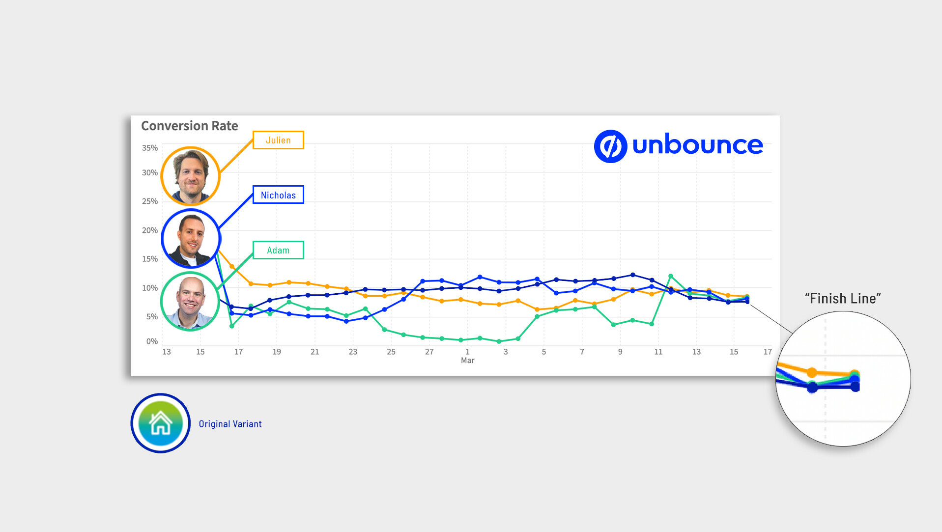
One month ago, we put three (brilliant) marketers to the test to see who could generate the highest lift of a customer’s live campaign in Unbounce, and identify a new audience with the help of Smart Traffic.
Nicholas Scalice, Adam Smartschan and Julien Level accepted this challenge with vigour, and Gareth Millward gave them the keys to the castle for a week to each create a new variant of the original landing page. Here’s a sneak peak of how each variant performed: (click to enlarge) 🔍
This battle royale (or O.K. Corral if you’re a country western fan) is known as So, You Think You Can Convert?, here’s how this most recent series unfolded:
Gareth Millward (@gforce01) is the Director of G Force Media Services in the UK, and when asked why he submitted his landing page to this contest he responded “because I’m always looking for ways to improve things”.
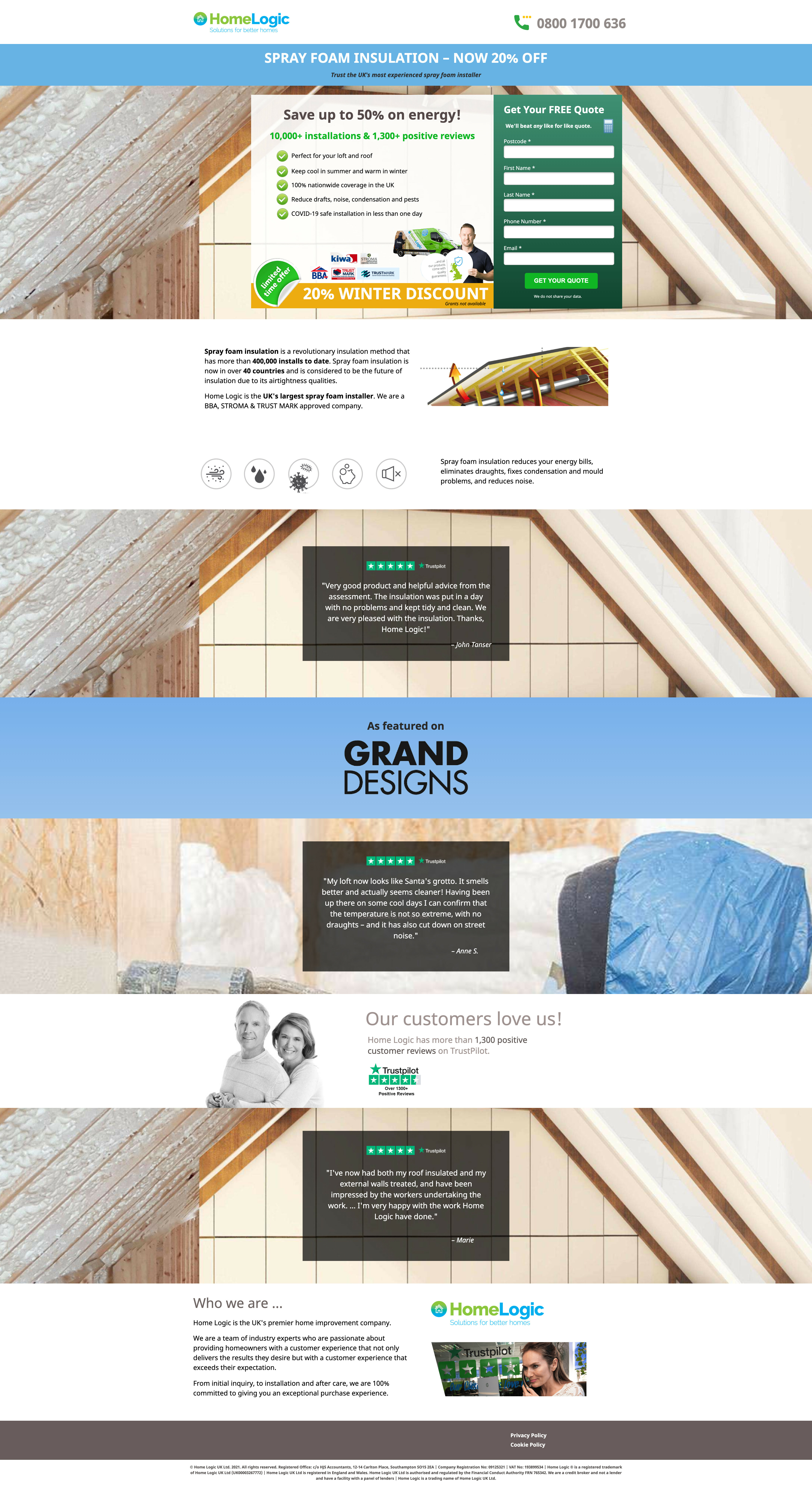
Gareth currently runs the marketing for Home Logic which offers home improvement services throughout England, specifically focussed on insulation. Thankfully, Home Logic offers an essential service in the UK which means business has been relatively uninterrupted during the pandemic. Shortly after Gareth’s page was selected, Nicholas, Adam, Julien and myself sat down with Gareth to learn about the Home Logic business, strategy, and possibilities.
Here are the high level details from Gareth’s landing page:
- Traffic is currently coming from Google ads and Facebook
- The primary CTA is to “Get A Quote”
- The page was performing at a ~10% conversion rate
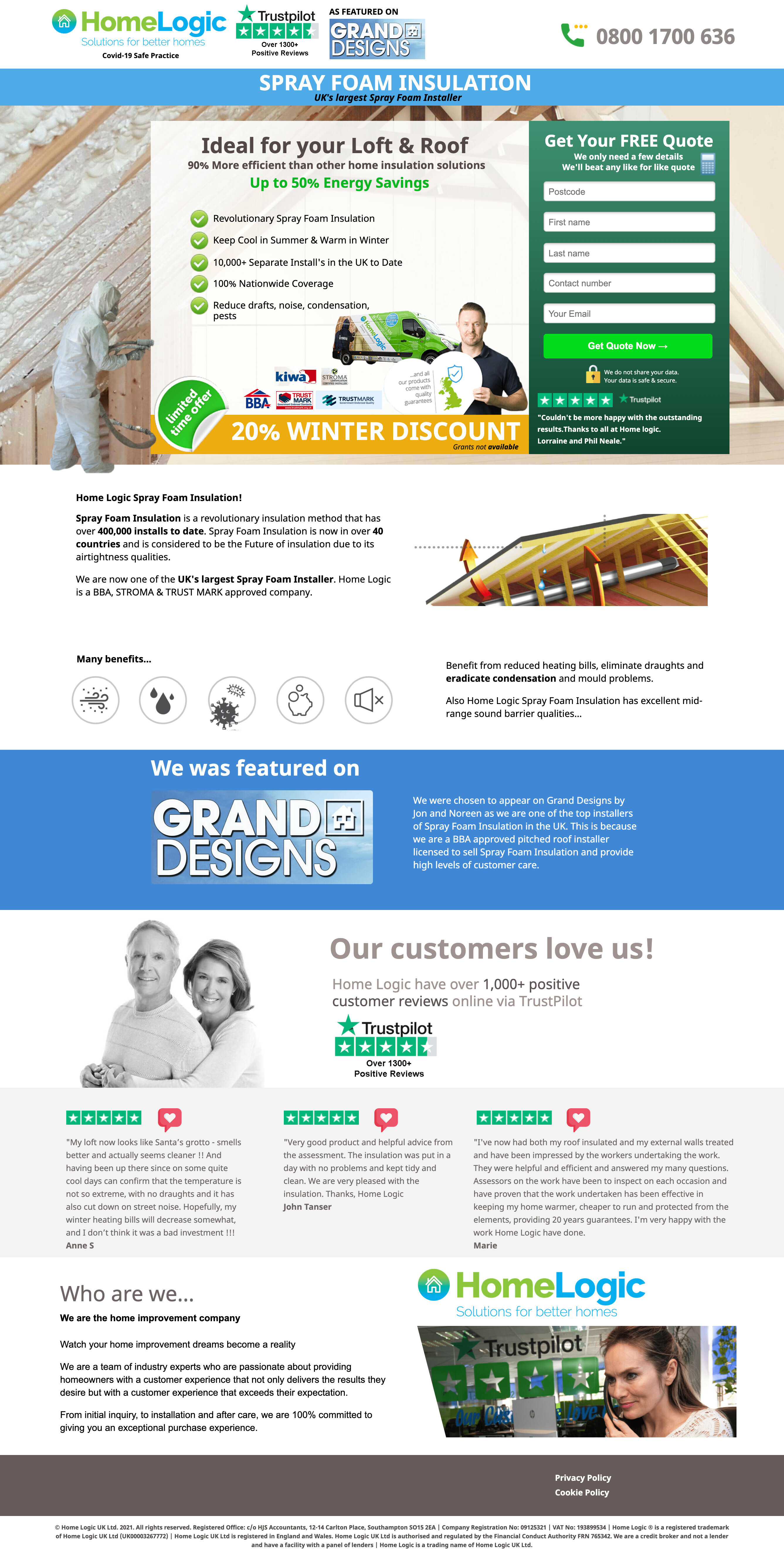
Click to see Gareth's original landing page
(Click to enlarge)
After our contenders had enough of their questions answered, it was time to get to work. They were each given 7 days to build a new variant and see who could generate the highest lift, and uncover a new audience with the help of Smart Traffic.
Uncover a new audience with the help of Smart Traffic, what?
What I mean by this is that Smart Traffic sends traffic to the variant that they’re most likely to convert on, based on specific attributes such as location, device type, and browser (full list of attributes here). If a variant receives a large amount of traffic, we can infer that Smart Traffic has identified that a particular audience is more likely to convert on that specific variant.
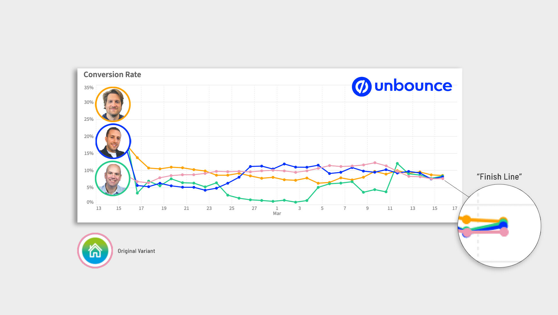
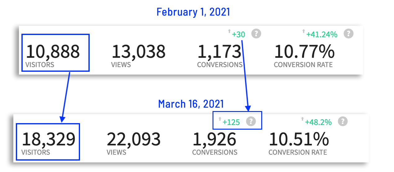
Here’s a glimpse into the metrics after 1 month:
(Note: Gareth sent more traffic to his variants over March, which (among other things) led to a decrease in the conversion rate but an increase in overall conversions compared to other months)
Each contender in this contest, in their own words, has written about their tactics, so I’ll pass the mic over to them 🎤
Adam’s Tactics
We went in looking to create something akin to a traditional A/B/n variant. That means relatively light tweaks, primarily to the value proposition.
As a result, we stayed away from massive design changes. Instead, we tested a hypothesis that focusing on users’ wallets would resonate. And just like traditional A/B/n testing, we learned something: For a service like this, the benefit is everything. The advertising driving traffic is capturing prospects relatively far down the funnel. They’re sold on the concept of spray foam insulation, and don’t necessarily need a few extra pounds in their pocket to push them over the edge.
What did we learn? Simple: Test, test, test. You never truly know what’s in users’ brains until you roll out a variant. And that’s the beauty of a tool like Smart Traffic – you get real insights into visitor psychology, not just conversion rate boosts. Honing the messaging going forward is worth just as much, if not more, than juicing the CR.
Click to see Adam’s variant
(Click to enlarge)
Julien’s Tactics
I love challenges and participating in So, You Think You Can Convert (SYTYCC) 2021 was really exciting. After years of making landing pages and collecting leads for my clients, it was a good way to compare my experience to two seasoned experts, Adam and Nicholas.
THE PERFECT SITUATION
I entered the challenge with a lot of confidence:
- Home Logic fit our type of client (B2C rather than B2B where lead gen uses different mechanics).
- I had some experience in the insulation field as in France the government is offering help to renovate old houses for only 1€ (which has led to a lot of scams but that’s another subject).
- I had perfected my landing page skills for a dozen of years, and I’ve been using Unbounce for almost 5 years now.
THE BUILD PROCESS
- I spent one hour on Home Logic’s website to synthesize and collect all the information that should be on the LP. (Logo, images, catchphrases, testimonials, etc).
- Take our best performing LP and adapt it to Home Logic (don’t reinvent the wheel each time).
- Improve the color scheme of the LP to make it more modern.
- Focus the campaign on the goal of the visitor: “Enjoy the perfect temperature. Stop choosing between too hot or too cold”. You have to give people what they want.
- I then spent some time on Shutterstock finding the hero shot that would suit best the message in 4.
- Clearly express the benefits of Home Logic.
- Humanize the testimonials.
- Add how we do it and who we are.
- Et voila! (as we, French people, really say).
THE MISTAKE
The day we had to publish our LP I was very excited to see what @Adam_Smartschan and @Nicholas had done. The moment I saw their great LP I had a moment of shock… I made the classic rookie mistake.
Gareth (@gforce01) from Home Logic is a marketing expert and he knows his product very well. When Adam, Nicholas and I shared our work, he reminded us of something very important: his conversion rate was at 10% on Google and 8% on Facebook, which for this kind of product is already excellent. However, instead of paying attention I wanted to boost my ego. I forgot the most important lesson I’ve learned over the years: If it isn’t broke, don’t fix it. One of my biggest clients is still using the same landing page we designed for them 5 years ago. With time, we’ve made small improvements with some help from A/B testing in Unbounce and increased the conversation rate by small amounts each time.
Like I said, if the conversion rate remains high and your client is satisfied with the quality of leads, don’t try to “fix” it. Adam made the right decision to iterate from the current Home Logic LP, while Nicholas was a genius for keeping the style while redoing the structure of the LP. Ultimately, this competition will be a great example for Unbounce viewers as they will have three different ways of improving a landing page. The current performance of the variants varies depending on the traffic source but with the help of Smart Traffic, Gareth now has in his hands a great playground to test new and different things and to continue to increase his conversion rate. Thanks again to Gareth, Adam, Nicholas and the great @Jess who is the mastermind behind So, You Think You Can Convert.
Click to see Julien’s variant
(Click to enlarge)

Nicholas’ Tactics
When approaching this Unbounce landing page project, we initially conducted a conversion audit using our 10-point approach which included looking at:
- Message Clarity
- Offer Relevance
- Design and Affinity
- Social Influence
- Trust and Security
- Unique Advantage
- Call to Action
- Interaction
- Speed
- Display
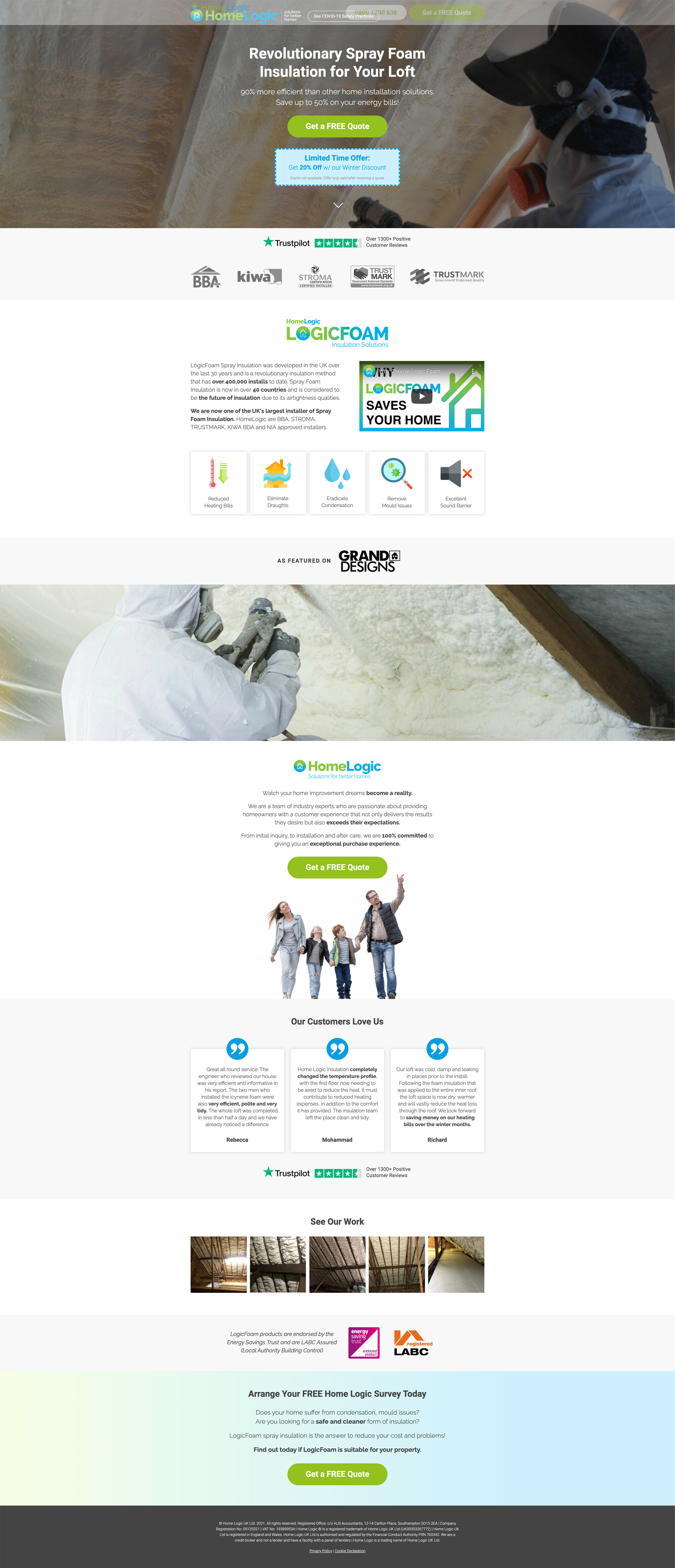
Overall, the initial page and offer was pretty solid, and was obviously converting well already, but we did see some noticeable room for improvement, primarily on the design and functionality sides.
For example, the original landing page was:
- Rather cluttered with limited spacing between elements
- The trust icons were small
- Too many shades of green color that does not match the Home Logic logo colors were present
- The Trustpilot reviews had been mentioned many times on the page which seems like too much for such a short page
- The ‘Grand Designs’ logo looked out of place
- The phone number wasn’t a click-to-call button
- The COVID-19 Safe Practice element wasn’t clickable to expand on some kind of safety message with more details
- The benefits icons weren’t explanatory (no description below each one)
- And the footer with Privacy Policy and Cookie Policy was out of place
Therefore, as we began our redesign, this is what we focused on to improve the chances of seeing a conversion lift:
- Cleaned up the page significantly by adding a lot of spacing
- Added a fading fixed header (via this Unbounce Community script) added to the page after the visitor scrolls past the header section
- Phone number is now a click-to-call button
- COVID-19 Safety Practices is an actual button that goes to a lightbox explaining the safety measures they are taking (copy taken from original website)
- Moved form to lightbox to make the page cleaner
- CTA button colors now match branding colors
- Large greyscale trust logos are now right below the fold. We included a Trustpilot icon with clickthrough to reviews.
- Added LogicFoam section to explain what it does. Included embedded video and it’s benefits with clear flat icons.
- Grand Designs logo is now in a singular color
- Added a new section with new testimonials and bolded the important parts of each quote. Repeated Trustpilot icon.
- Added an image gallery of the foam to show visitors the quality work they do
- Added in large trust logos from Energy Saving Trust and LABC
- Modified CTA section near footer to repeat for free quote
- Cleaned up the footer and centered Privacy Policy and Cookie Declaration
Before sharing our new variant with the client, we ran it through our internal quality assurance process, and our 3-point functionality test where we looked for any interaction, speed, or display issues.
Upon passing these checks, the page was set live as part of the Smart Traffic test with the other competing variants.
Click to see Nicholas’ variant
(Click to enlarge)
Gareth’s Client-Side Experience
I started using Unbounce around eight months ago. I wanted to quickly and easily create a landing page for our Home Logic Home Improvement products, while also allowing me to easily test different variants to make it the best it can be. Scraping as many conversions as possible can be crucial to business; so I am always looking for opportunities to test different things to improve conversion rate and customer quality.
When I saw the community post, “So, You Think You Can Convert!” I thought it could be interesting to see how others would approach the design and what they would do differently to improve the conversion rate. I hastily added my link to the post, and my initial thought was that “someone else will get picked”, but low and behold, a day later, I received the invitation email from Jess to participate.
Working with Julien, Adam, and Nicholas was a breath of fresh air because they understood the product straight away; after a simple Zoom call, they were ready to go, there were no pitfalls.
When the landing pages came back, I thought they were fantastic. While Adam cleaned up my initial design and added some features, Julien and Nicholas came back with totally different variants, and my reaction was WOW.
All the variants performed very well. I did think my conversion rate was relatively high at just over 10%. I think at one point early on, Julien’s had reached 14%. Later on in the month, we saw conversion rates drop slightly (we believe this was more to do with the ever-changing pandemic rules in the U.K; a few things happened in a few weeks, vaccine rollouts, children started back at school, our marketing was up and down).
All in all, we will leave the variants running with the Smart Traffic enabled. I enjoyed being a part of this, and I wish I could do it for every campaign product because they are true experts, and I will likely hit them up in the future! Also, thank-you Jess for your support through-out.
In Conclusion…
@julien_level’s variant won the highest CR% 🏆, but it was an extremely close race. As anyone knows, 1 month is not an adequate amount of time to run a proper test. That said, in just 30 days @Adam_Smartschan @julien_level and @Nicholas’ contributions have generated a seriously significant increase in conversions – and that’s what this series is all about!
That’s a wrap for our latest series of So, You Think You Can Convert (SYTYCC). This is hands-down my favourite project to be a part of, and I’m honoured to be a fly on the wall as the real heroes put their time and effort into these campaigns. I’m so grateful to Gareth for being so open and for allowing us to work with him on this project, and to Adam, Nicholas, and Julien for flexing their marketing expertise and opening this window into how the pros get it done.