1: What challenge are you currently trying to solve? Give as much detail as possible

Seeking to Increase Opt-In Conversions so visitors will take quiz.


2: How are you driving traffic to your page?

FB PPC ads


3: What is your conversion goal?

20%+


4: Provide a link to your published landing page / convertable:

na

Hey Avi,


You’ve got a straight-forward landing page, which is good! Gotta keep things simple. So without changing the whole look of the page, here are a few edits I suggest you make to help increase conversions 🙂


  1. SPACE, COLOR & TEXT…

    Things are too close and the text is hard to read so that it flows. Some text boxes are white, just a few shades lighter than the full background color…seems odd. Add some space between sections, and text areas and clean up those colors to give it a smooth finish. If you have any ideas on moving text around or making them more like a paragraph, that would help too. Some could argue too much headline style ruins the page.


  2. THE FORM…

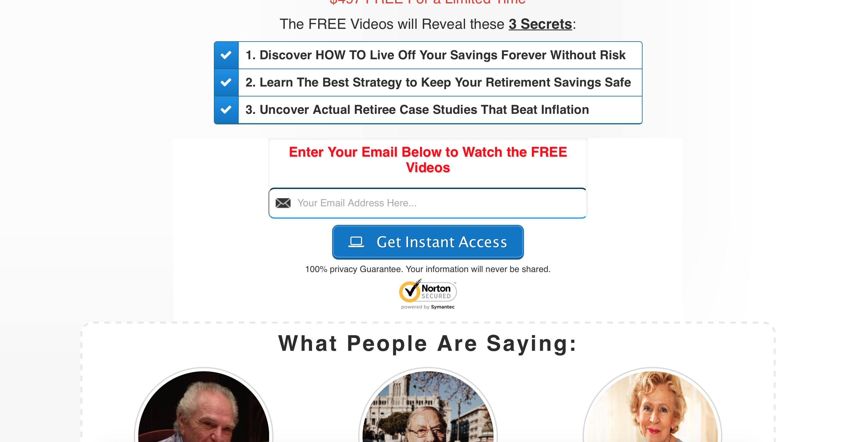
    Your form is hidden among everything else! The one thing you need users to do and it is the hardest thing to see. The submit button is so enormous I barely realized I had to type in my email above it. Make the form outline the same color as the button to show they are related (again, space won’t hurt here either). I would also just let the button say, “Get Instant Access.” I dig the computer icon too 👍 💻


  3. THE HEADER BUTTON…

    What’s up with that thing? Do I call or do I fill out the form? If you want folks to fill out the form, I would remove the button that has a phone number in it. Maybe add the number to call in the footer of the webpage.


  4. POP-UP…

    That “Provely” pop-up stating when someone last watched a video…oof. Unless you have factual data proving that those get you more conversions, I would get rid of it. It’s distracting. While positive and good to know that people watch, you already have a great testimonials section to tell me that.


  5. IMAGES…

    It would be great if you could create a mockup of these videos as if they were a DVD set. Or perhaps at least a screenshot of the video itself? Anything to help users see what they are getting is always nice. I’d place the image to left of the “3 secrets” boxes.


In summary, I actually like the repetitive copy with all its capitols and underlined things. Usually I think it looks spammy but it kept me engaged and focused so I knew exactly what to expect. I think your audience will appreciate that as well. I made a few quick edits shown in my screen shots below so you can visualize what I mean.


Hope that helps, let me know if you have any questions!


Hi Avi,


Here’s a short video with some additional feedback to consider: https://screencast-o-matic.com/watch/cFhnIibYCM


All the best,


Reply