Ho guys!
Need your fresh look at my work. I’ve been working for a couple of days so far and can’t see if I’m missing smth and what can be improved. Any thoughts?
http://unbouncepages.com/product_lp/
Cheers

Ho guys!
Need your fresh look at my work. I’ve been working for a couple of days so far and can’t see if I’m missing smth and what can be improved. Any thoughts?
http://unbouncepages.com/product_lp/
Cheers
I am new on the site and new at marketing. I would love to be as talented as you. I think you nailed it!!!
Wow, thank you, Loren!
Rita,
It is a great page for a variety of reasons. But, there is always room for improvement and plenty of things you could test.
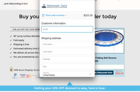
First, the headline in the blue photo could be stronger. It is definitely a good actionable headline but you are discounting the product before you event tell people what it is. I’d simplify the headline and have it clearly explain the product. Keep the 20% offer below the fold.
I am also not a fan of questions in headlines. They can be limiting. Now in order for yours to be limiting you have to be in better shape than an astronaut, but what if you are? Then this isn’t for you…
I love the photo and the bullets that point to it… however it doesn’t work at mobile. You might shut off that section and turn on a simpler bulleted list.
The arrow that points up at the middle of the page aroudn the 20% OFF section should point down. Or it should move to the right to point right at the order my reboudner now.
Again, change the question into a statement, Trampolining is good for any age/any fittness level.
The get my 20% off button should go to one block higher, get people to the point of conversion not just below it. This is important espiceally at mobile.
I’d test moving the testimonials around, changing up headlines, everything!
How are you sending traffic to the page?
Good luck, you are doing very well right out of the gate.
Joe
Hi Rita!
Enjoyed your design 🙂 it was not cookie cutter!
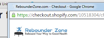
There always endless things you can test, but checking out on e-commerce is critical.
When I went to test purchase the trampoline the checkout continued in a small new window. I can see that this is via shopify, but it still gave me the quick fear, “Is this secure?”. Just a window into one user’s mind 🙂
Thought you did a wonderful job on this though.
Best,
Joe
Joe, I appreciate your feedback. Truly, everything is a matter of testing.
Yeah, I guess two questings in headlines on the one page is too much.
The page has PPC traffic.
In this case, testimonials are big and complete, I would definitely test moving the button one section up. You are right about mobile page length.
Thanks for pointing it out!
Yeah, Joe, shopify checkout page doesn’t allow much customization.
Will try to play around with it to add more trust indicators. I thought lock in address line might act as one, of course, it’s not enough 🙂
That was critical to hear your point about fear. Thank you for paying my attention to it once again.
Have a great Tuesday,
Rita,
If you are using AdWords traffic I’d suggest trying out Unbounce’s dynamic text replacement options for you headlines. I have found conversion rates go way up with well done dynamic text replacement.
Let us know what tests you do, and what the results are. It is a great looking page with a ton of good information.
Joe
Joe,
Agree, it can work really well!
My client uses a free unbounce account for now but I suggested the same. An alternative can be page duplicates with replaced headlines.
I’m excited to see results too. Do you think using a free account with unbounce branding displayed, might hurt conversion?
Thank you for assistance
Yes. You want the custom domain… nothing kills brand trust faster than generic urls. Ideally you want it to be https as well (which you can do with the paid account).
Since you are asking people to purchase a product you want to build up as much trust as you can. I would bet 1 sale will more than pay for the pro account with Unbounce… it is worth the investment… IMHO
Joe
No account yet? Create an account
Enter your username or e-mail address. We'll send you an e-mail with instructions to reset your password.