[Tips & Scripts] Sticky Navigation Bar For Desktop - The Code Behind Our 2015 Call-To-Action Conference Page

  • 16 February 2016
  • 51 replies
  • 1488 views

Userlevel 4
Badge

:spinbounce: Update:

We have now officially launched Sticky Bars natively within the Unbounce Builder! Click here to start using Sticky Bars on all your Unbounce landing pages! 🙂

Have you seen the 2015 Unbounce CTAConf page?? What a beauty!

Here in Customer Success, we decided to dig into that page a bit and show YOU how to recreate its sticky navigation header on your desktop page using two Tips & Scripts. This header will allow your visitors to blissfully jump from one page section to another, all while keeping the CTA button ready and waiting for that all precious ‘click’. 


How to Install in Unbounce

Click Here for Instructions

🚨
This is not an official Unbounce feature. This functionality is based entirely on third party code, and has only been tested in limited applications. Since this isn’t a supported Unbounce feature, our support team will be unable to assist if things go awry. So if you are not comfortable with HTML, Javascript and CSS, please consider consulting an experienced developer.


Instructions

Scripts Needed

Grab the two javascripts required for this setup here:

Step 1.

Build your header box. Add a box to your Unbounce page that spans across the entire width of your page section. You can completely customize the format of the header however you want.

Step 2.

Build your buttons. Drag a button element onto your page from the left-hand menu. On my page, I turned the button colour transparency down to zero and removed the button’s border so that just the text remains visible. Once you create the first button, you can just copy and paste it to create the additional buttons using our copy & paste tool.

Step 3.

Size and place the buttons inside your sticky header box.

Step 4.

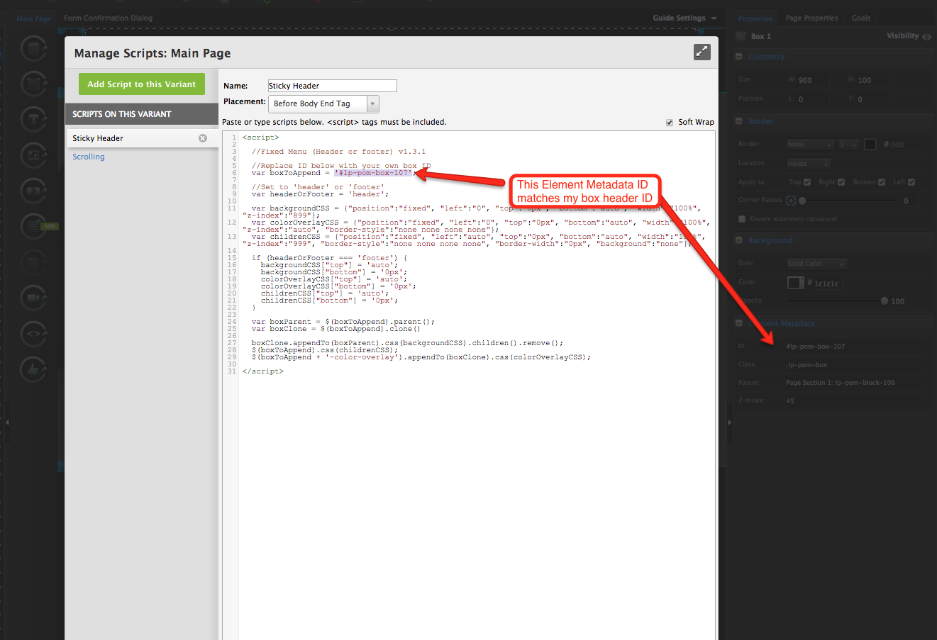
Creating your button anchors. You can use any element in an Unbounce page as a button destination/anchor. You just take the box/text/page section’s Element Metadata ID and use it as your Button’s ‘Go To URL’ destination. Check out my screenshot of where these IDs can be found here.

Step 5.

For my button anchors, I will typically use a transparent box. They’re very easy to add and format. Drag a box onto your page, then turn it’s opacity completely down and remove its border. You’ll want to place these boxes to the spots on your page that your navigation bar is going to scroll down to and make sure you consider the length of your header when you place this box. When you place the box, make sure to grab it’s Element Metadata ID and then put it in your button’s destination URL field.  

Step 6.

Add the two Javascripts. Once all of your navigation buttons are linked to the corresponding transparent box anchors on your page, all that’s left to do is adding the two scripts to your page for sticky header and smooth scrolling. Check out our documentation on how to add Javascript to an Unbounce page here..

You can take the Javascripts mentioned at the beginning of this post and paste them right into your javascript editor on the page. You will need to grab the Element Metadata ID of your header box and put it into the Sticky Header javascript, check out where that needs to be done here.

Step 7.

As mentioned in the title, this workaround is a desktop only feature. You will probably want to go to your mobile view and either compact the menu to make it fit on mobile, or hide its visibility completely. To see how our visibility tool works, you can check out our documentation here.

Testing

Like anything else you implement on your page, you’re going to want to test this out thoroughly to see what effect (if any) it has on your conversion rates. We recommend running an A/B test and segmenting a small portion of traffic towards the page - just to be safe.

Conclusion

This is a really slick way to have your customers navigate the different aspects of your landing page while still keeping your CTA on screen and ready to be clicked. 🙂


Can’t see the instructions? Log in or Join the Community to get access immediately. 🚀


Want to take your Unbounce landing pages + Convertables™ to the next level?
:spinbounce: Check out the Ultimate List of Unbounce Tips, Scripts & Hacks


51 replies

Yes please same for me, I’ve seen that yours is working now

Hi, I have this same issue and I have tried everything, can you please share the solution with me??.

Hi, I have also tried a ton of things and my header doesnt stick, can you please share with me your solution?, because I saw your link and I think you solved.

Hi Joel,
Can you also help me? I have done everything (not sure it was done correctly…) can you also try to see where I went wrong? this is my page - www.meravstern.co.il
I have only one sticky bar so it’s no problem finding it…
The sticky bar is all over the section with the buttons - and you have to close it to see the buttons. I didn’t understand at all what should be inside the sticky bar page… I put the box and the buttons and the codes - inside my landing page (and nothing realy in the sticky bar page…) is this how I should do it?.. please help… thanks a lot!

Hello! I’ve followed the instruction of this post, but for some reason the only part of the navigation bar that scrolls with the page are the transparent buttons. So I just have a few random words following along. The script seems to be working, so I’m wondering if I made a mistake somewhere in the set up? Any ideas or tips on how I can get the entire box/header to scroll along with the page? Thank you

I have tried a ton of things, but I simply cannot make my nav bar sticky.

Can someone try to help me out with the troubleshooting?

The page is published here: http://borsenlive.dk/bec/

Script looks as following:

<script>

  //Fixed Menu (Header or footer) v1.3.1
  
  /**
    * Do not remove this section; it allows our team to troubleshoot and track feature adoption. 
    * TS:0002-13-013
  */

  //Replace ID below with your own box ID
  var boxToAppend = '#lp-pom-box-522';

  //Set to 'header' or 'footer'
  var headerOrFooter = 'header';

  var backgroundCSS = {"position":"fixed", "left":"0", "top":"0px", "bottom":"auto", "width":"100%", "z-index":"899"};
  var colorOverlayCSS = {"position":"fixed", "left":"0", "top":"0px", "bottom":"auto", "width":"100%", "z-index":"auto", "border-style":"none none none none"};
  var childrenCSS = {"position":"fixed", "left":"auto", "top":"0px", "bottom":"auto", "width":"100%", "z-index":"999", "border-style":"none none none none", "border-width":"0px", "background":"none"};

  if (headerOrFooter === 'footer') {
    backgroundCSS["top"] = 'auto';
    backgroundCSS["bottom"] = '0px';
    colorOverlayCSS["top"] = 'auto';
    colorOverlayCSS["bottom"] = '0px';
    childrenCSS["top"] = 'auto';
    childrenCSS["bottom"] = '0px';
  }

  var boxParent = $(boxToAppend).parent();
  var boxClone = $(boxToAppend).clone()

  boxClone.appendTo(boxParent).css(backgroundCSS).children().remove();
  $(boxToAppend).css(childrenCSS);
  $(boxToAppend + '-color-overlay').appendTo(boxClone).css(colorOverlayCSS);

</script>

I am getting a bit desperate here, hope someone can help me out.

Thanks in advance

Mads

I see a blue sticky header, is that the correct one?

Hello,

I have added the script and replaced the id by my section id. The sticky header is working but the all element of the header is not showing!

Page link: http://unbouncepages.com/roofing-replacement-page/

Here are the elements: image

Please help me.

Thanks

Userlevel 5
Badge +2

Hi @joesloan93! Can you share with us your url so we can better investigate where you are having an issue.

Make sure you are placing all of the elements into the sticky nav box, not place it “over the elements”.

I could really use some help. I’ve added the javascript code in the code editor. I’ve added a transparent box over all of the elements I would like to stay in the sticky navigation. I reference the box id (#lp-pom-box-302). I have the javascript set to ‘Before Body End Tag’ (I’ve tried them all). Not sure what I could be doing wrong here. I want a sticky nav that will open a lightbox which isn’t an option with Unbounce’s sticky navs.
Any ideas?

super thanks Jess.

Userlevel 7
Badge +1

Hey Mario! Here’s a link to the hamburger menu workaround. Let me know if this is what you were looking for 🙂

http://landingpage.noahmatsell.ca/mobile-menu/

Hi Joe,
i cant seen the hamburger menu workaround you mentioned. It says the page does not exist. Can you repost that please? thanks

Hi all, we’re having issues with our sticky nav. I was curious if anyone could help me pinpoint the problem. When scrolling within the page, the sticky nav works properly. If you interact with the navigation before scrolling, it appears expanded in the sticky nav once you’ve scrolled. When you close the expanded sticky nav, then scroll to the top, the stationary nav is expanded.

If you interact with the sticky nav then scroll to the top, the stationary and sticky navigations act as they should and are not expanded. I have a feeling it’s the code and items need to be renamed for the sticky nav vs. the stationary nav, but if anyone has insight that would be much appreciated!

Our page: http://unbouncepages.com/aed-homepage-mobile/c.html

I have this and the mobile Nav working with Noah’s Fixed Fading Sticky Nav code on my page, but I have one little problem: On desktop, when the nav sticks (after scrolling), a second bar appears underneath it when scrolling down. It looks like it’s the overlay from mobile that appears on scroll, and it adds a large white bar under the menu on desktop only. Mobile is fine.

Is there any way to get @Noah’s fixed fading sticky nav to only trigger on mobile, not desktop?

edit:

After tinkering with it for awhile, it would appear that the problem lies in this code:

boxClone.appendTo(boxParent).css(backgroundCSS).children().remove();
(boxToAppend).css(childrenCSS); (boxToAppend + ‘-color-overlay’).appendTo(boxClone).css(colorOverlayCSS);

I’ve managed to get it almost there by disabling the first and last line of code - it gets rid of the second white bar, but makes the mobile bar transparent when I do that.

Any ideas?

Make a box inside the menu bar and inside that box drop the logo.

Hi Reuel,

Do you have a link for this page?

Thanks,

Jack

Hey there Joel. Same issue here. Can you help?

Any feedback or help? @Joel_McDonald @Noah?

I’m looking to get my mobile nav bar to be static as it is by default, but reappear by sliding down from the top of the screen when the user scrolls back up, or maybe reappear when they stop scrolling longer than say 3 seconds. Is this possible by modifying the above script?

Hi @Joel_McDonald & @Noah (I’ve tagged you cause you’re awesome lol),

This Sticky nav bar feature is pretty cool. I’m having a little issue where my nav bar is just under my logo section so when I test the sticky nav feature it ends up cover the logo. Is there a way where the nav bar is sticky once you scroll so that anything above it won’t be covered?

Hope I’ve made sense! Thanks

Here’s a screenshot:

Hi Joel I have the same issue. Could you please help me? Kind of a sticky white box is hiding my toolbar. thanks 

I added some more content to my question.

I added some more content to my question.

Reply