[Tips & Scripts] Mobile Hamburger Navigation Menu

  • 29 February 2016
  • 67 replies
  • 5207 views

Userlevel 7
  • Former Unbouncer
  • 126 replies

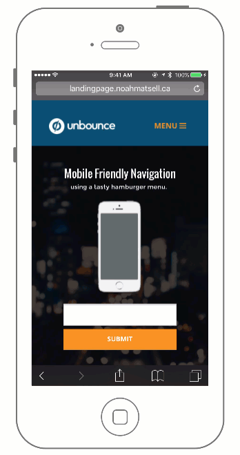
Building on the Sticky Navigation Bar Community Post, this tutorial shows you an easy way to take your navigation bar in Unbounce and make it mobile friendly.

The benefit of doing this is to give your users a way to quickly navigate your mobile landing page while allowing them to jump to the form at any time.

See this effect in action here (view on mobile):
http://landingpage.noahmatsell.ca/mobile-menu/


How to Install in Unbounce

Click Here for Instructions

🚨
This is not an official Unbounce feature. This functionality is based entirely on third party code, and has only been tested in limited applications. Since this isn’t a supported Unbounce feature, our support team will be unable to assist if things go awry. So if you are not comfortable with HTML, Javascript and CSS, please consider consulting an experienced developer.


⚠️ Before We Begin…

If you don’t have your navigation bar set up yet, start here.

Download the Scripts

Grab the latest menu_box.css and  menu_toggle.js files here:
https://gist.github.com/noahub/2c67b14bc043b049f394

Optional: Download the .unbounce template

You can download the .unbounce file for this project here.

Instructions

Step 1.
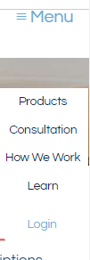
Copy your navigation bar box element in desktop, switch to the mobile editor, and paste the box on your page. This will be your mobile dropdown menu! Style to your liking.

Step 2.
Still in mobile, you will now want to hide the buttons in the original navigation bar and add your toggle button/image.

Step 3.
Switch to the desktop editor and hide the newly created dropdown menu box element.

Step 4.
Copy and paste the following snippet to the Javascript section with placement ‘Before Body End Tag’.

<script src="//ajax.googleapis.com/ajax/libs/jquery/1.4.2/jquery.min.js" type="text/javascript"></script>

This is the reference to the jQuery library. Next, paste the menu_toggle.js Javascript code below the snippet.

Step 5.
Replace “#lp-pom-image-120” with the ID of your toggle button/image from Step 2 and both instances of “#lp-pom-box-113” with the ID of your menu box created in Step 1.

Step 6.
Paste the menu_box.css CSS code in the Stylesheets section.

Step 7.
Replace “#lp-pom-box-113” with the ID of your menu box from Step 1 and the ‘top’ value with the pixel height of your original navigation bar.

Testing:
Like anything else you implement on your page, you’re going to want to test this out thoroughly to see what effect (if any) it has on your conversion rates. We recommend running an A/B test and segmenting a small portion of traffic towards the page - just to be safe.

Conclusion:
We’ve given you the ground work, but we would love to see how you implement this on your own pages. For example, maybe you choose to make your header fully transparent and only include a menu icon? This is your chance to get creative and show the Unbounce community how you’re using this.


Can’t see the instructions? Log-in or Join the Community to get access immediately. 🚀


Want to take your Unbounce landing pages + Convertables™ to the next level?
:spinbounce: Check out the Ultimate List of Unbounce Tips, Scripts & Hacks


67 replies

Badge

Hello,


Need help please…..I’m having issue on the mobile version for the hamburger nav. The nav doesn’t behave the way I want it. Every time I click on the drop down it automatically close instead of opening the sub nav for “Breakfast”

http://www.metrodetroitvenues.com/menu-guide-1


Thanks in advance...

Badge

Hello,

Is there a way for this to work as a Dropdown button on a desktop i.e “Top buttom” will have a dropdown nav as well.

Thanks,
LP

When I follow the steps exactly, and even try to us the template, all that appears in my nav bar is a white box with nothing in it. After publishing, it removes everything and is just white. Any help is appreciated

So I couldn’t get the mobile menu to close off of a hover, but I got it to at least stay with the header when scrolling. Changed the css position to relative:

#lp-pom-box-916{ display: none; position: relative; top: 130px; left: 0%; margin-left: 0px; z-index:9999; }

Hey Noah, that is awesome feature!

I managed to implement it in conjunction with the fading fixed header ([Tips & Scripts] Fading Fixed Header)

Everything seems to work fine, I have two headers in mobile, (consequence of the fading fixed header) and in each of them I have a menu “image” and have a Java Script calling each image to call the box of the mobile hamburger.

The only problem I have, seems like a conflict, is: when I click the image in the header, it calls the box where the mobile menu is (correctly), when I click a button it navigates to the correct page section then it closes the menu and opens it again. I don’t want to have it opened again. This is my only issue.

Do you know if this could be a easy fix?

Here is the website if you want to take a look: https://www.libpartners.com.br/

Thank you so much!

I actually solved my own problem. It took me way longer than I would have liked but…
Here is the updated CSS:

#lp-pom-box-999{
display: none;
position: fixed;
top: 60px;
right:0px;
margin: 0 auto;
margin-right: 0px;
z-index:999;

Hey everyone! Thanks a lot for the contributions!
The hamburger menu works fine, but it only displays centered on 320 px screens; when I try on my own mobile device, it is positioned to the left of the page, while my toggle button is on the right.
I’ve tried replacing ‘left’ with ‘right’ in the CSS, but the menu doesn’t appear anymore when I do so.
Any tips?
Thank you!!
Below is my CSS:

#lp-pom-box-999{ display: none; position: fixed; top: 60px; right: 0px; right-margin: 0px; z-index:999; }
Badge

Hey guys, I have created a collapsible mobile menu. Check Details here.

Hey @Greg_Babb… How did you fix this? I’m getting the same issue, where a user clicks the hamburger menu, then it just keeps ‘scrolling’ along with them until they click the menu again… also, due to the fixed location of the script, if they scroll at all at the beginning, it will throw off the location of the menu!
Capture2 Capture

Just want to say thank you and thank you for providing your burger menu template as an example. Without it I would not have had understood how to implement this

Hey thanks! Got this to work but I had on scroll animations as well that don’t show up now.

I’m thinking it’s conflicting with the java but don’t know how to break it apart.

I followed all the code for the fixed header and also the drop down menu, so that code is correct.

Here is my code for the onscroll animation.

Any suggestions?

Hello, does anyone know how to add this slider menu functionality to an Unbounce Bottom Sticky Bar?

I’m looking to include a sticky bar pop-up on a page for mobile that once a user clicks on the menu opens up vertically with 3 CTA buttons. Currently the mobile sticky bar only has space for 1 CTA Button, so having a slide up menu from this would be very beneficial.

Thanks!

Badge

Can anyone figure out how we can make it, so that it just goes off when clicked outside of drop down box? Right now, it use to stick even when we start scrolling down the page.

hello there, could someone please help me out?

I’ve got my sticky nav bar up, hamburger drop-down done and also checked against the .unbounce file from above - I still can’t figure out why the hamburger drop-down isn’t from the sticky bar.

Here’s the landing page i’ve built: https://discover.cardup.co/personal/every4free/

When we open the page, the menu is default open. It is covering the hero title of the page. How can I make it default closed? Quick help is appreciated 🆘

What do you mean by that? Like what exactly do I have to do so that I get a drop down menu? How to hide my buttons?

I figured out the problem. Some other jQuery I wrote was interfering somehow with the responsive code.

Hi, I’ve implemented this but somehow it only responds to clicking of the hamburger icon (to open/close) the menu. This means when the user clicks a link or button within the open responsive menu, that link or button functions correctly but the menu doesn’t close afterwards - i.e. the slideToggle function is ignored or the event listener attached to the responsive menu doesn’t fire.

Would anyone have a guess as to how or why this may be happening?

I considered an event bubbling conflict of some sort and reviewed potential conflicts but the only other event listener attached here is a gtag attached to the CTA button within the responsive menu. However even when removing this the responsive menu still doesn’t close after the user taps a link within it.

I’ve implemented the jQuery and CSS code exactly as described above. Thanks for any ideas as to what may be going wrong.

Userlevel 5
Badge +2

Hi @Havenly!

Would you mind sharing your page? It is hard to identify the issue without seeing it. Feel free to PM me if you don’t wish to post it on the thread!

Not working for me either!

Userlevel 5
Badge +2

@mstewart13

Here are the articles you are looking for.

@Noah This article is three years old, and it seems like an important feature–many of the links are broken. Is it possible to get this updated? I’ve been trying to follow the instructions, but I keep getting directed to broken links.

For example, step 1…

If you don’t have your navigation bar set up yet, start here . - This link is dead

Hey Tristan, did you ever find a fix to this?

Noah has the exact thing you describe on this example site that he used when describing how to build a sticky header (have to be on mobile to view) (https://calltoactionconference.unbounce.com/recap-2018/)

Hi, could you explain how you solved this? I looked at the slide deck and still am having an issue where the menu is just not showing up at all.

@Nathan_Lee @Uniting
Found a slide deck that helped me figure out the issue. The instructions are a little more clear for those of us who are newer to Unbounce.

Hope this helps!

Reply