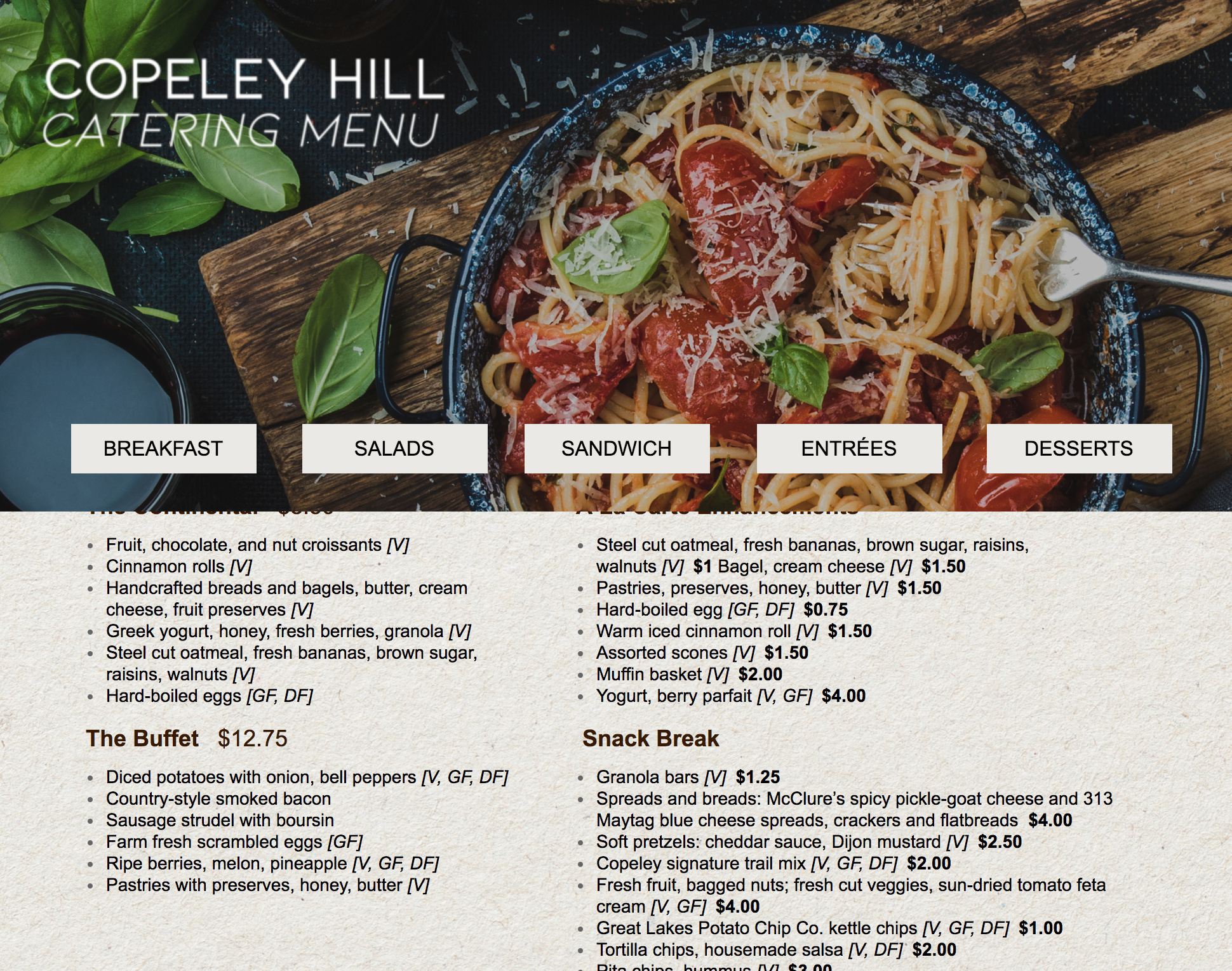
Looks like the header image is sticking to the top now. 🙂
Side note – I think the header image is taking up way too much space. It’s half the screen so makes reading the actual menu difficult (I’m on a 13" Macbook Pro). I’d consider reducing the height of the header to around 200px max.
I completely agree with @Zoe_Tattersall. This is more of a sticky hero. It takes up a lot of reality on smaller screens. I would decrease this by close to 90%.
On a quick side note, not sure if this has happened to others, but we tested sticky navs a lot and to be honest, though they look cool, they did not increase conversions. In fact in some cases we had higher conversions without the sticky nav.
Just my two cents.

