
This is an introduction to why A/B testing is so important, and a step by step image and text guide to how you can build a landing page with Unbounce, and A/B test using a r eal life example of a page we made for Hubble. You can check out the full guide with pics here but below is a quick digestible guide. Hope it helps :)
Ok, so landing pages are a brilliant, targeted way to get potential customers to perform an action. You get to create a dedicated page based solely around one single important action such as signing up to a newsletter, downloading a piece of content, taking a survey, performing a search… there’s an unlimited amount of reasons why you might want to make a landing page.
Lots of companies make the mistake of directing any clicks to their website from links or ads, directly to their home page.
Why is this a bad thing?
The homepage of most websites don’t answer a specific question, so visitors go elsewhere if they can’t see an immediate solution to their problem. If your visitors click on your a link and arrive in a place they weren’t expecting, or can’t perform the action you promised in the link, then they’ll go somewhere else - fast.
Don’t lose all your visitors because you’re sending them to the wrong place. Think about how you’re offering to help these visitors, what keywords you’re focusing on and how they’re getting to your site and create a bespoke page, just for them.
It’s not enough just to make landing pages, it’s all about testing!
Hold you’re horses, maybe you do have landing pages? Well, that’s a great start - but do you test them? It’s not quite enough to create a load of bespoke pages for your highest converting clicks on Adwords - or wherever. You have to figure out how to get your customers EVEN CLOSER Clarice , and convert them!!!
Horror film jokes aside, “Conversion” can be many things but for the purpose of this post - we’re talking about visitors to your site that perform an action. Specifically, the action you WANT them to take. You’re catching the fish right now, but they’re jumping out the net! It’s time to find out why, and stop that happening.
This is where awesome tools like Unbounce come in, because you DON’T EVEN HAVE TO KNOW HOW TO CODE to use them (FYI I am not an employee of Unbounce, they just help me do my job really well)
Below we’re going to walk you through how to create and A/B test your landing pages, so you can m aximise conversions in no time and grow your business.
We’ve made it as simple as possible for you to follow (we hope?). By the end of this post, you should know how to:
- Identify your goal
- Traditional definition of a good landing page
- Creating a new page
- Use the layout editor
- Widgets section (most used ones)
- Mobile responsive
- Saving and publishing
-
Split test (A/B test) and analyse the conversion
Shaaaalalalalalaaaa - is kind of what we want you to sound like once you’ve mastered this.
NUMBER UNO RULE = IDENTIFY YOUR GOAL
!(https://d2r1vs3d9006ap.cloudfront.net/s3_images/1313087/RackMultipart20151118-20316-1kwz2ht-Untitled_design 2 inline.jpg?1447847449 “Image https//d2r1vs3d9006apcloudfrontnet/s3_images/1313087/RackMultipart20151118-20316-1kwz2ht-Untitled_design__2__inlinejpg1447847449”)
Once you’ve identified your goal you can work out how to point visitors to it.
What is the particular product or service you’re trying to sell? What benefits does it give the reader? Who is your target audience for this landing page and where have they come from?
Once you’ve figured this out, decide the ONE action you want your page visitors to perform. This could be:
- Lead generation (You want to get your visitor to submit their details, e.i email, name, contact number)
- Download (You want the visitor to download a pdf, or any other document or application.
- Sale (You want visitors to buy something from you immediately)
-
Subscription (You want the visitor to subscribe to a newsletter or register)
Now begineth the example…
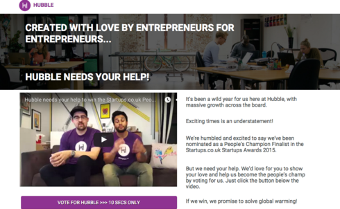
We (Rebel Hack for ref and lack of opacity - notice we’re not taking you to a landing page here) quickly made a page for one of our partners using Unbounce. You can check the real landing page out here but it looks like this…
2. A traditional example of a good landing page
A good landing page doesn’t just look good. It has a high conversion rate! Here are some tips that don’t _ always _ apply, but they’re a good place to start.
- Include only the important or key information. Don’t include any extra guff or text unless it’s absolutely needed to get your message across.
- Although it’s really important that you include good quality content, don’t include too much. You don’t want a wall of text to hit your page visitors as that will put people off and they will leave your site confused and befuddled.
- Specify exactly what your customer is going to get, be as specific as possible about the benefits you’re offering.
- Make sure the steps your visitor needs to take are easy, without asking for too much information. If you only need an e-mail then only ask for an e-mail.
- Make sure the call to action is showing on the first page and that it doesn’t require the visitor to scroll down for miles.
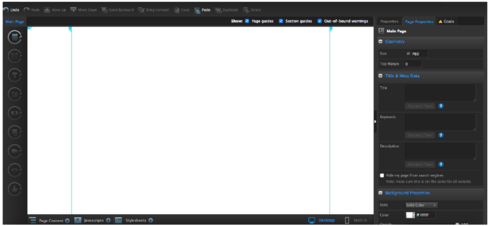
3. Create a new landing page
Once you’re logged into Unbounce, you’ll need to create a new page. Click on the green button ÒCreate New PageÓ on the top left corner.
You’ll be asked if you want to use an existing template or if you wish to start from scratch with a blank page. You have a wide range of templates to use.
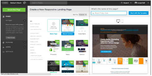
We’re going to start by choosing the blank page and then go to the top right hand side of the screen and name it Òtest landingÓ. Then click on ÒStart with this TemplateÓ.
4. Use the layout editor
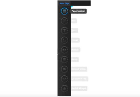
The editor is divided into 3 main sections. The left side has the widgets, the main widgets that we will be using for this specific page are:
- Page section (if you drag this onto the page it will allow you to split the page into vertical sections)
- Text (if you drag and drop this on the editor, it will allow you to add text to the page)
- Button (a customisable call to action button)
- Embed Video (allows you to add a video to your page)
5. Widgets section (most used ones)
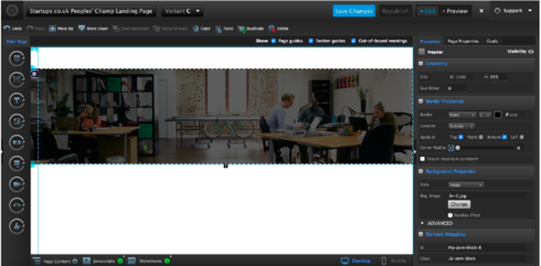
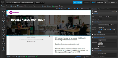
Let’s start by dragging and dropping the Page Section widget into the Editor. We’ll use the very top of the page for the company logo. The second section from the top will be used for the title of the page.
Clicking on the second section of the page will give you some useful options on the right hand side of the editor.
In the properties, select an image from the Background Properties field.

The next step is to add a logo to the page. To do this, drag the image widget onto the page and select the image you wish to use.
To create a title, select the text widget on the left ÒTÓ and drag it into the editor.
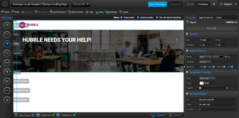
Now select an appropriate font and size. Make sure the message is simple and stands out.
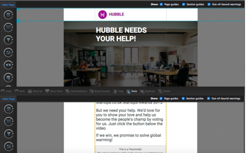
Now you need to add some content to tell people what this landing page is about. As explained earlier, we’re using this page to encourage visitors to vote for Hubble in a startups awards contest. We created a video to introduce Tushar and Tom, the co-founders. Then there’s a button that takes you to the voting page.
You can add content by dragging the text widget once more. See below (on the left).
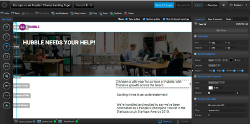
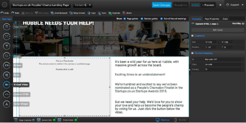
Now that the page as an image, a logo, a title and a description, we’ll need to embed the video and the call to action button.
Add the video by dragging the ÒEmbed VideoÓ widget.
Steps to copy the code to embed the video:
- Go to YouTube where the video is hosted
- Right click on the video and select copy embed code (see below)
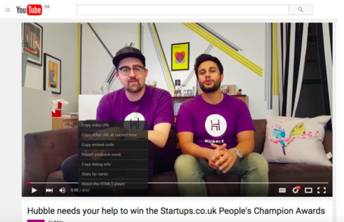
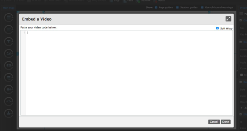
Double click on the video area on the editor and you will get a pop-up, paste the code in and click ÒDoneÓ.
The final step is the call to action button!
In our case, the call to action button will link to a web page where we want people to vote for Hubble at the bottom of the page.
To add the call to action, drag the ÒButtonÓ widget and drop it into the editor.
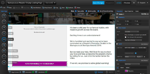
On the right hand side of the page you’ve got different options for the button. We chose the colour purple to recall the company logo. Try using a catchy message. In the click to action section we linked to the startup-awards page URL.
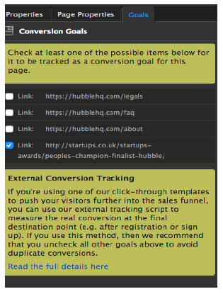
VERY IMPORTANT
Here you will be able to define the goal of your landing page, and what you’ll be measuring. We wanted a conversion to count when someone clicked on the call to action and ended up on the startup-awards voting page. Everyone that gets there through our landing page will be considered a conversion.
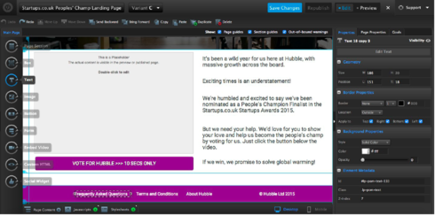
Try and keep the landing page symmetrical. We added added in a bottom section to close the landing page.
Drag the section widget to the end of the page. We used the purple again to match the logo and the button.
6. Mobile responsive
Now your page is done, but don’t forget to optimise it for mobile! To do this, just click on the mobile icon. See below in the bottom right hand corner highlighted in white.
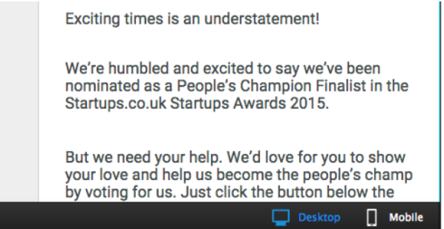
This will take you to the editor section for mobile.
Once your page is optimised for mobile, save your page by clicking ÒSave ChangesÓ at the top of the page.
7. Saving and publishing
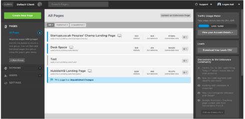
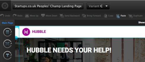
Click on the name of the page in the top left corner (in our case it’s Startups.co.uk…)
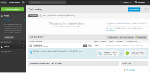
You’ll be taken to the following page, which will display all the pages for this specific campaign. In this case, you’ll see something like this…
8. Split test (A/B test) and analyse the conversion
Your page still isn’t live yet! If you want, you can create duplicates of the page to A/B test by clicking on:
 This is what you’ll see:
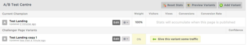
Usually a variant is created to test two or more landing pages. The 2 or more pages will have to have slight differences in the content or position or call to action (it’s recommended you only test one variant at a time so you’re sure on what is effecting the conversions). You can make several variations, each testing one variant. When you find a clear winner, test again.
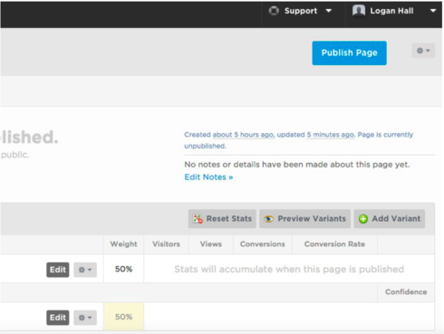
Assign traffic weight to every variant (make sure they have the same volume of traffic, for example, 50%/50% or 33%/33% etc.)
Going Live
Once that’s done, it’s time to finally go live. How? Simply click on ÒPublish PageÓ at the top right of the page.
You can always edit your campaigns once they’re running.
Let the campaigns run for some time until you get a sufficient amount of traffic on them. What you think sufficient is, depends on the volume you decide as a benchmark. Check the conversion rate of each variant page and the CTR to make a decision on which page you want to keep running.
Finally, assign your traffic to your highest converting page!
Shalalalalalalaaaa