Would love to see full responsive themes in the near future. Although a work-around is to build a mobile and desktop and redirect traffic appropriately, it creates double the workload on our dev team. Designing one responsive landing page that is responsive is the way to go to increase efficiency and ease of use. Would love to see new templates be released in the near future!
Hi Chris,
Thanks for the feedback! There is a thread over on our LinkedIn Group that’s started about this topic, you might be interested to follow along over there:
http://www.linkedin.com/groups/Anyone…
I do have a question about your “double the workload on your dev team” commentÑ how are you segmenting traffic between a mobile and a desktop landing page? Do you use the javascript snippet we highlight in this other get satisfaction post? Is your dev team responsible for building these pages in Unbounce? As much as responsive web design would eliminate the need for a redirect, you would still have to design the content twice (or more) to provide the necessary rules for laying things out.
Would love to hear more about what your current workflow is, and see any examples of what you wish to achieve.
Cheers,
Carter
Chris is right, you really need something like this. Or, even just the ability to build landing pages completely from scratch with html, css and javascript (if you had this, I’d never look at another landing page company again). Your editor is extremely limiting, especially when it comes to trying to build responsive pages that are optimized for both mobile and desktop users. Even using your html editor I haven’t found a way to really make this work. I did read the post you linked, so I’ll try the javascript and see if that works.
Hi Carter,
I was solidly on the page of building separate landing pages for both mobile and traditional until a lunch earlier today. (That’s the approach that you recommend on your ‘mobile templates’ post.) The problem with that approach is that as the number of pages multiplies, it becomes much harder to manage that fork.
One approach to responsive design uses @media queries to control how elements are displayed. For example, an iPhone 4 style sheet might start off like this:
/* iPhone 4 ----------- */
@media only screen and (-webkit-min-device-pixel-ratio: 1.5), only screen and (min-device-pixel-ratio: 1.5) {
/* Styles */
}
I know it’s not compatible with IE versions 7 and 8, and it looks like it has bubbled to the top of the roadmap based on the LinkedIn thread.
Thanks for staying on top of things.
Hey Brian – using media queries is exactly how we plan on solving the responsive issue. We’re in the R&D phase right now, playing with various prototypes and exploring our options. Our own marketing is champing at the bit for this as well, so we’ve got some pressure!
Hey all,
Carter Gilchrist, our Director of Product & UX, posted this update outlining where we’re at with Responsive including a video demonstration.
Check it out and please share your thoughts.
Hey all, just a quick update: We’ve moved into a closed Alpha stage with a handful of customers trying our Responsive feature out. I’ve written a blog post about our progress that you can read over on our Inside Unbounce blog…
Cheers,
Carter
Hey everyone!
We just moved into open beta for our Mobile Responsive feature. For further information check out the community post below:
https://getsatisfaction.com/unbounce/…
Hey Everyone!
Mobile Responsive has now officially launched! Every user now has access to the new tools enabled within the builder.
If you have any feedback let us know! We’ve love to hear it.
I’ve chosen to use one of the new responsive templates and it does not appear to be responsive at all. Is there something else that needs to be done in order for this to work properly? does it not work in the preview mode? the template name is Yuli
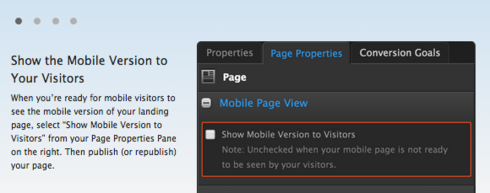
Hi Todd - the mobile view isn’t enabled by default (we do this so people won’t add elements to the desktop view and then push everything live without adjusting the new element in mobile first).
In the mobile view, in the Properties Panel, if you check the option to show mobile and save, you can preview the mobile version though:

Once you’ve enabled the mobile view and saved, open the preview then adjust the width of your browser to be skinnier. Once it’s smaller than 600px, you should see the page switch to the mobile view.
YES!!! This is awesome. You guys should be charging 2x (expect for those of us who are grandfathered in of course)!
Reply
Log in to the Unbounce Community
No account yet? Create an account
Enter your E-mail address. We'll send you an e-mail with instructions to reset your password.
