Hello, I put up my first landing page out to the masses and have below a 1% conversion rate - pretty sucky.


I was wondering if you could take a look at it and tell me what you feel the best way to enhance it is. The landing page is www.10wea.com - there’s traffic coming from sources ready to see something about a particular building, what they get is my landing page.


Thanks

Some quick ideas:


  • Move the lead gen form above the fold. Most people probably miss it.

  • Offer a catchy and unique value proposition in the header. Something like ‘Get a Comprehensive Listing of NYC Real Estate Properties’

  • If you don’t have something unique and exciting to offer, consider offering a free housing report or something for people to download that will help them in their research. You can then get them to submit their information in return for this helpful tool.

  • Reduce the size of your images. The big image at the top of the page took a while to load.

  • Explain what you do in 10 words or less and put that information above the fold somewhere.

  • In your bullet points, use more four-word sentences as sub-headers. For example, instead of saying ‘Market Analysis’ say ‘Get Unique Market Analysis’ or ‘Be Prepared with Market Analysis’


Hope this helps


  • Alex


@aholmes360


Thank you, Alex. I will get to work and I appreciate you taking the time out to view as well as critique.


Best,

Brad


Thanks, just redid. If you could critique again, Alex, that would be awesome!


Hi Brad,


  • I wouldn’t capitalize the “A” in “Receive A Comprehensive…”

  • Instead of two fields for First Name/Last Name - just use one field called Full Name.

  • Instead of You’ll in the title further down, I would say “You will” just to be professional.


Thanks,

Arun


@arunzy


Thanks Arun!


I opened your link using Chrome and your phone number is on 2 lines, going over the email address. There is also the … that are on top of “Get RLS access” - I attached a screen shot for you.


Then, the grey line below the picture is cutting the title “In addition you will” with the rest of the text, which looks weird to me.


I think you button, should be right under the form, in the picture maybe.


On the bottom there is a lot of white, you page ends very abruptly, I would add the contact info again, for instance.


Otherwise, not bad for a newb 🙂
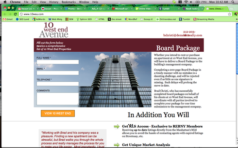


Thank you very much Celine. I’ve taken your advice and adjusted my landing page.


Once again, much appreciated.


Reply