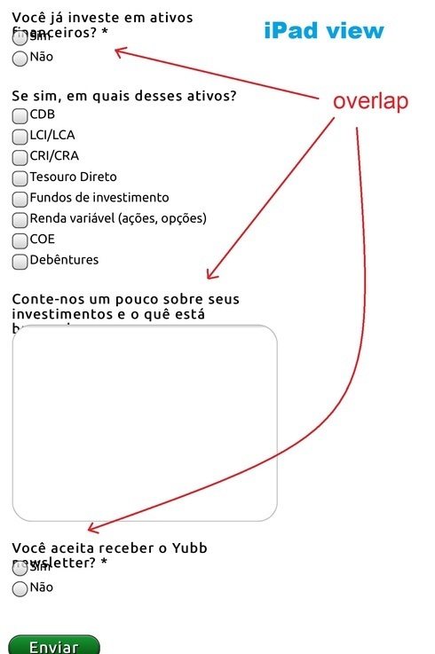
Hi Bernardo,
The mobile responsive version of your landing pages should look pretty much exactly the same across multiple devices and operating systems, including Android/iOS/Windows Phone. It sounds like there might be something else happening here that’s causing the issue, and it very well could be a bug. Since this isn’t a widespread issue I’m going to open a support ticket and have our support team follow up with you directly. Hang tight!
Hi Bernardo,
I can chime in here with a bit more information. What we’ve seen is that mobile browsers, and particularly the older ones, all handle fonts and line wrapping slightly differently. The iPhone 5 is particularly problematic.
We have assigned our developers to look into it and expect to make some significant improvements by mid next week.
Hold tight. We’re on it. 🙂
The support ticket that Justin has opened will allow us to make sure you’re kept in the loop.


