Hi Steffen,
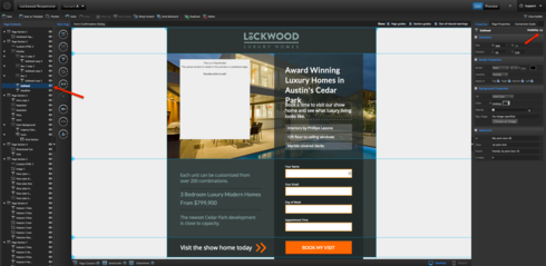
Anything on your page will exist on both mobile and desktop. Similarly, anything that’s deleted is deleted in both views. However, you can hide elements in one view or the other, using the visibility toggle in either the properties panel for that page element or via the page elements bar on along the left:

iframes are consistent across both views as well, so if you need different content for those between desktop and mobile, the hide function would work for that as well.
Since a responsive web page is technically one page with several different configurations, the css is also shared. You can use media queries to write different css sheets that only affect certain views though. Here’s the W3 Schools tutorial on media queries.
Elements on mobile and desktop will move independently, unless you move things between page sections, in which case, they’ll be reparented on both views into the new page section. To prevent this, just hold command/ctrl while you move items between page sections.
We have some more details on using Mobile Responsive, including a video that overviews making existing pages mobile ready here as well.
Mobile Responsive is a really powerful new tool, but there’s definitely a learning curve when it comes to making existing pages mobile ready (newer pages from templates should be a lot easier), so if you do run into anything else, please don’t hesitate to get in touch with us via support@unbounce.com

