Hi @Jasont88,
First, congrats on starting your first landing page.
Straight to your question… The short answer is that you need to utilize the Page Sections feature when you are building your landing page.
Now the longer explanation: When building a landing page, each element is placed in to the most appropriate section. As long as your elements do not move between sections, they’ll keep their relative placement in both Desktop & Mobile view.
Only when you try to move an element from one section to another would you also move into the other view (Desktop or Mobile respectively).
It also helps to keep in mind that if you place an element, for example a text element, inside a box element in your Desktop view, the mobile view also needs these two elements to go together.
Otherwise, if you try to take out the text element out from the box element only for your Mobile view, you’ll end up moving it in the Desktop view as well.
Last but not least, if you really need to move elements between sections, you can do so by holding down the Command/Contorl key on your keyboard.
This is the official documentation regarding the mobile editing.
Hope this points you in the right direction.
Best,
Hristian
THIS IS HORRIBLE.
Why I am I paying for a service that doesnt even let you EASY and INDEPENDENTLY change your mobile and desktop layout?
Has anyone tried LEAD PAGES???
What did you end up doing? I’m finding the discrepancies between mobile & desktop versions of my landing page to be infuriating. It is WAY too time-consuming to get them to work. It would be faster and easier to just design two different landing pages and send mobile-only ads to the mobile pages, etc. 😦
What about font sizes? I wouldn’t ever use the same font sizes for mobile as I would for desktop. How do I make those different for desktop and mobile on the same landing page?
Hi @kpgmedia,
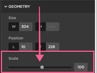
In the Unbounce builder, when you are working on your mobile view and select a text element, you have the option to scale down the font.

Best,
Hristian

