Hi Unbouncers!
A couple of weeks ago we unveiled MOAR landing page TEMPLATES (20 more to be exact). But in the midst of Project Add-All-The-Templates, we got to thinking:
ÒWhat should everyone consider when choosing a template?Ó
Well, besides finding a design that best helps you achieve your campaign goal (whether that’s lead generation, click-through to a shopping cart, or something else), it’s especially important that you consider how well your campaigns will perform on mobile devices.
Or y’know…
Check yourself before you wreck yourself
Because almost half of your potential customers open emails (and consequently landing pages) on their phones, you have to make sure you create a seamless mobile experience.
If your landing page is viewed on a phone and looks like it was designed for a giant 27Ó iMac (all skewed and warped because it’s not shrinking to fit a smaller screen size), your chance to convert is over. Done. Finito. Hashtag epic fail.
You can’t design for desktop alone anymore, so we updated Unbounce’s Template Library to make it easier for you to put more of a focus on mobile.
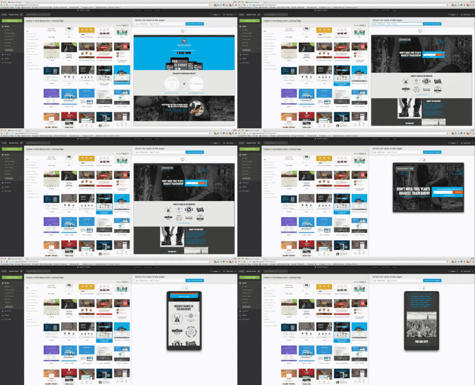
The new split-screen Template Library makes it easy to browse through all the high-converting templates, and Ð most importantly Ð you can toggle to see how each one looks on mobile before you commit to the design.

This means that your customer’s mobile experience will be front-and-center in your mind, right from the start of your campaign.
And this customer-centric thinking ensures you’re ahead of the game.
Four for you Glen Coco.
In other news, we’ve officially figured out how to read minds.
Okay, okay, not really, but we’ve got you the next best thing…
A Free Review of Your Landing Page
If your last marketing campaign felt a bit like guess work (i.e. ÒThis headline looks okay…I guess?Ó), we’re betting you’d love a good ol’ sanity check.
That is Ð does your most recent landing page make sense? Does it convey your intent clearly? Do people know what your brand is offering?
Well, with the help of UserTesting, you can find out. With their service, Peek, you can submit your landing page URL, and get a free landing page review in return. The review is a short video of a real person’s experience as they navigate through your page and speak their mind.
Let’s just say it can be pretty telling if you’ve created a landing page about your new product release, but your reviewer never mentions the word, ÒnewÓ, or worse Ð thinks your brand sells something completely unrelated.
Clarity can be a conversion killer, so find out what folks think of your newly built landing page here.
So from Mobile to mind reading Ð er Ð landing page reviews, that’s our update for now.
Let us know what you think of the new Template Library design below, and if you get a review of your landing page, share what you learned with a comment!
Happy marketing!
