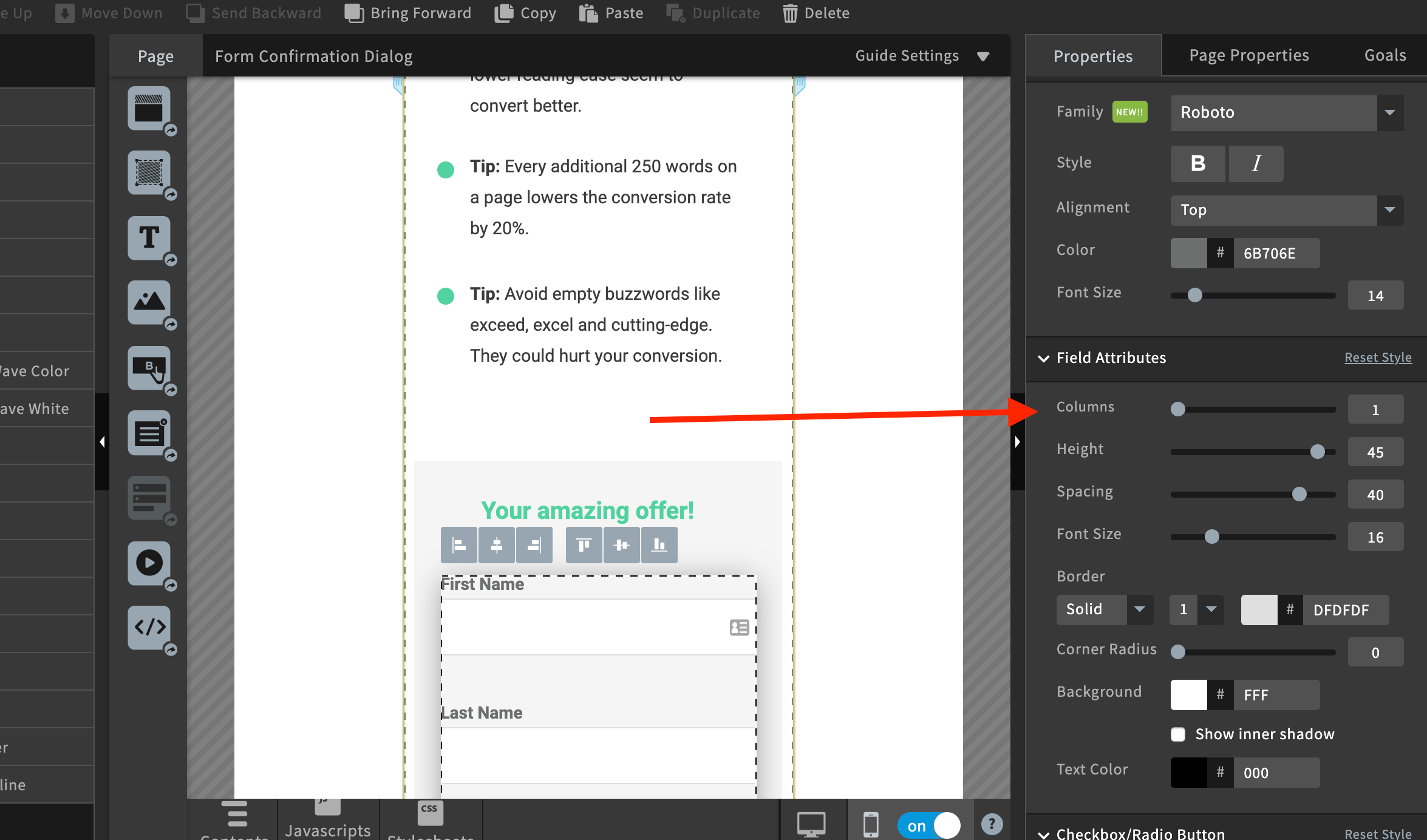
are you sure you are using a 100% width and 1 column for your form?
Hey @bouncecrunch welcome to the Unbounce Community 
You can also drag the form field container to whatever width you desire. Just like @Malik shows in that screenshot, there are settings you can use to customize the style of your form.
That’s the thing, I am on about the pop up forms in lightbox. On mobile the lightbox width is capped at 320px and I want to make it wider than this. Otherwise the form has to be contained within that.
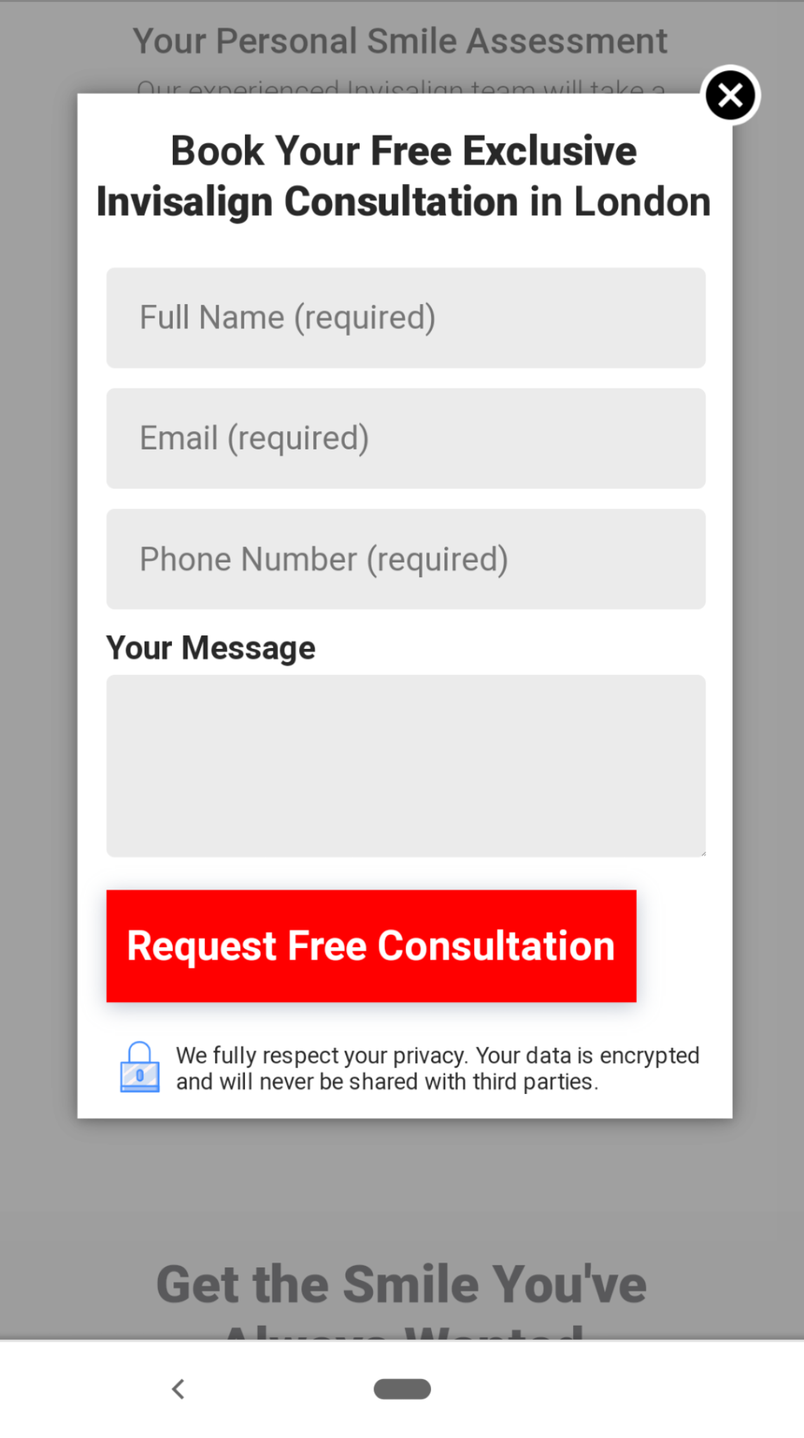
My form is customised and as wide as it can go whilst still leaving some space so it doesn’t look silly. But there are still gaps either side in the lightbox on mobile where it could be stretched further to make it easier for people to fill the form.
See here can we fill up more space with the lightbox at all?
Oh your form is in the Lightbox, sorry I missed that.
I think you make a good point, it would be great to adjust the mobile width in the builder. Devices are wider these days so adding 50 more pixels for mobile would be great 📱
To be honest tho, I would be surprised to see a decline in conversions because the form fields in a lightbox window weren’t full screen width.


