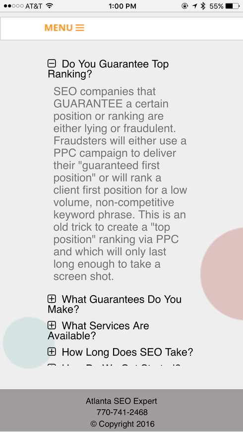
Please review my newest landing page - please check on phone to if possible. Yes I used Mobile Menu “hamburger” on both desktop and mobile
Looks good, AJ. That’s an awesome domain name by the way. Here are just a few thoughts from my review:
- Consider adding a logo near the header. The page looks a little generic without it. This would add a lot of credibility.
- The sub-menu items don’t work for me on desktop or mobile, except for the “Contact” item. But even that jumps to the wrong place below the actual contact info on the page.
- The accordion menu content gets cut off on the bottom of my screen when viewing on mobile (Chrome on iOS).
- Consider removing the click-to-call link for your phone number on the desktop version, as it really only is useful on mobile.
Hope some of this feedback is what you were looking for. Great page overall. Best of luck with everything.
Thanks for taking the time to look at this
- perhaps we fixed the menu issue
Question:- where does accordion get cut off? what is the last word you can see?
Thanks again!! AJ
thanks so much!
I like it - especially the domain. Legit!
A few comments (I have a tendency to be harsh, but know I mean it all in love):
- The headline: I feel like I can answer “no” to that and exit. Being seen is not what business owners looking for SEO care about. Really it’s not what anyone cares about. You and I both know they need to be seen, and some may even think that’s what they want - but what do they REALLY need. How can we play on the fact that they want results (leads/sales).
- You don’t have a title/meta description. This isn’t necessarily a must have, but I think as an SEO expert, you should put best practices in place on your website.
- Why is connecting on LinkedIn a call to action (and the first one)? You don’t want them to just connect do you?
- Stars on testimonials: Maybe others will disagree, but this just feels a bit cheesy to me.
- Under the question “How do we get started” - don’t just tell them what to do - make it easy. Make your phone number a clickable link or something so they don’t have to find the CTA.
I hope you kick ass!!!
Awesome comments
I think I liked the image and was trying to play off of that - the actual sale here is more leads/business not necessarily SEO placement, but I do find many clients saying their site “can’t be found”.
the missing title and META are strange - (we don’t ever use keywords so that should stay empty) I saved them in another version but when I copied it they didn’t make it. Thanks for catching that - I have not crawled the page yet with our Google tester but glad you saw that.
SEO’s are bombarded by link builders and other SEO tool sales so I tend to use phone or LinkedIn since those tend to filter out many of the Asian based spammers
I think I will kill the stars since these are LinkedIn based referrals and they dont really have “stars”. Many of my service clients though are on Yelp etc and so they are sensitive to this …
Totally agree about placing the CTA’s within the “answer”.
Let me know if I can return the favor!
AJ
Reply
Log in to the Unbounce Community
No account yet? Create an account
Enter your E-mail address. We'll send you an e-mail with instructions to reset your password.

