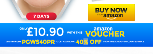
I would AB test the call to action in a box like this:
Sorry about the prices, I didnt have time to check the numbers…
a)

B)

Hi Todor,
A few things that stood out:
- Really hard to concentrate your attention when you initially land on the page. Too many competing colors, fonts and weights fighting against one another.
I would also A/B test the main hero image or in your case the main lady image 🙂
Gray font testimonials on gray-ish background with a font-size of 12px, makes it really hard to read anything or pick up on important keywords.
- You assume everyone landing on the page would know what a whitening strip is and what it does. A bit more copywriting to persuade those on the fence.
- What makes it unique compared to the strips you can get at your local pharmacy?
- What problem does your strip(s) solve?
As with anything remotely medical related, it’s always good to have a testimonial/endorsement from a doctor or in your case a dentist.
- Any particular reason you are sending them to Amazon.
Do they handle fulfillment for you?
It might be worth it to look into rolling your own eCommerce cart.
The new Shopify SDK makes it really easy to add one to any page/site.
The code part might be confusing since, when you click through to Amazon, the price you see is different and YES you have a coupon but that’s only applied when you get to the checkout.
Last but not least… Have you A/B tested an intermediate step to collect email addresses before forwarding your potential customers to Amazon?
Best,
Hristian


