Hi Jim,
Here’s some feedback. It’s all meant to be constructive.
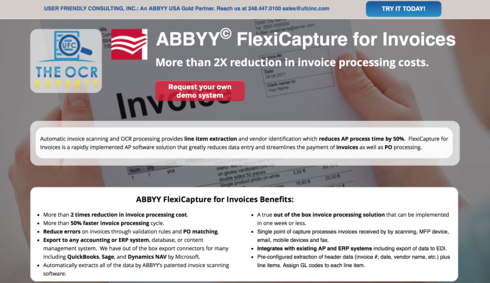
- First impression is that the page is too busy. Too much text. Try cutting the text down to focus on your core message.
- Your main headline was a little confusing. I first looked at “ABBYY FlexiCapture for Invoices…” since it stands out more in the yellow outline, but the text above it seems to be fighting with it for my attention. Choose one main headline that should stand out above all else.
- I like that the CTA buttons lead to a form below. I use this technique on a lot of my pages, because that way, the visitor doesn’t get blasted with form fields as the first thing they see.
- Consider adding a secondary call to action headline just above the form field, so that when the user clicks and goes to the form, they’re reminded of exactly why they should fill it out. Right now, when I click, I just see the top of the first form field.
- Consider reducing the number of testimonials, but moving them above the form, so that when someone is scrolling, they can see them before they decide to fill out the form or not.
- Lastly, there are a lot of links on the page as it is. The testimonials, the blue buttons near the bottom, etc. I would consider removing as many of these as you can stand. Read up on Unbounce’s “attention ratio” article/video that explains why: http://unbounce.com/conversion-glossary/definition/attention-ratio/
I hope this was helpful. I think you have a good page in the works here. Didn’t mean to be super critical. There is a lot of good conversion design going on here as well.
The
Thanks so much, this is very helpful to this newby. I am going to digest this and work on alternative designs.
Fantastic feedback, Nicholas! Especially point number 6 regarding the attention ratio. I’m pretty OCD when it comes to links now, always striving for that 1:1.
Thanks so much. Can you take a look at our revisions?
https://abbyy-flexicapture.com/for-invoices
Thanks so much,
Jim
Hi Jim,
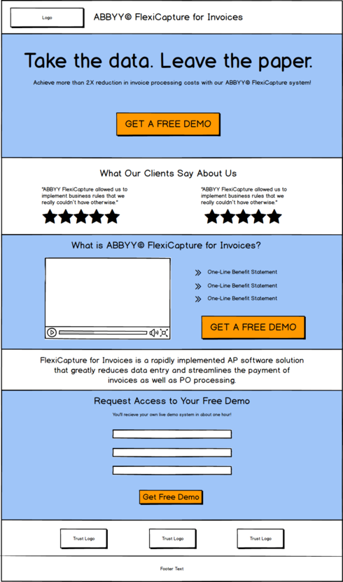
I see some improvements here. But to be honest, personally I still think there is too much going on. I would recommend split testing this page with one that is much simpler (using about a third of the content).
Here’s a real quick 2-minute wireframe I made to show how you could cut down the content and still keep the message on point (the blue areas would be nice hero images, or darkened backgrounds to give the page some visual flair):
Hey Jim,
Nicholas’s response hit it out of the park. I attached a screen shot of what I see above the fold. When you look at it with unassuming eyes how do you feel? My immediate reaction was overwhelm. The two button for different actions and a large intimidating two column bullet point list.
1:1 will help and just simplifying it down to the core.
Here’s a resource to help you compare, visualuze and find inspirstion: http://unbounce.com/landing-page-examples/built-using-unbounce/beautiful-landing-page-design-example…

Let me know if you want a bit more detailed help. Happy to chat
Thanks so much, your feedback is very helpful!
Thanks so much. I am working on this using everyone’s ideas, and this is extremely helpful Nicholas. Wish I had discovered these things two years ago, wasted a lot of advertising expense on bounces to our web site. Thanks again.
I implemented something very close using your wireframe. Can you take a look Nicholas? https://abbyy-flexicapture.com/for-invoices/
Since these buyers require some extensive research before they buy we did allow a few outside links. Our thinking is that if these pages don’t produce we will move to funnel system. But let’s see what happens.
Jim
This looks fantastic, Jim! It’s like an entirely different experience. I like it. Let us know how the conversions go, if you split test this with the other page(s).
Sure will, I really appreciate your help!


