I know this is probably a very basic question, but how can i make same text use different font size on desktop vs. mobile size.

How to change font size for mobile vs desktop
 +1
+1
@am93 you can make a copy of the element… So now you will have 2 identical elements on the page. Hide one in desktop and the other one in Mobile. And change however you like - position, font-size, color, font-style whatever! 😉
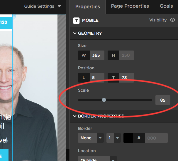
How does the scale feature work when you’re trying to change the positioning of the font?
For example, on desktop the entire header fits on one line, however on mobile you need two lines and to increase line spacing. I don’t want to change the desktop positioning to show two lines just because I’m changing it on mobile. I was hoping holding command and changing the line spacing would work, but it doesn’t.
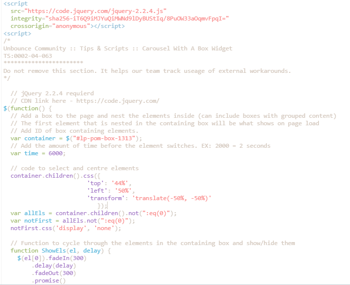
I’m using the unbounce script. See below:
Userlevel 7
 +4
+4
Hi there!
Looks like a strange bug to me - do you have a script or any CSS targeting that element?
Hi Stefano,
Here’s a video link. Thanks!
Userlevel 7
+4
Hi there!
Could you share some screenshots + URL?
Hi there,
I tried what you said with the scale and it’s not working. The mobile text is still the same size as the desktop text 😦
Userlevel 7
+4
Hi there!
Great question - when you’re editing the mobile version of your page, select the text box, then use the ‘scale’ feature to decrease your font size.
Let me know if this helps 🙂
Reply
Log in to the Unbounce Community
No account yet? Create an account
Enter your username or e-mail address. We'll send you an e-mail with instructions to reset your password.