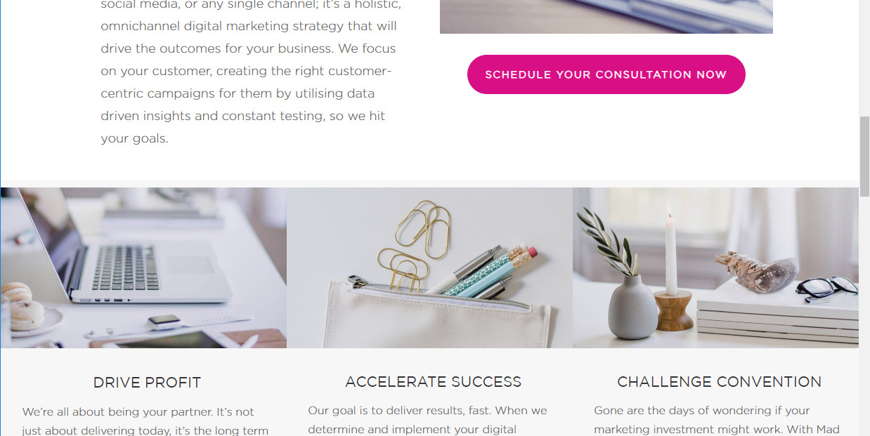
Hi there are some significant limitations when it comes to full-width functionality and I’d like some responses for workarounds or could these please be added for the features list.
FULL-WIDTH SECTION & ELEMENTS
I’d like to create images with text beneath that goes the full width of the page, i.e. three columns. But then have the rest of the page with the normal page width.
If you look at that image, it has text and images that are responsive to the full width of the device. and the section above has a narrower margin.
COLUMNS:
I’d like to have a column option, i.e. two columns format (i know Unbounce doesn’t have a column tool but it is based on 12 columns and 940 px) say 470 px each with a different background in each. And no, if I create an image 940px width with the two backgrounds it is NOT mobile responsive, it only shows the middle of that image and doesn’t resize correctly.
Ideally, it would be two columns each with the ability to have a separate image, video etc.

