Why isn't my landing page converting?

  • 13 April 2016
  • 7 replies
  • 2 views

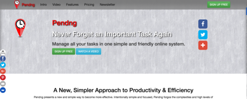
I’ve got various campaigns directing traffic to my site, but I don’t seem to be able to get conversions. I’d love some expert advice about what is wrong with the landing site. Is it clear what the product offers? Is the call to action obvious enough?

Any advice from the experts would be very gratefully received.

http://www.pendng.com/


7 replies

Hello! 

The question is a loaded one… there could be hundreds of reasons. First what campaigns (platforms) re you using to send traffic to your site? AdWords, Facebook?

I would use a platform like usabilityhub.com to test different versions of the top of your page. When I do the “squint test” (push my chair back 5-6’ from the screen and look at the page) I see a big clock and some social icons. I don’t see your headline or your subhead at all.  So at a glance… I have no clue what I am looking at.

I love the sticky header and the “menu” at the top, navigation is super easy.

The parallax effect is a bit much for me. But I have a personal bias against parallax.

I would A/B test switching the order of the blocks and get that video up higher on the page. Yes, I want to see Pending in action well before you tell me all about it. A picture is worth way more than 1k words.

The headlines are as big as the subheads so it is slightly confusing when you reach a section i.e. features.

It is a great start, the content is good, but the design may be getting in the way of conversion. 

Good luck! Show us v2 v3 etc.

Joe

Hi Joe,

Thanks for that, very very much appreciated. I am currently mainly using AdWords to push traffic towards the site, have used Facebook took, but that’s on hold.

I did originally have the video up top, but now I have a proper A/B testing framework in place, I will try reordering the blocks to see what impact that has, great idea, thanks. I actually have an experiment running at the moment, so I’d be interested to know which variant you got, it sounds like the older one, the newer test has a different headline setup…

I’ll make some tweaks to the font size as well, it’s a good call that I hadn’t noticed.

Off to make some new experiments.

Thanks

I saw a different version, not the one you have above.

Are you using the search or display network? I’m trying to see if message match is an issue… that’s all.

I’d remove your name, Pending from the top and just have Never Forget an Important Task Again big, bold in your face! And then test variations of that headline with your ad copy.

Maybe work the lower headline simpler approach to productivity up higher, that seems like a softer message might appeal to different users.

Are you focusing on enterprise? or more of the individual? (trying to flush out buyer persona info).

You are well on your way! Good luck.

Joe

I was using both, but the campaign was paused, it is restarted now.

I have implemented some of the changes you’ve recommended. I agree, the extra Pendng was extraneous. I’ve increased the size of the main heading and swapped the secondary heading in from the intro section.

I’ve also setup a new A/B experiment with the top two sections swapped, intro and video to see if that has any impact.

I’m definitely focusing on individual users, not enterprise at this point.

Thanks so much for all your valuable feedback, much appreciated.

Paul

Hi there,
Sorry for hopping in a bit late on this, but I can tell you that I just glanced over the landing page quickly and could not determine exactly what the offering was.  

I knew it had something to do with task productivity, but then I saw a video thumbnail of what looked like a mind map and was slightly confused.
Joe Savitch’s advice was sound and I would echo it.
You might benefit from some social proof. 
Wishing you all the best!
Regards,Joe

Hi Joe,

Thanks for taking the time to look and offering your advice, much appreciated.

I understand your point, it could certainly be a lot clearer exactly what problem Pendng solves. The video thumbnail probably isn’t the best to encourage further investigation, when you see the video and interact with the software it becomes (I hope) a lot clearer, but I’ll see if I can change to a more inviting static image to encourage more people to dive in and find out more.

Social commentary is a good idea too, I will reach out to the beta testing group to see if I can get some useful quotes.

Thanks.

Paul

Let me know if I can be of any further help.  You are on the right path, in the right place.
Happy to provide feedback or bounce ideas.
Best,
Joe

Reply