Section Background Stretched Image: How to make it fit properly?

  • 19 December 2019
  • 5 replies
  • 189 views

Badge

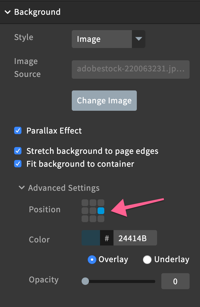
When you select an image to use for a section background and have it stretch to page edges. It never fits the whole photo correctly. When you are in edit mode and then switch to preview (or published) it looks totally different. It usually looks much larger, zoomed in and not showing areas of the photo that need to be seen.
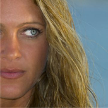
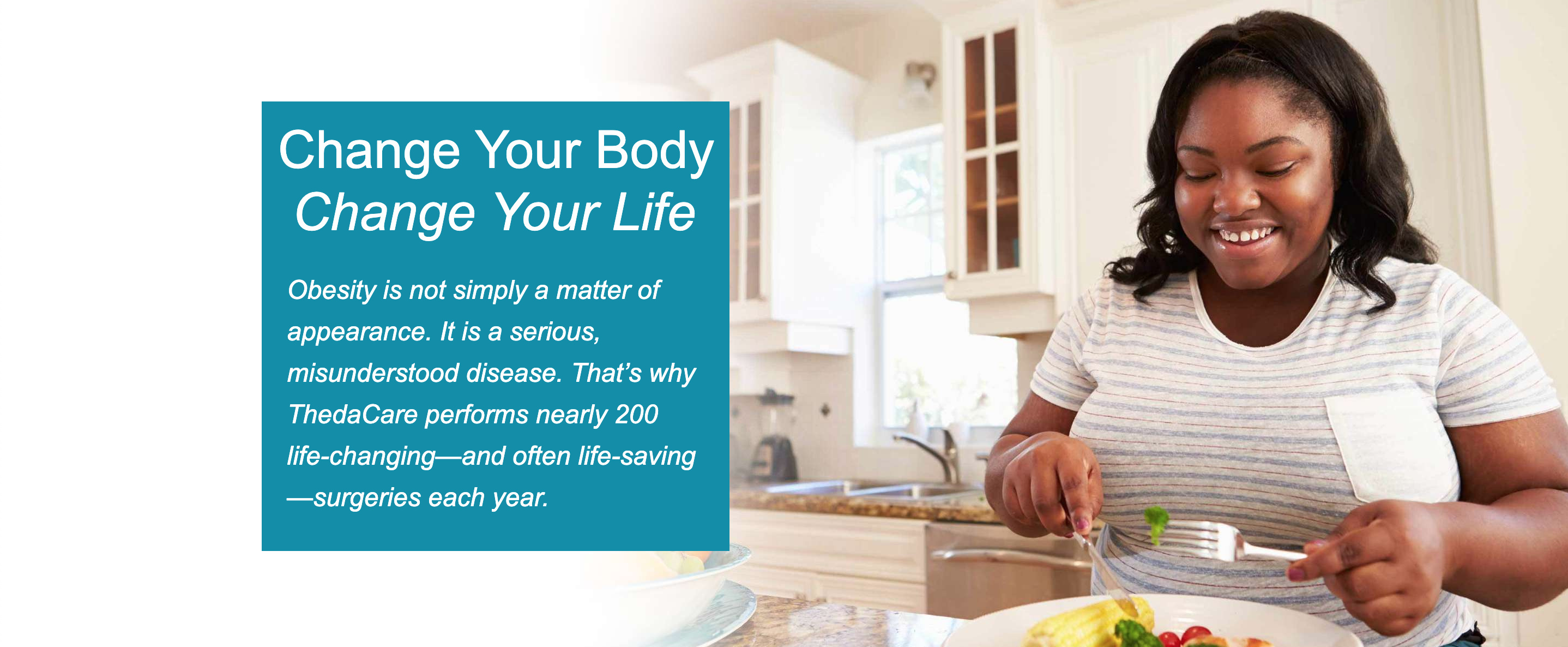
Here is a screenshot of how it looks in the editor: (I had to zoom out in the browser in order to capture the full picture for the screenshot) https://www.screencast.com/t/a4QE0lKe Even here you can barely see that the girl is eating a healthy meal.
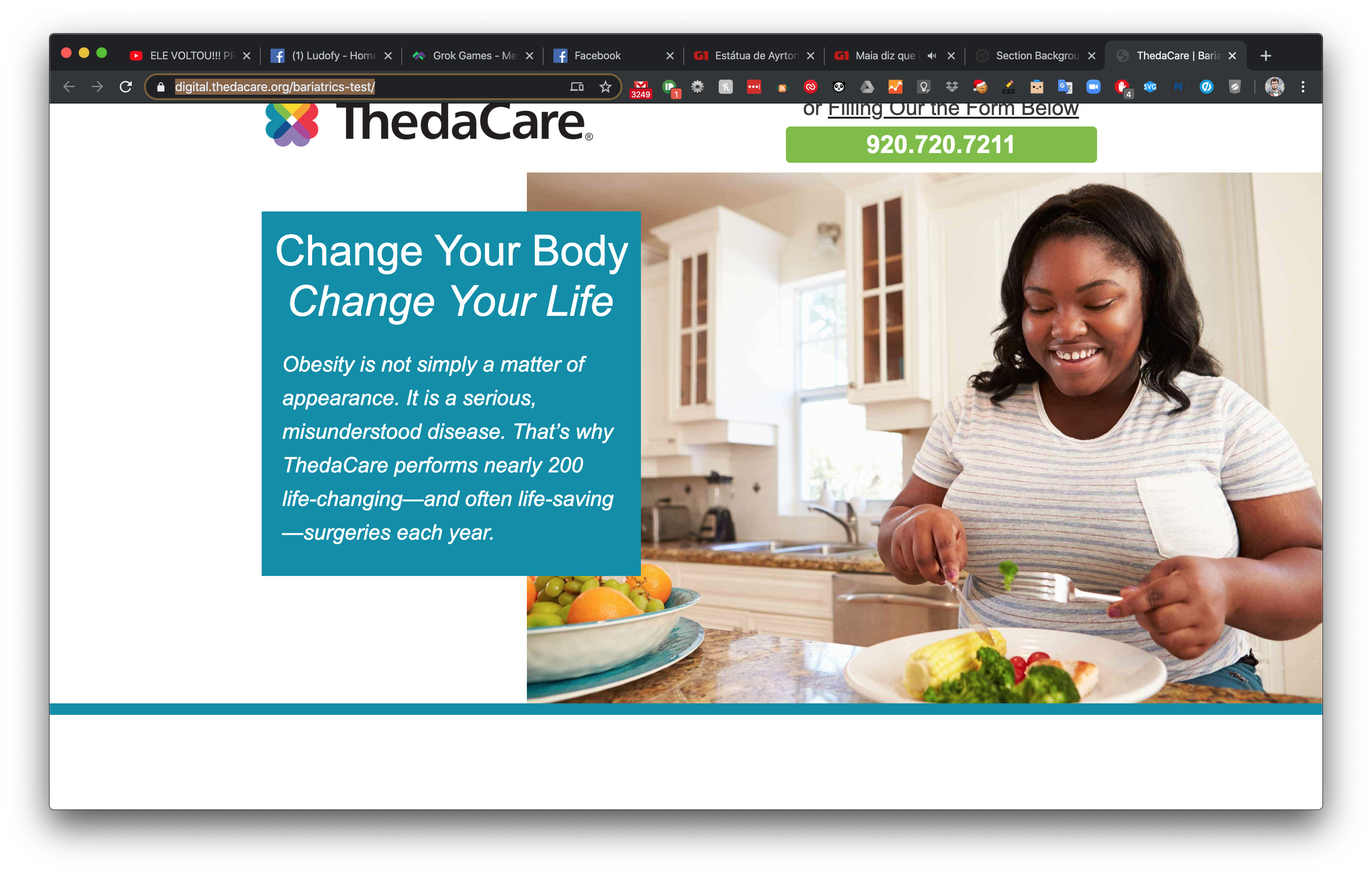
Then when you view the published page, you only see her face, you can’t even see that she is sitting in her kitchen eating her broccoli - which is the whole purpose of the image! https://www.screencast.com/t/mfnnPoklR

Here is my testing page: https://digital.thedacare.org/bariatrics-test/

Is there any solution to this? Does the image need to be a certain size or resolution? Does anyone have any CSS tips they could share? Trying to find photos to use in this way is a constant battle. Thanks for any help!


5 replies

Userlevel 7
Badge +4

Hi Tiffany,

This is the age-old issue of responsive design. It’s actually not an Unbounce issue, but just an issue with how responsive images work in browsers since it dynamically adjusts based on the page width.

What we usually do is just try to use images that are “zoomed out” enough where the focal point has enough space around it to accommodate for the different sizing effects. I know that’s not always possible though since you’re usually limited to using whatever images you have and not getting them custom shot at more of a distance.

The other thing I’d recommend doing is trying to optimize for just 1 specific screen size on desktop, rather than trying to get it to look great on all different sizes.

And lastly, you probably already did this, but play around with the positioning settings in the builder:

Good luck!

Badge

I would love to use images that are more zoomed out and I do search for them, but they are hard to find in the stock image sites. (at least at BigStock). I have played around with all the little settings in there, and sometimes it does help. I guess I was hoping for perhaps a CSS trick that might help!?!?!?

Userlevel 3
Badge +1

Hello Tiffer,

Try this:

  1. Set the hero section height to something smaller (like 600px)

  2. Add the following CSS replacing lp-pom-block-8 to your section id

     <style>
     /* change #lp-pom-block-8 to your hero section id */
       #lp-pom-block-8 {
         background-position: right top;
         background-size: contain;
       }
     </style> 
    
  3. Republish and it now will look like this no matter what the screen resolution:

PROTIP: Fade image edge to transparency for a nice transition into image

Userlevel 5

OoooOOOOooo I love the pro tip

Badge

What a great tip!! How did you do the fade?!?

Reply