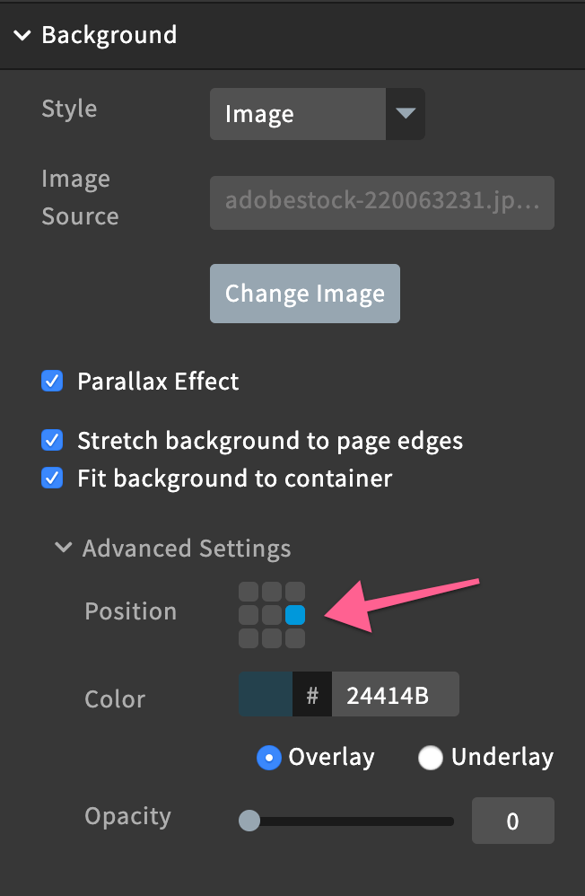
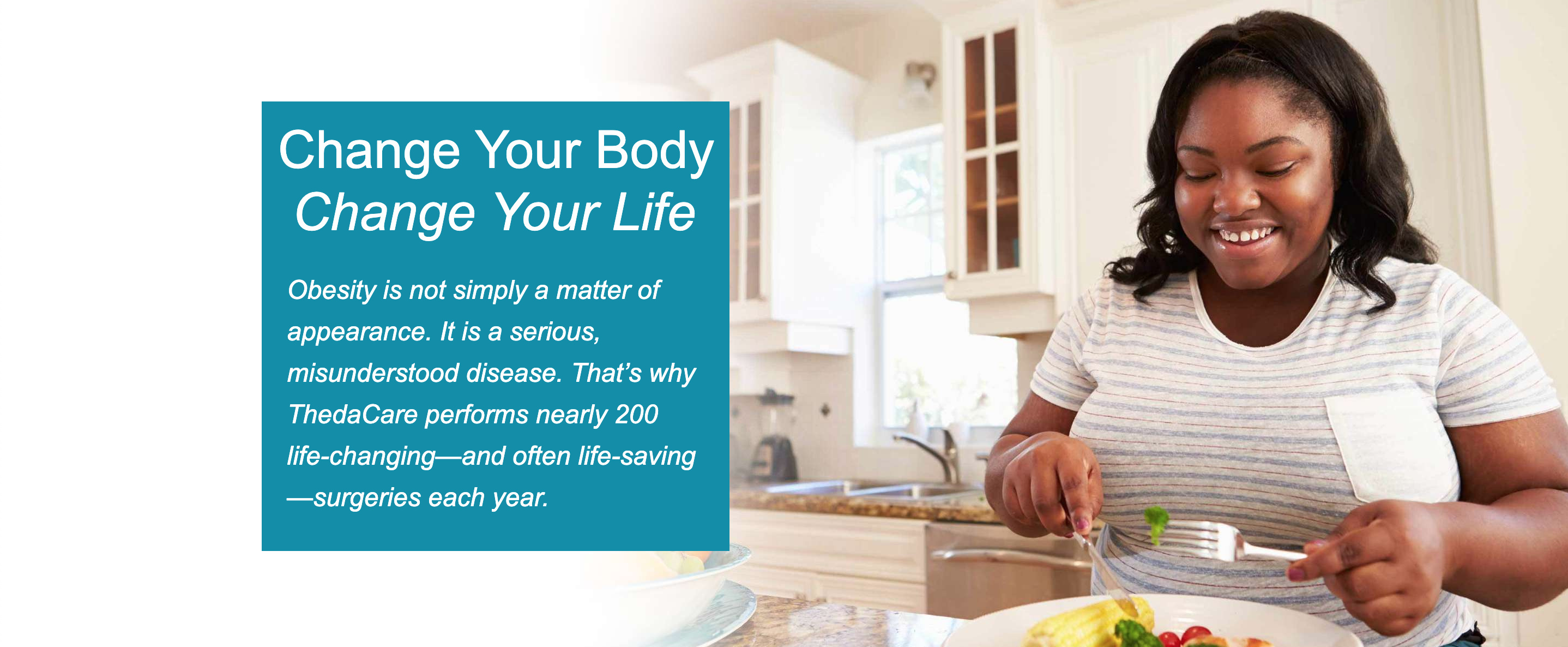
When you select an image to use for a section background and have it stretch to page edges. It never fits the whole photo correctly. When you are in edit mode and then switch to preview (or published) it looks totally different. It usually looks much larger, zoomed in and not showing areas of the photo that need to be seen.
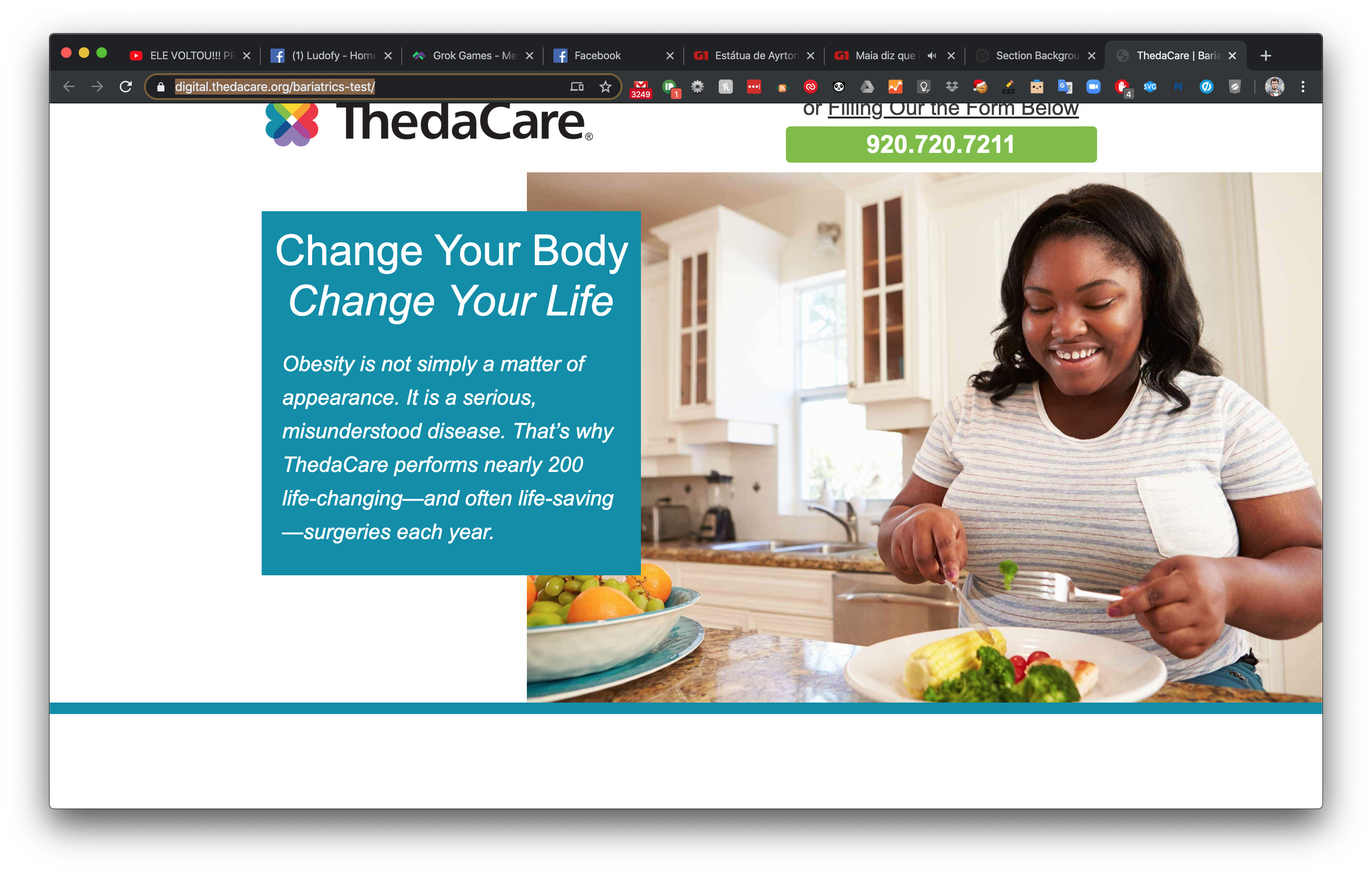
Here is a screenshot of how it looks in the editor: (I had to zoom out in the browser in order to capture the full picture for the screenshot) https://www.screencast.com/t/a4QE0lKe Even here you can barely see that the girl is eating a healthy meal.
Then when you view the published page, you only see her face, you can’t even see that she is sitting in her kitchen eating her broccoli - which is the whole purpose of the image! https://www.screencast.com/t/mfnnPoklR
Here is my testing page: https://digital.thedacare.org/bariatrics-test/
Is there any solution to this? Does the image need to be a certain size or resolution? Does anyone have any CSS tips they could share? Trying to find photos to use in this way is a constant battle. Thanks for any help!


