They look like desktop radio buttons, not the usual wheel-style select you would expect. They should at least be horizontal (and bigger). It is practically impossible for a user to click on one item and not the other here:
https://skitch.com/obvio171/8q2j9/unb…
Radio buttons on mobile look awful
Hi Helder,
Thank you for your inquiry.
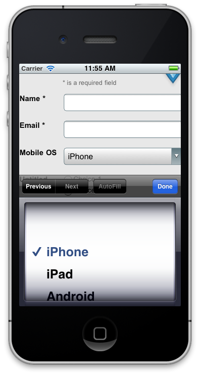
The radio buttons are displayed like that on iPhone by default. If you want to see a spin-wheel selector on the iOS devices you need to use the other form element Ð drop-down menu.
Our editor has several pre-defined drop-down menus like Country, State, Age, etc. and you can create a custom one for the Mobile OS options.
It will be displayed like this:

Let us know if you have any questions.
Reply
Log in to the Unbounce Community
No account yet? Create an account
Enter your username or e-mail address. We'll send you an e-mail with instructions to reset your password.
