Is there a way to have the screen adjust automatically based on the user’s screen resolution? Thanks in advance.

Page Width
Hi there, welcome to the community!
What you’re looking to is often referred to as ‘responsive pages’. This is something we’ve been working on internally for quite some time now, and we’re just about ready to roll it out into public beta. There are a few kinks we need to work out before we do that, but if you want to sign up now you can do so here: http://get.unbounce.com/responsive-be…
How this essentially works is by creating two different versions of the same page - one for desktop, and one for mobile. Once the browser size reaches a certain ‘break-point’, it will automatically switch to another design with the same assets that you’ve created in Unbounce. For instance, if a mobile browser loads up a responsive page, it will automatically be served the mobile view because of the size on the browser window.
You can read more about where we’re at with responsive templates here: http://inside.unbounce.com/product-de…
*Edited for clarity.
Justin, can I create a landing page in Unbounce that would scale based on the device’s monitor resolution? I have clients complaining that they see too much of blank space on the side on larger monitors. Thanks.
Hello Nooshin,
That’s something that I have heard too. So just to define the objective, you are looking to make your landing page width responsive to the viewport. Something tells me that Justin has a good solution coming 🙂
Best of luck,
Joe
Hey Nooshin!
I think what you’re looking for is true mobile responsive functionality. This isn’t something we offer at this point in time, but I wouldn’t let that become major issue in your overall landing page design. In fact, the vast majority of the web is designed around the sub 1000px design standard, which displays with the same white space on ultra high-definition monitors.
If you’re really concerned that this is going to be an issue for a large number of your clients, I would pull up a report in Google Analytics to filter by screen sizes to determine who your largest audience is. You can follow this step-by-step guide to get started: http://salman-w.blogspot.ca/2013/10/google-analytics-screen-resolutions-report.html
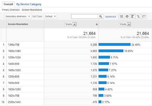
If I were to make an educated guess, I would say that less than 5% of your traffic is coming from folks who have ultra high-resolution monitors. Don’t worry though, these users aren’t going to get a ‘bad’ experience - in fact, most of the most commonly visited websites in the world follow the same sub-1000px design standards.
Hope this clears things up a bit, Nooshin!
I hope this is a priority. Fixed height and width is very counterintuitive in today’s web.
Reply
Log in to the Unbounce Community
No account yet? Create an account
Enter your username or e-mail address. We'll send you an e-mail with instructions to reset your password.