Mobile site left with blanks on the sides

  • 12 July 2017
  • 3 replies
  • 19 views

Hello!

I used to make pages based on desktop and then to mobile,I would use the layout assistant, make some tweaks and all is fine.

Recently I’m having to design pages based on mobile first. I would use pictures with a width of “320”, insert an “image” box and click on “scale image to fit page”. When previewing the “mobile”, it seems alright, but actually using a phone to check the link, there’s always blanks on the sides (checked with various mobiles), is there any way I can fix it for it to be “full screen”?

site: http://unbouncepages.com/peri-phase-2/

thanks!


3 replies

Userlevel 6
Badge +1

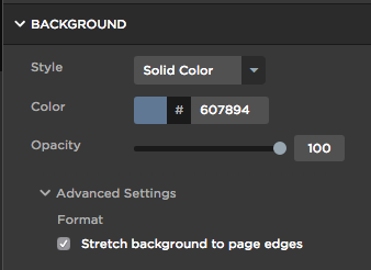
Hey @sciniderthere are some default margins that Unbounce adds that cannot be removed based on the way their adaptive LPs work. However, for all you background & background images, if you set them to “Stretch background to page edges” under “background” under the properties panel this should fix it. See image below for reference.

Let me know if you need any other help here.

Hey @digibomb thanks for the reply. The background was fine in the sense that there are no blanks, but the problem right now is that the images shown on the phone is cropped and displays only the image in between the default boundaries.

Is there any solution for this? thanks alot for you help once again!

Userlevel 6
Badge +1

Hey @scinider are the images background images? Or just images placed in that section? I need to understand a bit more before I can troubleshoot.

In terms of removing those margins, as far as I know that cannot be done in Unbounce, yet.

Reply