Exciting news hot off the press from Unbounce! We’ve updated our text editor from good to GREAT!


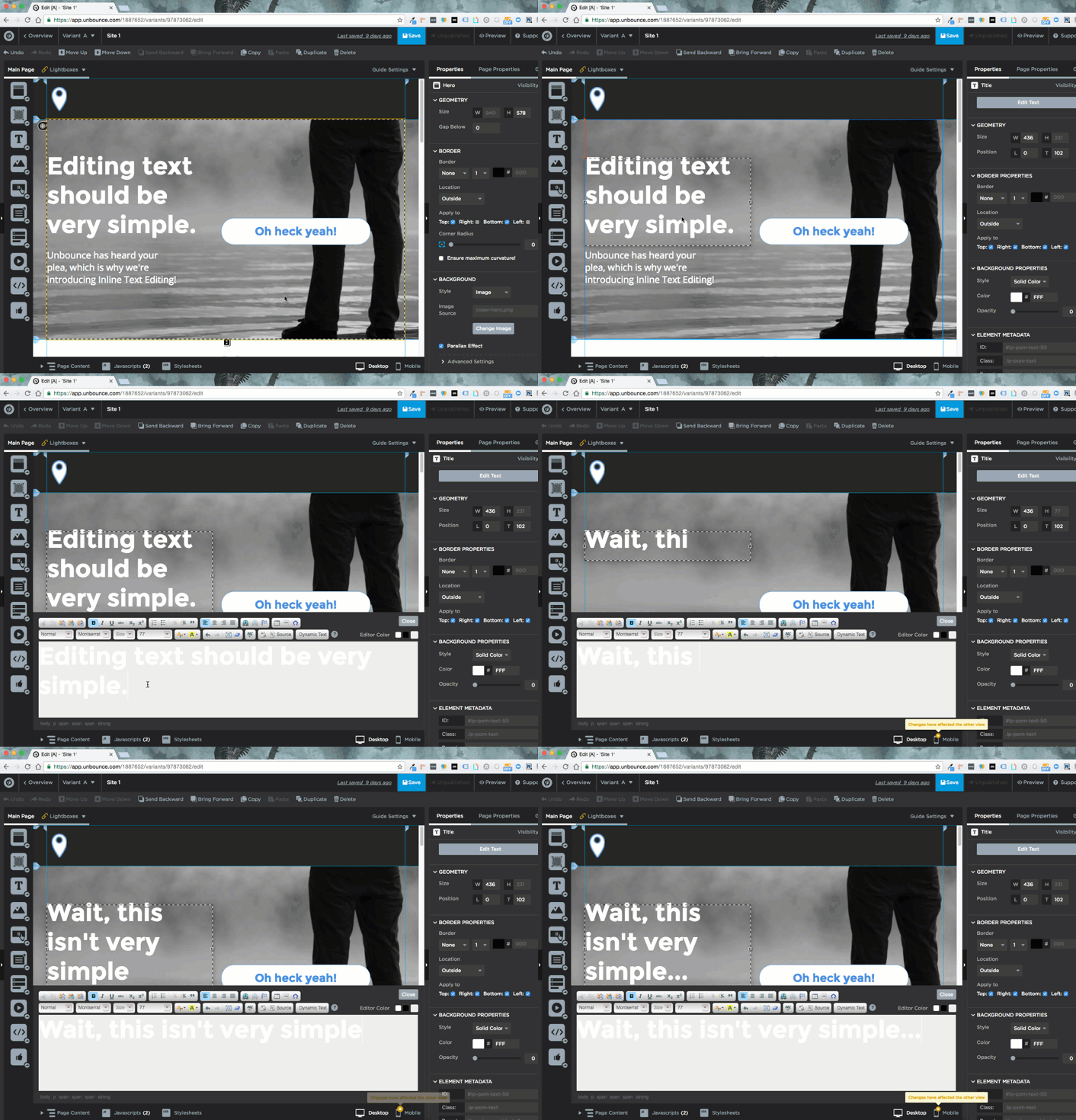
This is how formatting text used to look:


Trust me, we understood the frustration. So, I am thrilled to announce one of our brand new features in the Unbounce page builder…


Introducing: Inline Text Editing! 😍


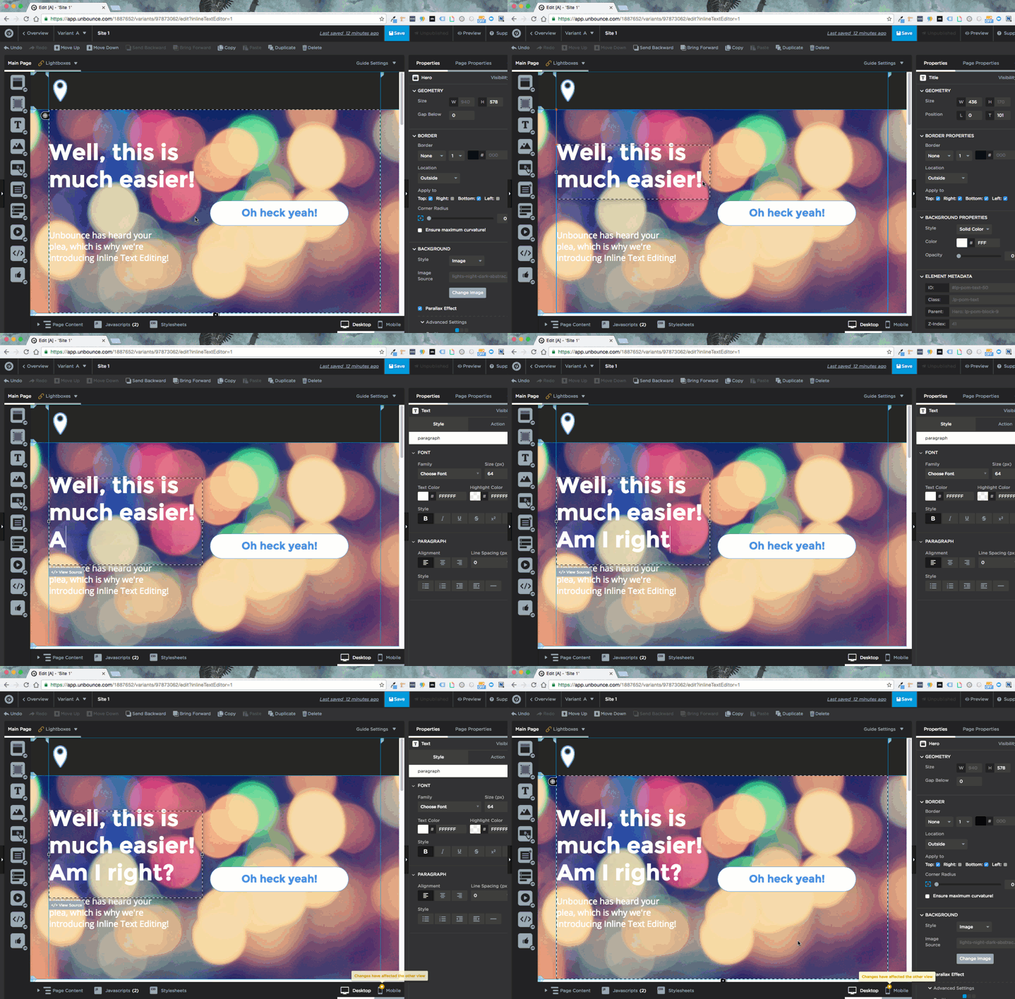
Building beautiful copy in your landing pages has never been easier! We’ve implemented Inline Text Editing into Unbounce’s page builder, for all of your inline text editing needs!


Basically, what this means is when you’re adding text into your landing page, rather than a separate text window appearing at the bottom, you will be able to edit your copy as you make it. This way, you’ll be able to see how your content looks in relation to other page elements, which will make it easier to create visually appealing pages.


This new update will display your content exactly how it will look in your published page - without adding an extra text editing panel to your screen. This will also make it easier, if, for example, we wanted to add a few hundred custom fonts to our page builder in the not-so-distant future. 😉


So, rejoice! Gone are the days of that old text editor, make way for an easier, more modern approach to editing text!


This feature is currently in labs, click here to enable it on your account.


Let us know what you think of this new feature in the comments below, we love hearing from you! 😍

Woo-hoo!! 🙌 🎉


I’ve been using this for the last couple days internally and can confidently say that editing text is SO much easier now (and way more intuitive).


Awesome job, team! :spinbounce:


I too have been using this editor… it does take a little getting used to, but it is so good. So, so, so good!


Waaaaaayyyy better from a design POV. Love it!


Very very happy about this.


You and me both, @Daniel_Keebler!


I find it much more difficult to use to be honest. I don’t like how small the Properties bar is on the right, and I find that it’s glitchy and making my usability experience slower. Other than that visually in the landing page it looks good.


@ChurchillKnight I love your transparency! Honestly, if all we received was positive feedback, we wouldn’t have jobs anymore! 😁


Thank you for the feedback! We’re actively working on improvements to the inline text editor so we’d love to hear more about your experience. Are there particular tasks that you find more difficult now vs. the old editor?


I love it lots, still getting used to it! I really love the dark background and the color coding you’ve used. However, for me, when I select a piece of code in there, the highlight color matches the background color too closely. But that’s just me! =)


So much better. Please add icons for the next update!!


What happened to “Line height”? Really need it…


Soooo, I’m having a little trouble =)

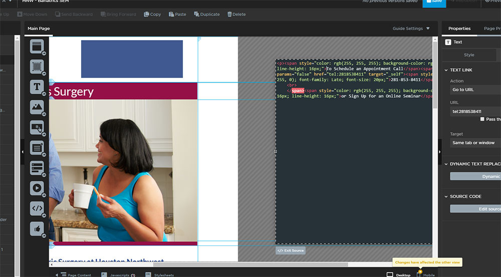
In this screenshot, I’m working on the right side of my page adding text to that purple box on top. When I click “view source”, my text box disappears and I have to scroll over to get to the code. On other occasions the code editor shows up BEHIND a photo and I can’t get to it… =(

Also, seems like some features are missing from the “style” panel… I really need the “line height” option instead of typing it manually into the code. I use that often. Also, there used to be a drop down where I could select the type of link I was making, for instance… tel: or mailto: Now I have to type it out…

Am I missing something or doing something wrong?


Hi @Tiffer,


I am the Product Owner for our Builder team. We are aware of the issues with the source mode and how we are missing line height and are actively working on some fixes for just these things in the next couple weeks.


For now, to hep with the code showing up behind your photo, try increasing the z-index of the text box.


Thanks for the feedback and let us know if you have any other questions or ideas for how we can improve the experience! Really appreciate you giving it a try 🙂


The new inline text feauture is a nice add on but still has some not user friendly way.

For example when I click on the text itself, the font size dropdown could be made editable, it display the font size for 14-16 but what if I want a 15 point size?

In the “View source” mode, the dark grey windows showing the code seems to be cut off. After calling your support, I learned that I actually need to scroll sideway in order to see all the codes. For me it looks quite weird that the code windows is not showing within your working space and it is showing out of the working space canvas. You guys could have used the same panel popping up from the bottom like before to display all the source codes.


@Will1 You’re in luck, these are actually 2 things we’re actively addressing right now. Stay tuned 😃


Thanks!!

Ilook forward 🙂


Glad you are on to this. It is the only issue I could find with the inline editor.


😁


Can you please either fix the new Inline text editing or revert back to the original editing box.


The new editing tool is so glitchy and is creating twice as much work to do the same task.


Example - when copying and pasting text to other text boxes all the text formatting is lost.


Even copying and pasting text within the same text box loses the formatting.


The forced justified option for paragraphs styles is gone.


The text box doesn’t organically grow with the font size and neither does the leading value.


Hopefully you may be addressing these issues


Regards


Laeth


Reply