Images on mobile responsive version of the page looks fuzzy on actual mobile device (iPhone 5). What to do?
Images on mobile responsive version of the page looks fuzzy on actual mobile device (iPhone 5). What to do?
Hi Rohit,
This issue has been mentioned here before, but I’ll chime in with a response here as well in case anyone else is wondering. This is likely a result of your mobile devices being retina display (HD). Retina displays have a much higher resolution and will make images “fuzzy” compared to a screen of the same size that is not retina display.
Retina Image support is definitely something we’re looking to exploring in future, but step one was to get Mobile Responsive out the door as a usable feature. Now that we’ve finalized our Mobile Responsive launch (which was one of our biggest projects to date), we can now start to focus on these smaller wins. With that being said, I don’t have an exact timeline as to when this will feature will push live, but rest assured that it is on our radar.
I had this issue. I made improvements in the image quality by:
- Saving the files as PNG-24
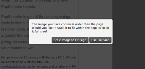
- Inserting them into the mobile side of the editor first, not the web version. It asks to resize or keep actual size. I click “Scale Image to Fit Page” and then position. Do NOT drag the handles to change the image size once done.
- Once you do the mobile side, you can then resize the web side.
When I did this the images render in beautiful hi-res.
Hope this helps
I had this issue too.
In my case, I saved the files in GIF.
Worked for me.
Reply
Log in to the Unbounce Community
No account yet? Create an account
Enter your username or e-mail address. We'll send you an e-mail with instructions to reset your password.

