

Earlier this week, @myles asked if there was a way to create looping videos in Unbounce landing pages, and after some brief head scratching - we’ve figured it out.Below are some quick steps that will help you to implement this nifty feature on your pages.
Thanks for bringing this to our attention, Myles! 👊
If anyone in the Community has any kinds of requests like these, I’m officially inviting you to challenge us to make it a reality!
You can see this in action (built in Unbounce) here:
http://landingpage.noahmatsell.ca/perspective-effect/
How to Install in Unbounce
Click Here for Instructions
🚨
This is not an official Unbounce feature. This functionality is based entirely on third party code, and has only been tested in limited applications. Since this isn’t a supported Unbounce feature, our support team will be unable to assist if things go awry. So if you are not comfortable with HTML, Javascript and CSS, please consider consulting an experienced developer.
Step 1.
Create a box element that will contain your section elements. In my example, this container has a transparent background.
Step 2.
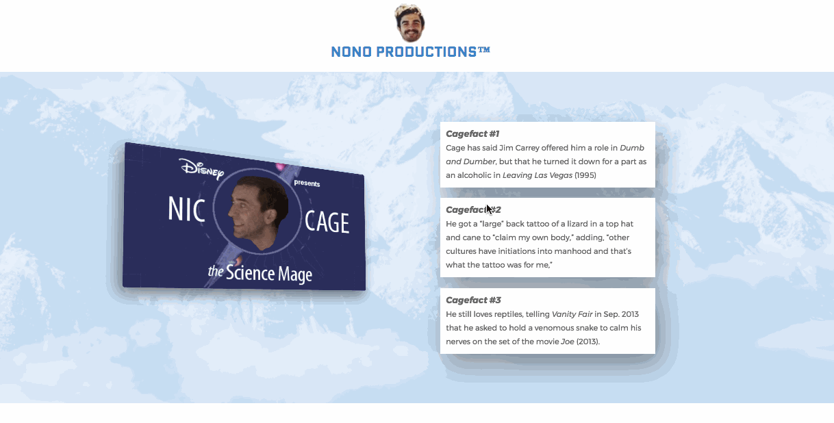
Create an element that you’d like to apply this perspective alteration to and nest it inside of the containing box element from step 1. In my example, I created box elements with background images of my hero Nic Cage.
Step 3.
Adjust the perspective element so it is the full-sized. You may need to use the ‘Bring Forward’ feature to ensure it displays in front of other elements.
Step 4.
Copy this CSS snippet and add it to your Stylesheets section:
<style>

.wrapper{

transition: all 0.3s cubic-bezier(0.165, 0.84, 0.44, 1);

left: 10%;

perspective: 1000px;

-webkit-perspective: 1000px;

perspective-origin: 30% 70%;

}


.item:hover{

cursor: pointer;

}


.item {

box-shadow: 10px 20px 80px rgba(0,0,0,1);

transition: all 0.3s cubic-bezier(0.165, 0.84, 0.44, 1);

      transform: translateX(0px);

    }


    .perspective{

      transition: all 0.3s cubic-bezier(0.165, 0.84, 0.44, 1);

      left: 50%;

      box-shadow: -10px 20px 80px rgba(0,0,0,0.5);

      transform: scale(0.45) rotateY(14deg) rotateX(2deg) rotate(0deg)  translateX(-75%) !important;

    }

    </style>
Step 5.
Copy this Javascript snippet and add it to your Javascripts section with placement ‘Before Body End Tag’:
    <script>

      //first element

      var $wrapper = $('#lp-pom-box-448');

      $wrapper.addClass('wrapper');

      var $item = $('#lp-pom-box-450');

      $item.addClass('item perspective');

      $item.click(function(){

        $item.toggleClass('perspective');

      });

      //second element

      var $wrapper2 = $('#lp-pom-box-458');

      $wrapper2.addClass('wrapper');

      var $item2 = $('#lp-pom-box-459');

      $item2.addClass('item perspective');

      $item2.click(function(){

        $item2.toggleClass('perspective');

      });

    </script>
Step 6.
Replace the $wrapper IDs with your containing box element IDs and the $item IDs with the perspective element IDs.
Want to take your Unbounce landing pages + Convertables to the next level?
 Check out the Ultimate List of Unbounce Tips, Scripts & Hacks
