First Landing Page, in the bag!


Userlevel 4

1: What challenge are you currently trying to solve?
Generate Lead form submissions and phone calls of consumers that are in need of various types of care.


2: How are you driving traffic to your page?
Google PPC


3: What is your conversion goal?
Form submission or phone call

4: Provide a link to your published landing page / convertible:
info.goldenagecompanions.com/live-in-care/


11 replies

Userlevel 7
Badge +1

Hey Josh!

While we wait for some other community members to share their feedback I wanted to chime in because this landing page is looking awesome! Especially considering it’s your FIRST! Holy smokes.

A few things that I’d suggest to take this to the next level:

  1. My favourite thing to point out: favicon! We have a workaround here that’ll show you how it’s done. It’s the best way to take any landing page from good to great, and adds legitimacy to your brand.

  2. The images look a bit compressed here ☝️ , a good way to avoid that is by uploading .SVG images if you have them. Here’s a post that shows you how that’s done if you’d like.

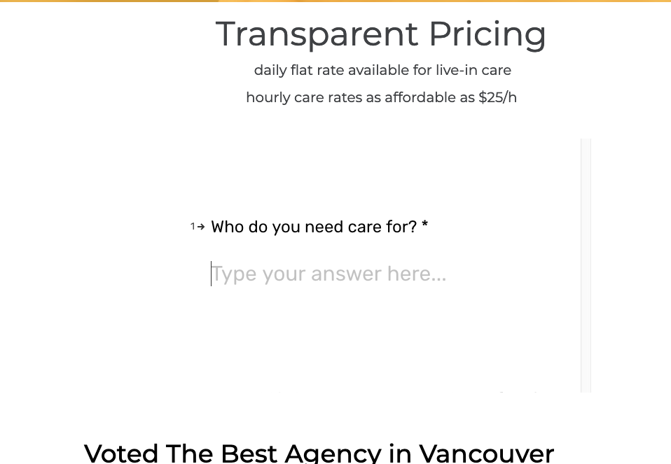
  3. I really like the way you’ve implemented the form here, however it’s a bit unclear (unless you scroll through it) that this is where the visitor is meant to submit their information. I’d suggest adding a title above it that says something like “Enter your information here for a free consultation” so that it’s super clear what the visitors are supposed to do here.

  4. The section that says “voted best agency in vancouver” doesn’t have a centered title, not sure if that’s intentional or not, but all the other sections have a centered title so I thought I’d point that out.

I’ll leave the rest of the feedback for the @Unbounce-Experts, but take a look at those and let’s see how it’s lookin’!

Congrats on your first LP! 🎉 That’s huge!

Let us know if you’ve any questions 🙂

-Jess

Userlevel 7
Badge +4

Hi Josh,

Here’s a video with some feedback for you! https://www.loom.com/share/28abd25371e84e489968a2e781a0dc6e

Regards,

Userlevel 4

Wow this is so awesome!! Thanks for taking the time to review this and coincidently, I had already been in the process of working on a lot of the changes you mentioned.

Sub-headline - I thought the subhead goes below the headline too, but I could have sworn Oli said in one of his speeches to put it above the headline since its a clarifying statement but I may have misunderstood.
I was also talking to my friend yesterday about it, it’s so generic and cheesy but I don’t know what to change it to.

Lead Gen Form - I am working on the redesign for the multi-step lead generation form that will make it 10x better with a welcome screen and thank you page, it’s just taking me a bit longer to learn some of the advanced options in Typeform.

Font Size - You are right, I will make the font larger, I just didn’t want it to be too close because its vertical so I didn’t want it to be misinterpreted as some random sentence.

The Video - This same from a video that my friend already had and it did have a CTA but it was his generic office phone number and we are trying to track all of the calls that come from Unbounce so I didn’t want someone to watch the video and call the number from the video so I trimmed it for now.

I will certainly highlight some of the key terms of the review and add a CTA at the bottom of the page as well as enlarge the people that left the reviews(avatars) and talk to my friend about getting a group picture for the site. Thanks Again Nicholas!

Userlevel 4

Hey Jess, sorry it took so long to get back to you. I didn’t really have any experience with .SVG prior to your recommendation but I went ahead and converted all of the images and have replaced them on the first varient.

Also, I attempted to change the favicon but the one used on the normal site was not a .ico, Wordpress allows you to use a 512x512 png and it automatically converts it in the necessary area’s so I was not able to locate a usable file and properly install it using the documentation you sent over. I will continue working on it.

I am also redoing the lead generation form and when I am done it will be 10x better I promise.

I also centered the text and changed that line to be more specific.

Thanks for taking the time to review my page, really glad I didn’t have to start talking to myself on your forum =]

Userlevel 5
Badge

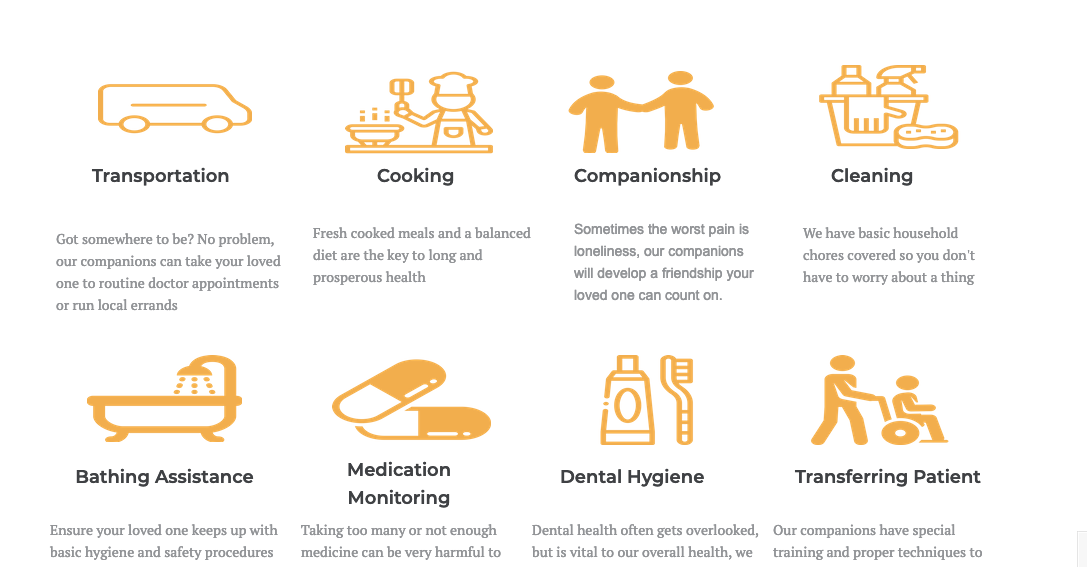
Overall I think this this is a really nice page. It’s well laid out. You’ve done a good job of conveying features and including elements to build trust.

One of the things I would do is try testing a headline with more of a benefit to it. Your current one says what you do, but it doesn’t tell someone why they should want what you’re offering or why they should choose you.

I might also test a different call to action. It’s a bit of a mismatch logically from the rest of the page. Most of the the page seems to be selling using your company for their in-home caregiving needs, so I would expect the CTA to be about maybe scheduling an interview with a caregiver, a consultation with a rep to discuss needs or something along those lines. Calling it a quiz to find the best care option makes it seem like it’s more of a tool to help people determine whether should choose between a nursing home, in-home care, and other types of options. Maybe just position the quiz as something more in line with the rest of the page, like “Find a companion who meets to your specific needs.”

I think it’s smart how you try to personalize the page by city. This could work well with your target audience, but since I’m on the East Coast and your page focuses on CA, it makes me wonder if you’re being honest.

I think you can make the copy more compelling by switching the focus from you to your potential clients. Instead of “Our companions do it all,” “Find out how we…” etc., use “you” statements.

Finally, the footer has Terms and Conditions and a Privacy Policy, but they don’t appear to be clickable links. That’s not the best UX.

Best of luck!

Userlevel 4

First off, Thank you so much for taking the time to review my landing page. I really really appreciate it.

I am working on A/B testing the headline right now, I have known that the sub-head needs work but I really struggle with creative wiring (sales copy).

You are right about the quiz, it doesn’t match the webpage. I got inspired from this article I read about this beard company that generated a lot of leads from a quiz, so I tried to tie that in.

I know the geo-dynamic city name is a little unethical because it could be a lie, so I added “area” at the end, because the ads only show to people in this county and area is a vague word.

I make the mistake of being a selfish marketer too often so I am really glad you pointed that out, I changed “Our companions do it all” to “You Can Relax, We"ll Take Care of It”.

Lastly, I added the clickable terms and privacy policy.

Do you think there is anything else I can add or change? I think I might try to tie in some people from the company using like a picture or video to build trust.

Userlevel 4

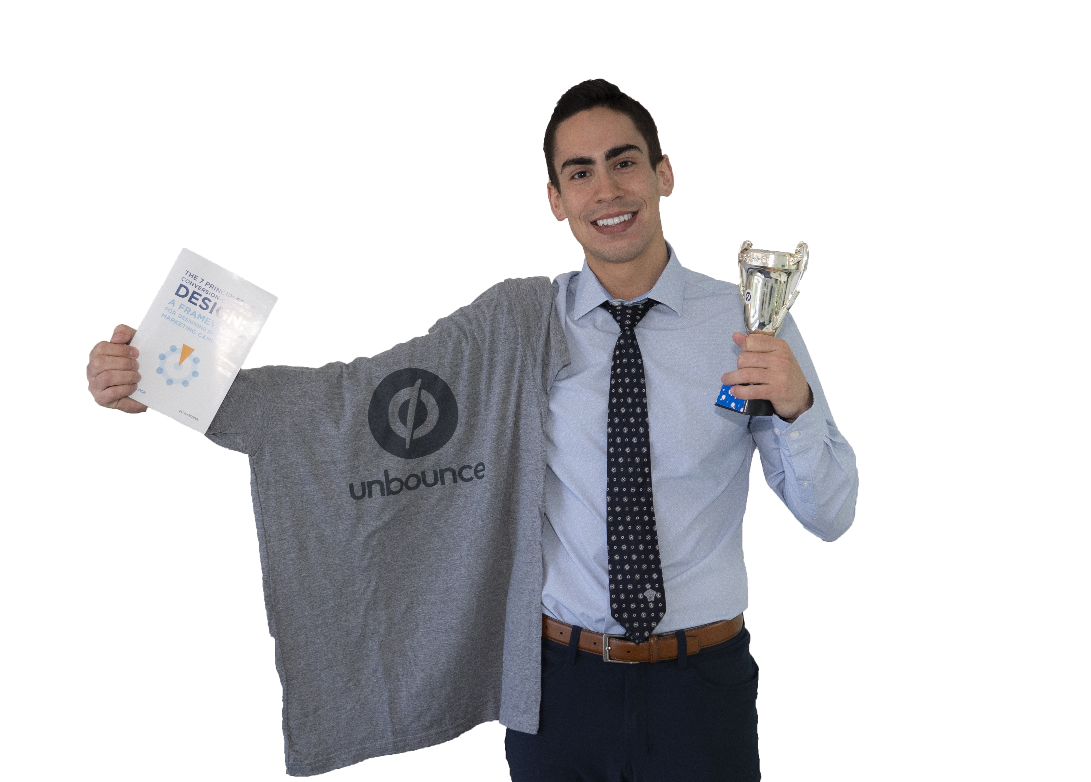
I just want to let everyone know that I got my first conversion last week, then 3 right after -💪 . Thank you everyone for ongoing support, I couldn’t have done it without you, great community. Please let me know if you need my address to send a trophy 🏆

Userlevel 5
Badge

I think the quiz works better in the article because the quiz was the main focus and the products were secondary. Maybe save that approach for a campaign targeting people higher in the sales funnel.

You’re not alone in using too much “we” and “our.” That’s one of the most common mistakes I see.

I like the idea of showing some of the people. It makes it seem a bit more personal, and that’s even more important since having a stranger come into their or their loved one’s home could make anyone a bit apprehensive.

If you’re having trouble with copywriting and want to outsource any of, feel free to reach out to me.

Userlevel 4

Sounds good, Thanks Sean

Userlevel 4

Update and PSA

Update: Got my Trophy!!

PSA: Unbounce may be the coolest company I’ve ever worked with.

Userlevel 7
Badge +1

SUCCESS!! So stoked for the work you’re doing, Josh! Keep it up 💪

Reply