Change landing page if viewed in mobile (iphone, for example) browser?


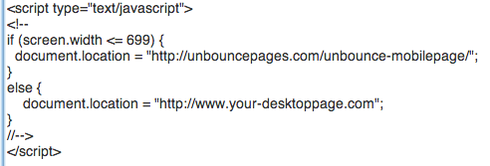
Let’s say someone opens one of our emails on their iphone, and then surfs to one of our unbounce hosted landing pages.

Is there a way to change the formatting of that landing page if they’re viewing it on a mobile device? Any suggestions? Switch out templates, for example? Any ideas? This would be soooo useful.


15 replies

Hi Peter! Right now we don’t have a good solution for this, sorry. I did a quick search, trying to find a web service that would let you do that kind of segmentation (something like a URL shortener), but didn’t come up with anything. We eventually hope to add support for segmentation of traffic to your page, and I’ve made a note of your use case in our issue tracker. Will update you if/when we can get to it!

Peter, I share your desire for Unbounce to incorporate web sniffing technology so that a visitor will be auto switched to the appropriate environment based on the browser/platform that they are using to view your site.

In the interim, another solution to consider.

* Budurl.pro is a URL shortener that shortens a URL, creates a QR Code (in desired) and can also route the viewer to a “mini-site” which you create. NOTE: does not compare to Unbounce in any way with features but can deliver a mobile-optimized site.

I was thinking about this, and thought maybe it was a bit far-fetched, but then unbounce is all about achieving higher conversion rates and believe strongly that a one-size fits all doesn’t work, a page should be optimised for mobile just like a page should be optimised for desktop.

Would be brill if unbounce could add this sort of functionality!

I agree with J.Grafton. Talk it. Walk it.

Hi Jon, Chris - I’m not sure if this would work for you but we have another thread that contains some javascript you can use to detect a user’s device and forward them to an alternate URL (e.g. a mobile specific page).

I hope that helps!

Can this script be tweaked so it can direct users depending on screen size?

I currently run a site which terrible on a 28 inch mac due I have combined it with a CSS powered full screen picture …

Anyonw with knowledge to hack it?

/mathias

I find some of the LPs we make with unbounce don’t align properly and text and form fields are in the wrong place when viewing on an iphone or ipad, but on PC/Mac it’s fine… any way we can fix that?

Hello Mathias,

There is a good discussion about webpage modification by screen resolution at http://stackoverflow.com/a/6990086/11…. Please note that this is not an Unbounce resource, but a general technical discussion site.

I would recommend engaging a web developer to assist you with a custom CSS Media Query if you would like your background image to be responsive to screen size.

Regards,
Evan

Hi Ben,

We’d be very interested to see an example of the issue so we can get it fixed! Please grab a screenshot of the page on your iOS device and send it to support@unbounce.com

In case you’re not familiar, instructions for taking a screenshot on an iPhone or iPad are available at:
http://www.apple.com/itunes/inside-it…

Regards,
Evan

What about building a theme template for unbounce based on the twitter bootstrap mobile responsive javascript/html5 framework. http://twitter.github.com/bootstrap/ and adding in optimized web form editor options using knockoutjs.com

Use 2 LPs.
Page 1 is an unbounce mobile LP
Page 2 is a blank page with the following redirect script placed in the HEAD tag:

href=“https://d37wxxhohlp07s.cloudfront.net…”>

Point traffic to page 2. Mobile device traffic will be sent to page 1 (unbounce mobile page), desktop traffic will be sent to your full size page.

For me and my business, it’s more than a desired need to have the landing page display nicely on mobile platforms.- it’s a must.
I may soon have to find another service provider if mobile is not part of the solution,

Hi Flemming,
We do have some mobile templates available as a labs feature already, you can read more about that here:
https://getsatisfaction.com/unbounce/…

And in the near future (once we’re finished with an open beta we’re running for new design features in the editor) we’ll be tackling some issues to bring those templates out of “labs” and add some new, nicer templates to the system as well.

Hope that helps, and sorry about the wait!

Carter

I can attest to Ben’s issue. I have seen it as well in particular to the iPad and iPhone. Best thing I was able to do was to simply play with it via trial and error method till something looked bearable.

If you have this kind of an error in the browser, try reinstalling the browser and set the application to custom settings to solve this issue if this occurs in near future, I myself did this and solved it, but this time I came across an unknown error Mac Error Code 43, any solution regarding this issue will be appreciated.

Reply