
We collected your landing page links, and selected one lucky winner, Andreas Obel (@andreasobel).


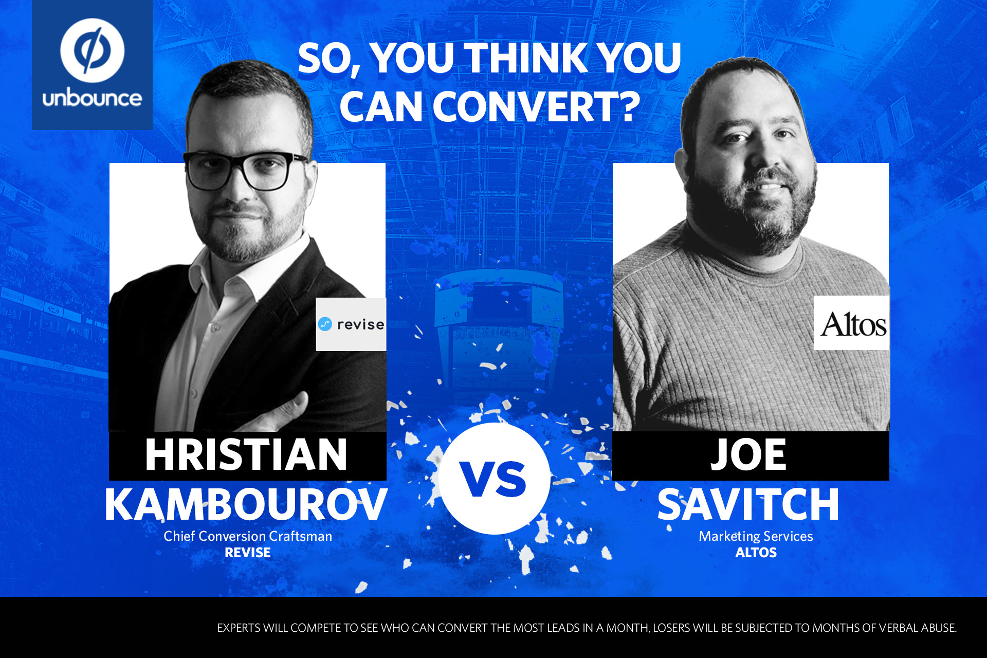
Then they were off to the races! @Hristian and @Joe_Savitch created two beautiful new variants for eloomi’s Request A Demo page. It was a tight race, but in the end, @Hristian proved victorious! 
I’m sharing this here as there are findings from this experiment that I believe are universal to building high performing campaigns in Unbounce. If you have any questions about this contest, the Unbounce Experts, or their findings, please don’t hesitate to reply in the comments below!
And as promised, Hristian and Joe provided a writeup detailing the assignment.
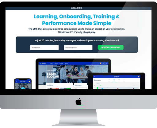
Here are @Hristian’s designs and findings:
It’s always challenging coming into a project that has a long history of optimization and trying to improve conversion rates on a short deadline. However, it’s the kind of challenges we like here at Revise. It forces you to dig down and really understand what works and what doesn’t work.
The awesome team at eloomi have done a splendid job so far to push their landing pages forward and constantly improve their conversion rates.
We took that as a good starting point and tried to build up on it even more. Armed with various analytics data and customer reviews, we devised a game plan that concentrates on 3 main areas we wanted to improve:
Copywriting
It’s easily one of the most overlooked areas of a landing page. More often than not the copy is put together in a rush. It really comes down to solving a particular pain point for your potential customers and presenting them with a trustworthy solution. Based on our conversation with the eloomi team and numerous platform reviews from customers, we tried to tweak and improve the copywriting by highlighting certain benefits and giving more context to others.
Hat tip to @Joe_Savitch and the Altos team here since we think their work on the copywriting was better than ours
Design
Somewhat constrained by the existing design style guidelines, we tried to be creative. Utilizing more white space; allowing content to “breath” and therefore making it easier to guide the visitor’s attention to where you want it. Playing with the contrast of the page, better highlighting the social proof elements of the page and various other tweaks along the way.
Form & Flow
eloomi’s form is as short as they come. 3 fields of which one is optional. So what did we do? We made it even shorter. Simply by getting rid of the optional Company field. Based on reviewing hundreds of screen recordings, we wanted to make the decision process of a potential lead as simple as possible. However, the biggest gain here, I think came from tweaking the copy around the form and call to action buttons. Making it more clear what a visitor can expect from filling out this really short form.
Overall, we were pretty satisfied with the end result but the conversion craftsman in me has a few more things, we would have liked to do:
Page Size
Due to time constraints, the final page size wasn’t as small as we usually want it to be. Some of the gorgeous images eloomi provided us with can be optimized. Also, taking advantage of the newly released SVG support would be great.
Multi-step Forms
We’ve seen some great success with other B2B clients when a proper multi-step form is applied to the page. As always, these can be tricky but the results can be worth it.
Dynamic Replacement & Personalization
It would have been nice to have more time & traffic to be able to do more personalization on the page.
“One thing you should take away from this awesome challenge: Never stop working on your landing pages and striving to improve them. Base your hypothesis on hard data, invest in your resources and put a good process in place.”
Here are Joe’s designs and findings:
This was an incredible ‘competition’ and even though we did not win (ok, H’s version scord 104.82% higher conversion rate). However, in defeat much can be learned.
I want to echo what @Hristian said, the eloomi team was incredible to work with and they provided us with a treasure trove of data. It was great to see the history of the variants (great Unbounce feature BTW) and have all of their amazing assets at the ready.
Our process was similar. It started with the copy doc. Given the time constraints of the project I really wanted to do more… and in the end I kept going back and tweaking right up until the final submission.
“The page structure/wireframe and subsequent copy decisions are the backbone of any good webpage, and it is the lifeblood of a dedicated landing page. I am fortunate to work with a designer that has a minor in creative writing.”
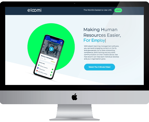
I did not review as many screen recordings as Hristian did. My designer at Altos and I spent more time pouring over the Capterra reviews for eloomi. We wanted to read what fans of the product had to say about the best features, why they liked it and most importantly what problems it solved for their organization.
Our focus was to position the eloomi platform a the best solution. And coax visitors down the page through our various content sections using angled or ‘false’ bottoms. There is a great script in the community for angled page sections. It made this super easy. We also added more functionality to the page by having a sticky heater (also community script) with a persistent CTA that would scroll you to the bottom of the page right to our form.
I added inline field validation, styled the error messages differently, and had the form ‘wiggle’ if you submitted it incorrectly (all community scripts too  I focused so heavily on the UX and the functionality of the form as it is the most important element on the page. I honestly wanted to add more fields, to reduce the anxiety around only submitting two of the most valuable pieces of information you have (name & email). I’m guessing that would not have helped in this case. The fewer the fields the better! We also should have focused a little more copy around the form. I had a potential variation with more text around the form but I decided to change things up. It is why you have to keep testing. I would have eventually put more text around the form and seen better results.
The next time Hristian and I are in the same country, I’m sure we will be discussing this topic several times over. If you would like to get in on the conversation we would love to chat with you!
A big thank you to @Jess from Unbounce for organizing this contest, and @andreasobel for sharing eloomi with us.
A note from our recipient, @andreasobel
Unbounce has always been excellent at engaging the communities, and this competition is yet another great example of that!
Handing over internal assets and control to someone else was I admit, a bit scary, but both Joe & Hristian are highly professional people and Jess facilitated everything like a true Unbouncer with NDA’s and a Slack-channel for quick conversations.
Once it was off to separate corners, the experts had very few questions and actually set everything up fairly quickly with impressive accuracy in terms of alignment to our tone of voice.
I was very impressed with how they both understood and captured the eloomi vibe, and transformed into completely different landing pages.
It’s always wonderful to get insights into other marketeers’ way of thinking and getting to work closely with these two fellow conversion fanatics was a pleasure!
Thank you Unbounce
–Andreas Obel
As you can tell, creating a competitive variant was no small task.
In the end, Hristian was the champion, scoring a 1.58% higher conversion rate than Joe’s variant. The next time Joe and Hristian are in the same part of the world, Joe owes Hristian a beer. 
We will be holding another So You Think You Can Convert contest in the future, so keep your eyes peeled  .
.
It was a pleasure to work with such talented individuals, major props to them all!
Oh, and @andreasobel made good on his promise of cake!