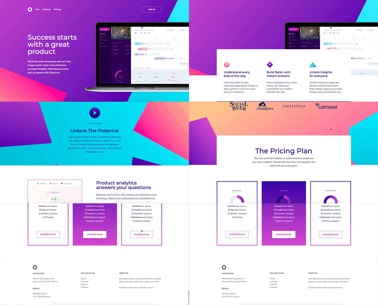
Next time you go to create a new landing page, you’ll notice 7 new templates added to our collection to help you crush your conversion goals in style.

And in true Unbounce fashion, we’re making sure you’re putting your best foot forward by observing some of the newest design trends on the market. Each of our new templates was developed with the focus of enhancing visitor experience to optimize your conversion rates across all of your campaigns.
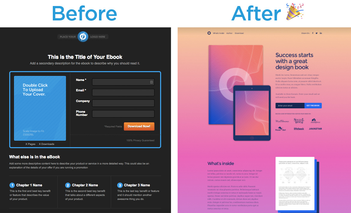
With this new release, we’re replacing some of our legacy templates and their component variables with some 🔥 new templates, like this one here 👇
Why did we do this?
During a recent audit of our template collection, we discovered that many of our templates had a number of components in common. The visual style set each template apart, but the content remained relatively consistent across the board.
So, what did we do exactly?
Taking the insights we gained in our audit, we were able to break down all of the common user interface (UI) patterns and components, along with the landing page types such as lead generation, click-through, coming-soon, product launch, SAAS, consultancy and e-book.
We created three minimalist templates for lead generation, click-through and product launch to help you launch your first landing page successfully, without needing a ‘throw away page’ while you’re still being introduced to the builder.
We also updated four more templates for SAAS, consultancy, coming-soon and e-book. The inspiration was derived from current design trends. We used vibrant colours, gradients and strong typography to put a exciting new twist on our newest material.
Give them a go!
Getting Started Click-Through template
Getting Started Lead Generation template
Getting Started Product Launch template
Coming Soon template
E-book template
Consultancy template
SaaS template
As you can see, Unbounce doesn’t just offer world-class conversion tools – it’s an expressive platform that utilizes beautiful design and best user experience practices!
We’re really loving this new look, and we hope you do too! Let us know what you think in the comments below! 💙


