Hey everyone!
As promised, I’m kicking off our series of tips and tricks to optimize your landing pages for high conversion. Whether you’re just getting started building your landing pages in Unbounce, or if you’re a seasoned pro looking to get the most out of Smart Traffic – there’s something in here for you.
Variant Creation – Where To Start?
First I’ll explain why to create variants for your landing pages: When you build just one landing page, you’re limiting yourself from being able to appeal to a wider audience. Even with traditional A/B testing, that’s still suggesting that there’s a “one-winner-fits-all” landing page, which as we’ve discovered isn’t true at all.
By creating multiple variants, you’re giving your landing pages the highest chance of success by appealing to many different kinds of visitors. Perhaps your visitors are on mobile devices, or they’re located in a specific region, or they match a certain demographic. Whatever it is, there’s a way for you to create content that feels tailored to them, making them more likely to convert. Smart Traffic learns from a visitor’s attributes (including their location and device, among other attributes) to send them to the variant where they’re most likely to convert. It never stops learning and adjusting, always working on getting you the highest conversion rate possible – this is why it’s very important to create variants to give Smart Traffic more information to learn from.
What to test on your landing pages?
When in doubt, here are 5 essential elements to always test on all your landing pages:
- Headline and sub-headline
- Hero image
- Benefits section
- Social proof and testimonials
- Call To Action/CTA
Below I’ve put together some things to consider when you’re testing these elements to drive up your conversions:
Headline and sub-headline
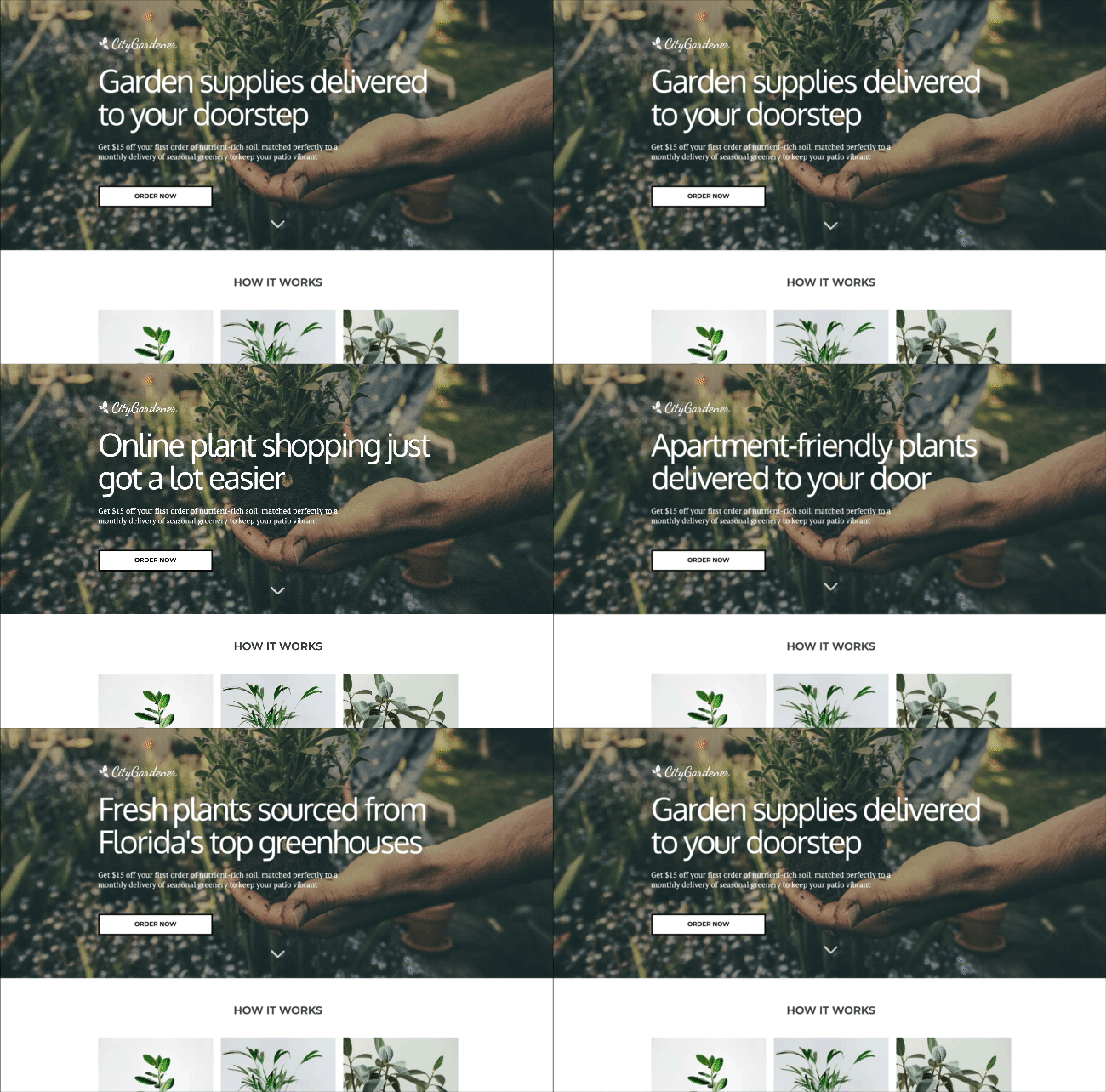
This is the first thing your visitor sees when they land on your landing page, the goal here is to make your offer very clear so that within 5 seconds, your visitor knows what they’re looking at. By mixing this up, you have a better opportunity to appeal to a wider audience, depending on what they’re looking for. The insights from this may surprise you!
Hero image
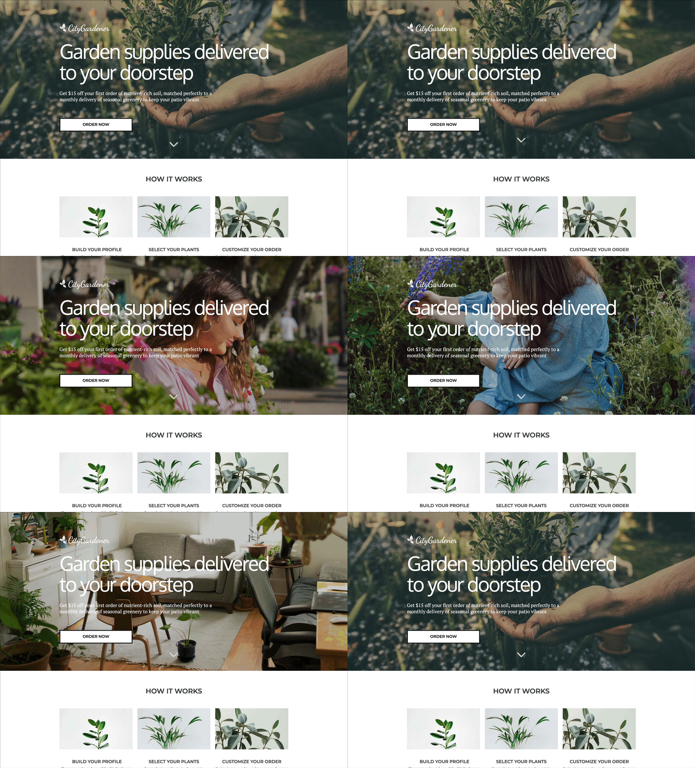
This is where I implore you all to be picky. A poor-quality or mis-matched hero image can throw your visitors off. This is a great opportunity to let your audience visualize what you’re offering. Try testing images with and without people, or if you’re targeting specific regions or demographics – use imagery to draw your audience in. The easier it is for your visitors to see themselves in your content, the more likely they are to convert.
Benefits section
When it comes to writing this type of content, the most common questions are about how to pick the most persuasive angle, and how much to write.
Copywriting expert Joanna Wiebe explains that to write the best body copy possible, you need to remember two foundational principles:
- Customers’ awareness dictates page length
- The warmer your lead is, the less copy you need on your page, and vice versa.
- Start with your conversion goal and work backwards
- Make sure that the features and benefits you include are tied directly to the action you want your visitors to take.
Try adjusting your benefits section to cater to your visitors, and where they’re at in their customer journey.
Social proof and testimonials
Testimonials are a terrific way to show your visitors that your product/service is worth it – but if you add too much content into this section it can crowd your page. There are a handful of different ways you can test this, but my most recent favourite has been from @julien_level:
You can also test how many testimonials you include. Sometimes it helps to have a lot of testimonials for social proof, but in some cases it can crowd your page. This is where experimenting comes in handy.
Call To Action
Your call to action, whether it’s a lead gen form or click-through button, is arguably the most critical element of your landing page. If there’s no call to action, your visitors can’t convert.
If your landing page copy does its job, your visitors should know exactly what to expect when they encounter your form, but there are some things you can do to ensure your form works like it should:
- Make sure that your lead gen form is prominent and that it’s clear to prospects, why they should want to convert
- Include the minimum number of form fields needed to produce the highest quality conversion
- Customize your field labels for smoother integration with your 3rd party tools
- Use a button label that clearly states what will happen when users submit their info and completes the question “I want to…”
- Set up a Thank You page to optimize the post-click experience
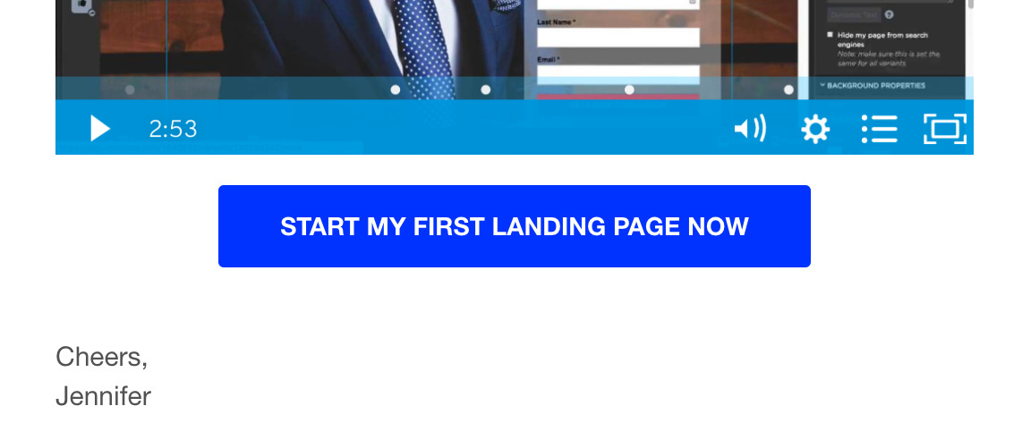
Something that we (at Unbounce) tend to use when we’re building campaigns for our customers (you) is building out our CTA’s that engage our readers by saying “you” and “your” as much as possible. All our messages are specifically tailored to our readers, and we want each of you to feel that way. Here are a few screenshots from actual emails that we have sent out:
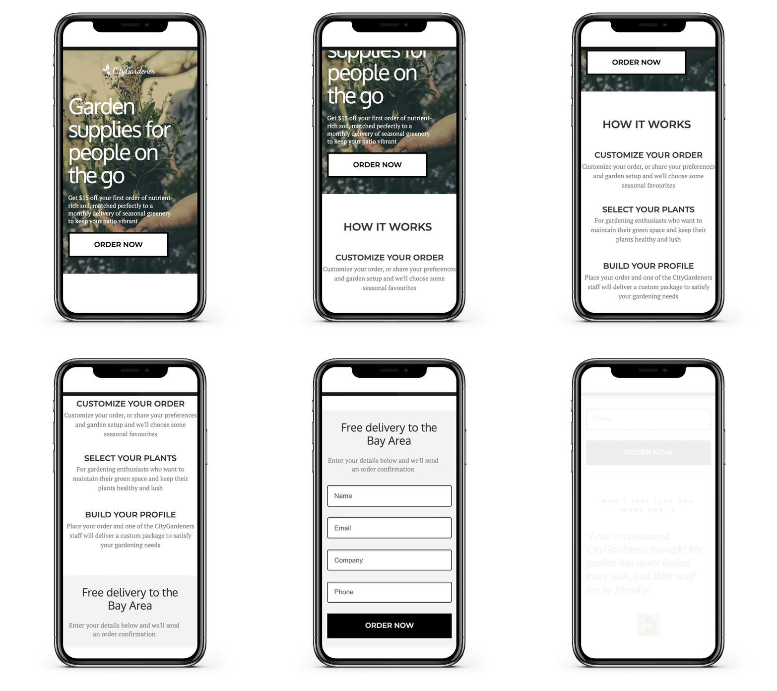
Here’s another tidbit to keep in mind when you’re testing out your variants: device type. It’s not groundbreaking news that over 50% of all web traffic is on their phone. Consider tailoring your content to that and see how it performs.
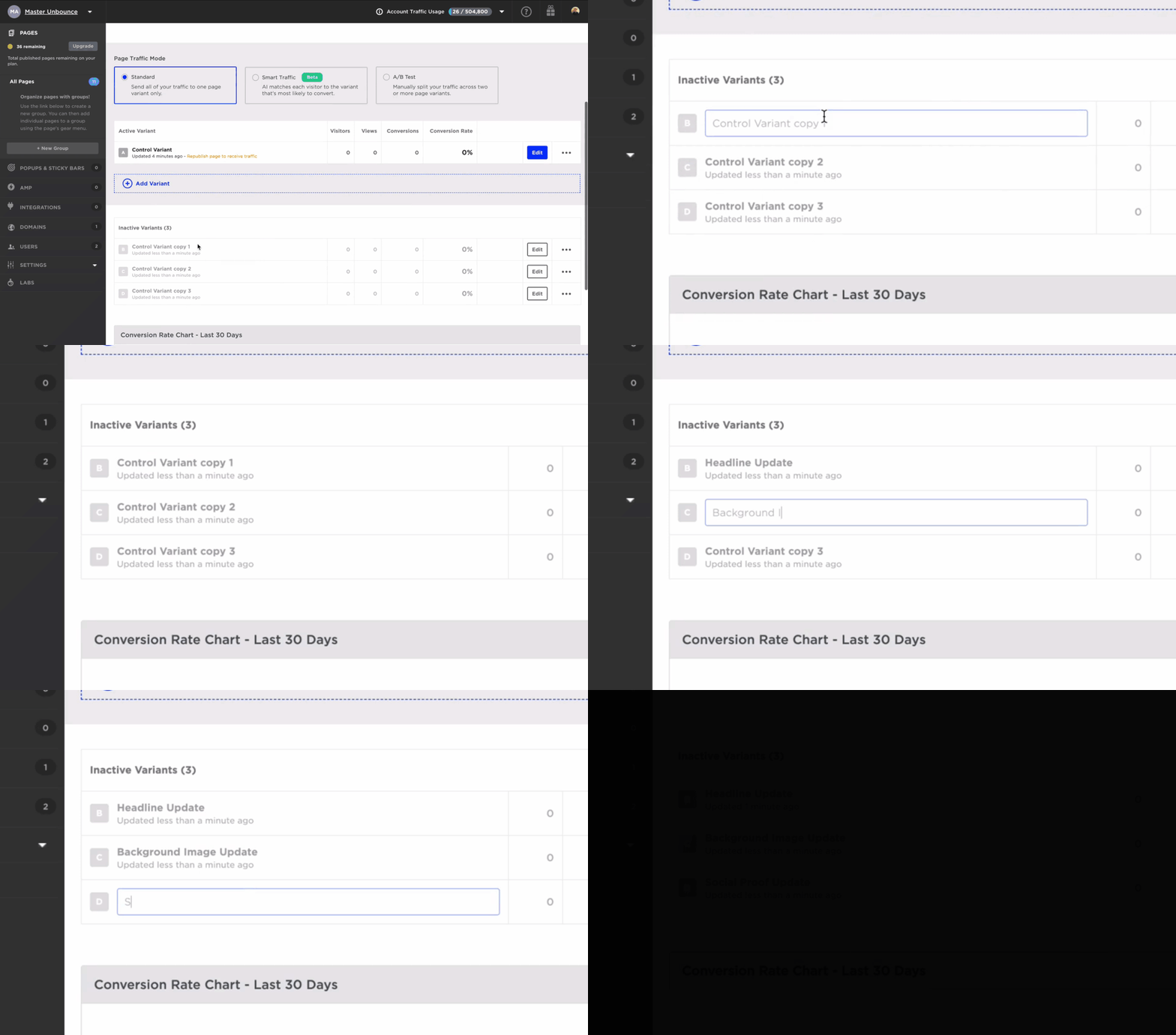
Finally, once you’ve created each of your variants, it helps to name them to keep things organized.
And last but certainly not least…
Make sure to set your conversion goal (you’d be amazed at how often this goes unchecked). It’s the best way to see how your variants stack up, and to get the most insights out of your content.
Before we wrap up, there’s one more point I’d like to make. When you’re using Smart Traffic (you are, aren’t you?) it’s crucial that you build more than one variant. Smart Traffic learns from your traffic and sends your visitors to the variant where they’re most likely to convert – but if you only have one or two variants, it doesn’t have much to learn from. This is why variant creation is essential to getting the most out of Smart Traffic. Feel free to ask me to elaborate on this in the comments below, or ask me what my favourite Netflix series is (just checking to see who has read this far). 🙊
That’s it for now! Hopefully this gives you some brain food for your landing page variants, this content is also available in a bit more detail for bookmarkin’ here. Feel free to let me know in the comments below if this was helpful, or if there’s anything you’d like me to clarify a bit further.
See you in the forums!
-Jess

