Hi @gregoryburke ,
looks good overall - i like the design - nice and clean, well layed out and professional look 🙂
i’m just thinking through - what do people want when searching for a lawn-care service… i am actually interested in one although not sure you / your client can service my garden in england 😦
Which leads nicely into what i think is potentially a massive point:
- Where are Wake Pro? What areas do you cover?!!! I can’t find it - maybe i’m missing something. ‘Local’ is mentioned once or twice - but local to where!?
- Although i have no experience of marketing local services, I would expect this is possibly one of the biggest factors. I think even if i were to look up on a directory - it tells me wake pro are 1 mile from me - i would still be looking for verification of this pretty much first thing on site.
still writing… will post more shortly
in my view i would expect it to work better if you plaster the area very visibly all over the page:
Do you use geo-locate within the ads? Grass-Cutting in [town] - Limited Capacity - Get Your Quote Now
I would suggest it’s worth testing if you don’t and also test within headline of LP.
In addition, list out the areas covered: Servicing, Worthing, Littlehampton, Steyning, Rustington and sourounding areas. (these are towns near me…)
There will be many people who live near Worthing (the biggest town in the vicinity) - I’m in Rustington they are in worthing - will they cover that far out…? If they see “Rustington” on the site - all doubt is immediately Removed.
As part of my trying to fugure our where the service is, I scrolled to the bottom “blurb” area looking for an address - nothing 😦
This blurb does a couple of things:
1 - it’s a common place for people to look to see who and where you are - really imnportant for this kind of service
2 - it re-enfoces trustability…
grabbing an example and typing - more to come…
Thanks Alex, that’s great feedback. I definitely agree, and will add the address very conspicuously on there.
(Although the location is not quite as mysterious as it may seem)
- The “Wake” in Wake Pro Lawn Care means Wake County. Almost everyone around here would catch that.
- Almost everyone would recognize the (919) area code.
- In AdWords, the geotargeting is a very small small area around Raleigh (in Wake County). He just focuses on the highend neighborhoods downtown.
I also have some separate landing pages for when people’s searches do include the city name. If someone searches “Cary lawn maintenance,” it’ll say Cary in the headline.
I really appreciate the feedback though. I’ll put it to use!
ahh - completely missed that! more on the way - less area focussed!
So this is typical of the kind of blurb i would always want at bottom of site:
This one is for a Financial Services company, so heavier than most of ours:
_* Feefo Rating for XXX based on 331 verified reviews, 31 January 2018
This site is operated by XXX, a company registered in England and Wales (registration number 4519020), at XX. xxx is an active member of the Consumer Credit Trade Association and is fully authorised and regulated by the Financial Conduct Authority. Firm Number xxx.
 2014 XXX All Rights Reserved
Site designed by Digital Oyster Ltd
Registered in England and Wales, company number: 08692911
Privacy Policy Cookie Policy_
In my view - although few people read much of it - it being there is re-assuring. Makes one think this is a real company regitetred autorised, i can seee their address - i trust them a bit more now,.,
Having nothing there makes me think - who are these people!?? and raises a red flag on the trustability - more acceptable for a local lawn cutting company - but some basic details would go a long way i would expect.
more on the way…
Some things i would be keen to either do (no-brainer) or test:
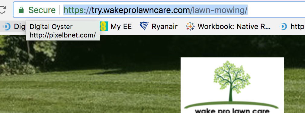
which is defnately worth trying aswell - article on force to https here https://documentation.unbounce.com/hc/en-us/articles/204756634-How-do-I-secure-my-landing-page-domain-with-SSL-#content2
This has the benefit of giving you a nice reassuring green padlock (make sure you don’t pull from any non-ssl sources - otherwise you get warnings galore on the page) - but yours is fine atm (just be aware if adding any scripts etc)
You’ve been ridiculously thorough. I will implement these suggestions, and check back in a month or so with my new conversion rate stats.
Thanks!
rather
Cheers!
Last one!
I would also try some different messaging on that 1st section and a different approach on the CTA (treat as seperate tests so you can see whats working and whats not - 1 variable per test - multivariate is fine if done properly):
1 (thinking - let’s concisely give them everything they need above the fold, let them know they found the best one, — fill out the form!!!) . The longer text below can be good for re-assureance - if we can close the deal now, let’s do it…
Headline: Full Service Lawn Mowing, Turf, & Yard Maintenance (the current one - concise, ticks the boxes - this is what i am seaching for - great)
Subheadline - i like this also . Prompt. Professional. Precise. -
these two can give good uplifts so are always worth testing around - although i like what you have there.
i would be inclined to include some bullets answering some questions, which are further down currently:
- Weekly or Bi-Weekly programs
- Full service - weed control, leaf cleanup and more
- Trusted - established in 2001 and use by over 2000 homeowners
- Competitive priced and great looking work!
Get the garden and service you deserve - complete the form to get your quote now:
I would definitely test: dropping the 50 offer instead
- bring the form on page on the right side
- remove address from the form
- make email non-mandatory
- Headline for the form - GET YOUR QUOTE NOW
- button text - GET MY QUOTE
With the headline and bullets we have established:
- its the service they are looking for
- its THE one - professional, trustworthy, good price…
So what next - “Get $50 Off Your First Month” - lovely, but whats next. At this stage - i want it - but how much does it cost - i’m perhaps reluctant to pick up the phone - seems like a mission, if i’m not fully commited - GET YOUR QUOTE NOW - 4 fields - looks easy, immediate, and i don’t have to come out of my hermit shell and talk to someone - well teleohone…
I would expect this to do well - one way to find out…
I don’t have as much advice as Alex, but here are some additional suggestions I have!
Not sure what device your audience is mostly using (can be found within Google Analytics) - but on a Mac the images are not clear due to the retina issue. A quick fix is to place a box and set the background to the image. Clean images can help with your page look more professional.
I would consider installing Hotjar on your site (if you haven’t already) for inspecting a heat map of your page. I use this on all of my pages, and find it especially helpful when I have longer pages. It can show you what the users are reading on your page - therefor, what elements they find useful or don’t.
With a $50 promo this would be a great time to use one of UB’s sticky bars! I would display it after a user scrolls down after 50% or so! You could also implement one of the pop ups as well. My favorite is using one when a user try to exit the page.
Good Luck!
Thank you, these are also very good suggestions. I’ll definitely HotJar it up. I also like the idea of an exit intent pop-up or a sticky bar.
This was a fairly low budget client, so I didn’t have many hours upfront for so much analysis, but this is definitely great stuff to do in the upcoming months.
This community is great! I should have stopped by this place sooner!

 2014 XXX All Rights Reserved
