I just published my page, I completely new at this. My goal is to get people to take action to book sessions with me. Any feedback would be greatly appreciated!
Here is my page: https://www.realignyoursoul.co.uk
Thanks,
Astrid

Feedback on my page
Userlevel 5

Hi Astrid.
Welcome to the community.
First, here are a few general design comments.
-
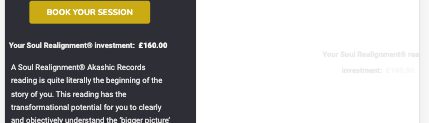
Reversed out type can be hard to read, especially when there is a lot of it as there is on this page. I would stick with dark text on a light background unless it’s a short callout or headline in pretty big type.
-
The form and the button should really stand out. Draw attention to what you want people to do. I would encapsulate the form and give it more contrast from the rest of the elements around it. You should also make sure the button color and text have enough contrast to read easily.
-
You may want to visually break up the content a bit more. If it looks like it’s going to be work to read and understand, many won’t bother.
-
The logo takes up a lot of space at the top of the page. That’s prime real estate that could be better used communicating your value proposition. You can probably make that much smaller and perhaps move it the corner to free up space.
As for the content itself, a bit more information would be helpful. Who are you targeting with this page? Where are they in the customer journey? How much knowledge of the subject do they have? Are they actively seeking this specific type of service or are they seeking more for solutions to the problem? How are you driving people to the page?
The answers to these questions will help determine the best messaging to include and potentially exclude. Going by what you have on the page now, here’s what I suggest.
Come up with some alternate headline/subhead options. Provide a clear benefit as specifically as possible. Think about your target audience. Why is it they would want to do this? What’s in it for them?
Give the form a heading and perhaps even a line or two of intro text so there is some context. People need to know what it is they are signing up for, why they should do it, and what happens when they do.
If you are going to include a price, then you need to be able to convince people this will be worth the return on that investment. You also need to answer any potential objections and questions they may have in their mind such as what is a reading like?, why should they trust you?, what if they don’t get the value promised?, etc.
Perhaps you could include samples or snippets of recordings and materials as examples. You could also possibly enhance the what’s included section, maybe by listing the benefits of each component and/or assigning a monetary value to each that makes the total price of the package seem like more of a deal.
Include multiple calls to action throughout the page so that it’s easier for people to act when they are ready. I would put at least two more (one at the bottom of the page and one before the testimonials). This can simply be a button that jumps to the form or opens a lightbox with the form in it.
Add some context to the Awareness, Understanding, Awareness boxes with subhead and or lead in. They kind of come out of nowhere and interrupt the flow of the messaging.
I hope that helps. Best of luck.
Userlevel 6
+3
Welcome @astridbarney !
Sean has given some excellent points that I agree with, so I’ll just drill into the design aspect a bit more:
- There isn’t a strong brand established here – the image at top is definitely taking up too much space as Sean mentioned, but I’d be looking at adding in an actual logo/brand name to establish some credibility about who you are / who the brand is.
- I don’t mind the dark background / white text, but sparingly – if I’m thinking about my soul, aligning it, connecting to a higher purpose etc… a lighter, brighter approach will feel more positive and appropriate.
- The images, whilst interesting and alluding to the concept of a soul, mind, energy etc… are a bit repetitive and I think you could add in some more descriptive icons/graphics to allow the speed readers to get an idea of the offering. Also some photos of people showing how you would feel after a session would be good.
- Break up the block text into clear benefit based subheadings and short paragraphs of further info underneath.
- Create a separate section for the details on what the package offers, with another CTA button here that links to back up to the form. Again, some icons to illustrate here would be good, even just check marks.
- Keep your fonts to 1-2 over the page. You’ve got a few going on here.
- Lastly, on mobile you’ve got some text fallen off the page:
I’d actually love to work on re-designing this page for you, I have some ideas that will really help elevate the brand and give it more soul (pun intended!) – if you’re interested in a quote, feel free to pop me a message or email via our website >
Hi Sean,
Thank you so much for taking the time to write so much great advice! Is exactly what I need!!
All your points are very valid and I totally get it! But I needed someone to guide me.
I will work on these pants over the weekend and improved as much as possible!
I’m really grateful for your tips!
Kind regards,
Astrid
Hi Zoe,
Thank you so much for taking the time to write to me! I really appreciate all the points Sean has mentioned and now adding to yours, I can start seeing how much I need to get this right! I will work on it over the weekend and adjust it as much as possible.
I just don’t understand what you mean by these two points:
Sorry Zoe, I didn’t see the bottom of your email! Spinning head today!!!
I am super broke atm, but I’m interested in knowing how much would you charge?
Super thanks!!
Astrid
Userlevel 6
+3
Hey Astrid, which 2 points didn’t you understand? (There was nothing in your above message after that line).
Shoot me an email via our website and I can give you an approx quote.
Hi Zoe,
Thank you so much for taking the time to write to me! I really appreciate all the points Sean has mentioned and now adding to yours, I can start seeing how much I need to get this right! I will work on it over the weekend and adjust it as much as possible.
I just don’t understand what you mean by these two points:
- Create a separate section for the details on what the package offers, with another CTA button here that links to back up to the form. ( are you suggesting I delete the bottom of the page where those details are and add a button to drive the customer to these details?) Again, some icons to illustrate here would be good, even just check marks.
- Keep your fonts to 1-2 over the page. You’ve got a few going on here. (Do you mean the font is over the border of the page? Jesus! Definitely need to adjust that!!!
Sorry Zoe, I didn’t see the bottom of your email! Spinning head today!!!
I am super broke atm, but I’m interested in knowing how much would you charge?
Super thanks!!
Astrid
Userlevel 5
You’re welcome.
I’m glad you found the comments helpful.
Userlevel 6
+3
- I think you need to highlight the package info more clearly, this section:

So an example:

- Yes the font over the border of the page on mobile needs fixing 😉 But also just the number of different fonts you’re using on the page - Verdana, Arial, Roboto, Nunito. Typically 2 fonts should suffice.
Hi Zoe,
I understand I need to make a ton of changes, I need to make this work! How much do you charge to help me get this right?
Kind regards,
Astrid
Userlevel 6
+3
Hey @astridbarney I prefer to not quote publicly here, if you can please email me and we can discuss further 🙂 zoe@sevahcreative.com
Hi Sean,
I have updated the landing page. (I wasn’t able to work on it at all in the last 6 weeks due to ill health), but I’m back on it! I have revised quite a few things, such as images, reducing the text quite a lot. But I have a ton of testimonials and I don’t know if this should be all in there or if it affects the word count for conversion.
I would be grateful for your feedback.
Many thanks,
Astrid
Userlevel 5
Oh, no. I hope you’re feeling better.
In terms of the length, I wouldn’t worry about setting a hard word count. Instead, focus on keeping the audience engaged. One thing I like to do is put myself in the reader’s shoes and imagine how I would react to the elements on the page.
In the case of your testimonials, I think personally, I would either look at it one long testimonial (which it kind of looks like at first glance) or see there are a bunch of testimonials (which is good social proof) but without pulling out specific points.
If you do decide to use fewer testimonials (perhaps the best 3 or 4) the individual messaging of each will stand out a bit more. So there is a bit of a trade off between using a bunch and using a few. Which is better probably depends on what you are trying to convey. If you generate enough traffic, you could test to see what number gives you the highest conversion rate.
Either way, I would tweak the design of that section a bit to break it up visually. If you have images of the people giving the testimonials, that would do it. You could also put the attributions on their own lines and in bold or italic to separate them a bit. You could also make the quote marks visual elements. Or you could encapsulate each testimonial in a box or speech bubble. I’m sure there are other options, too.
I would also include a call to action at the end of those. It could be as simple as a button that links to the form at the top.
Since you’re asking specifically about the testimonials, I won’t get into the other parts of the page. I realize you may still be working on it. I do want to mention though that there is some copy that is repeated under the " We all seek to gain a deeper understanding of who we are" subhead in case you weren’t aware.
Hi Sean,
Thank you very much indeed for the advice!!!
I have removed several testimonials. I also have removed the video as it was too Lon. I’m in the process to making a shorter on and will re upload it.
On another note, I have a notification saying my sentences are too long, I’m learning lets see if I can further reduce it and make it punchier!
So much to do and no conversions….
I hope I’ll get there!
Kind regards,
Astrid
Reply
Log in to the Unbounce Community
No account yet? Create an account
Enter your username or e-mail address. We'll send you an e-mail with instructions to reset your password.