Hi Christopher,
What’s probably happening here is that you’re moving the form to a different page section on Mobile. When this happens, the form is also moved to that page section in Desktop, meaning it’ll be in a different position in your page.
You can avoid this by holding the Control (Windows) or Command (Mac) key when dragging the form. This will allow you to move the form anywhere on your mobile page without moving it into a different section on Desktop.
There’s some more information in this support guide: http://support.unbounce.com/entries/5…
Thanks!
This is so important it should be included in the little pop-up window when you turn on the mobile view. I spent many hours jumping backwards and forwards trying to work it out.
Thanks for the feedback, Sholto!
We’re currently working on increasing the visibility into how the feature works, including the tips Mark included above. If you have any more ideas please feel free to share. :)
can you edit a javascript to only appear on the desktop version and not the mobile version?
Hi Lenny,
You won’t be able to serve up javascript based on what device is loading the page unless you specifically code the javascript to do so. An alternative to this would be to use our old Mobile Redirection Script. This way you can just build two different versions of your landing page, one for desktop and one for mobile, and then push mobile users to the mobile page where you can have different javascript. Please note though that while this technically still works, it’s no longer supported since we’ve rolled out mobile responsive. Hope this helps!
Hi,
I’m having issues changing text size on mobile version without it affecting desktop view. Holding down command button only works for placing content to the different page section. Please advise.
Hey Keenan,
You actually want to hold down the control key. Word to the wise, I almost opened a support ticket a couple weeks back because even holding the control was making changes to the other…turned out my unbounce control button usage knocked my left control key out of commission. Thankfully there is a right one! haha
Also remember that for images you can use the scale slider under properties for ease of use and the layout assistance under page properties (precaution: it’s not perfect, but a good starting point).
Best of luck,
Joe
Hello, I’m having the same problem re: changing text size, but when I hold down the control key the other version still changes (it even has the little popup saying changes have been made). I’ve checked the function of my control keys and that doesn’t seem to be the problem. Is there something else I could be doing wrong?
I am having the same issue as Katherine. Holding down CTRL doesn’t work for Text Size. Anyone know what to do?
Hi there Katherine and Robert! You can definitely resize the text from your desktop version to fit your mobile version. To change your text size, just select the text box and use the scale bar on the upper right of the Properties Page. The text box itself can also be resized separately on desktop and mobile. Keep in mind that any adjustments to font, font size, format or line height made from the Text Editor will affect both views, so make use of that scale bar! As far as your forms go though, forms and buttons will be the same across your mobile and desktop view, and your form (including fields, and field label text size) must be consistent across both versions. I hope this info is helpful, but if either of you have any further questions, just shoot us an email at support@unbounce.com. We can take a look at your specific landing pages, and lend a hand.

Hi everyone, I understand consistency although in mobile I would like to add a Click to Call that I don’t need in desktop. How do I allow that CTA on mobile and not in desktop? Do I create two different versions A/B? How would I segment each? Thank you so much!
Hi Raquel,
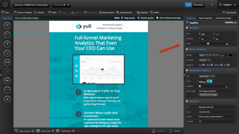
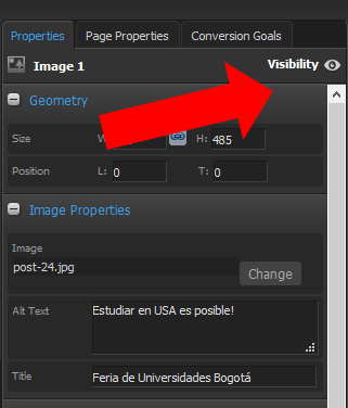
Every item you have on the desktop or mobile version has a visibility icon. On the panel in the right side.
When you click on it, it will either enable or disable it on each version.
You could also create different A/B versions to see what is working better. 
Hi,
I’m having trouble resizing text in the mobile version. When I use the scale tool it just resizes the box the text is in but the font stays the same size, am I doing something wrong?
Hey there Jenny! The scale bar should allow you to resize both the text and the text box on your mobile page version, so I’d love to check out your specific landing page, and take a closer look at the issue. Keep your eye out for an email from support@unbounce.com. I’ll be in touch shortly! :)
Have been having issues with this same thing – with extreme frustration. What about formatting text? I want text aligned left on the desktop version but the same text centered on the mobile version.
Additionally, some text was somehow copied and placed on both desktop and mobile versions… it’s not like normal text in that I cant edit or delete it (http://screencast.com/t/VWo90lumO) - how do I get rid of this?
Hi Sarah,
If you’re looking to have different formatting for text from your desktop to your landing page, you can duplicate the text element and show one version on desktop - and the other on mobile. To do this, you’ll just click the little eyeball on the lefthand side of the element and it will hide it on the view you’re currently working on.
! ](https://d2r1vs3d9006ap.cloudfront.net/s3_images/1410283/RackMultipart20160504-83818-1d4zuzr-Unnamed_image 60 inline.png?1462394966 “Image https//d2r1vs3d9006apcloudfrontnet/s3_images/1410283/RackMultipart20160504-83818-1d4zuzr-Unnamed_image__60__inlinepng1462394966”)
For the other issue (the double text issue) I would definitely reach out to our support team about that. Looks like that might be a bug. Give us a ring and we’ll get it sorted out: 1.888.515.9161
I also have this issue. Is there no way to edit mobile and desktop independently? This honestly seems ridiculous. I have moved things and deleted things to make them mobile friendly and that has ruined hours of work in my desktop version since I clicked save and assumed they would operate independently as would seem logical.
Hi Kirk,
I know that at first getting the hang of how things translate from mobile/desktop can be a bit tricky, but once you get using the Control/Command down, the whole process will be much easier.
Tip: You can avoid changing things on the other view by holding the Control (Windows) or Command (Mac) key when moving elements around.
Give this a shot and let me know if it helps!
I am pressing command while I shift but it still changes the positioning cross platform. Please advise?
I am having the same problem and holding down the command key while moving things around still does not seem to solve messing up the opposite view I am working on.
Just read this whole post - I didn’t know about the control keys etc… Some pretty helpful stuff!
If you find that it doesn’t work for you, you can always copy, then hide your content in your desktop view and in your mobile view, create a new section and paste the content in this section, format however you want, then hide the mobile section from the desktop view.
That’s how i’ve always done it anyway 🙂 ha!
The mobile version of my page is a mess. Text overlays on top of txt and graphics, background colors are different from the desktop version, and I have no idea how to edit it.


