Update:
We have now officially launched Sticky Bars natively within the Unbounce Builder! Click here to start using Sticky Bars on all your Unbounce landing pages! 🙂
Have you seen the 2015 Unbounce CTAConf page?? What a beauty!
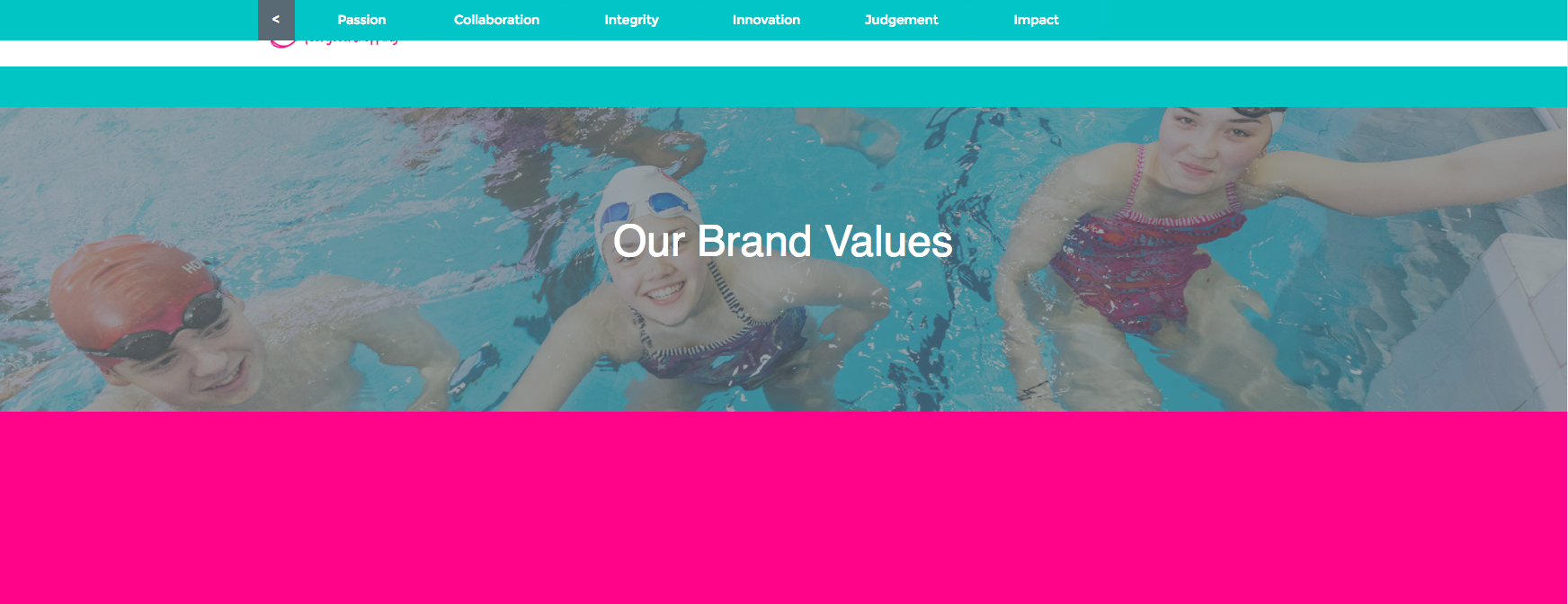
Here in Customer Success, we decided to dig into that page a bit and show YOU how to recreate its sticky navigation header on your desktop page using two Tips & Scripts. This header will allow your visitors to blissfully jump from one page section to another, all while keeping the CTA button ready and waiting for that all precious ‘click’.
How to Install in Unbounce
Click Here for Instructions
🚨
This is not an official Unbounce feature. This functionality is based entirely on third party code, and has only been tested in limited applications. Since this isn’t a supported Unbounce feature, our support team will be unable to assist if things go awry. So if you are not comfortable with HTML, Javascript and CSS, please consider consulting an experienced developer.
Instructions
Scripts Needed
Grab the two javascripts required for this setup here:
Step 1.
Build your header box. Add a box to your Unbounce page that spans across the entire width of your page section. You can completely customize the format of the header however you want.
Step 2.
Build your buttons. Drag a button element onto your page from the left-hand menu. On my page, I turned the button colour transparency down to zero and removed the button’s border so that just the text remains visible. Once you create the first button, you can just copy and paste it to create the additional buttons using our copy & paste tool.
Step 3.
Size and place the buttons inside your sticky header box.
Step 4.
Creating your button anchors. You can use any element in an Unbounce page as a button destination/anchor. You just take the box/text/page section’s Element Metadata ID and use it as your Button’s ‘Go To URL’ destination. Check out my screenshot of where these IDs can be found here.
Step 5.
For my button anchors, I will typically use a transparent box. They’re very easy to add and format. Drag a box onto your page, then turn it’s opacity completely down and remove its border. You’ll want to place these boxes to the spots on your page that your navigation bar is going to scroll down to and make sure you consider the length of your header when you place this box. When you place the box, make sure to grab it’s Element Metadata ID and then put it in your button’s destination URL field.
Step 6.
Add the two Javascripts. Once all of your navigation buttons are linked to the corresponding transparent box anchors on your page, all that’s left to do is adding the two scripts to your page for sticky header and smooth scrolling. Check out our documentation on how to add Javascript to an Unbounce page here..
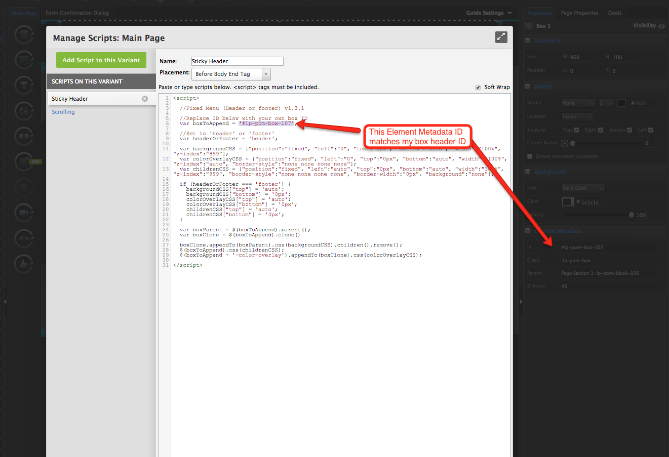
You can take the Javascripts mentioned at the beginning of this post and paste them right into your javascript editor on the page. You will need to grab the Element Metadata ID of your header box and put it into the Sticky Header javascript, check out where that needs to be done here.
Step 7.
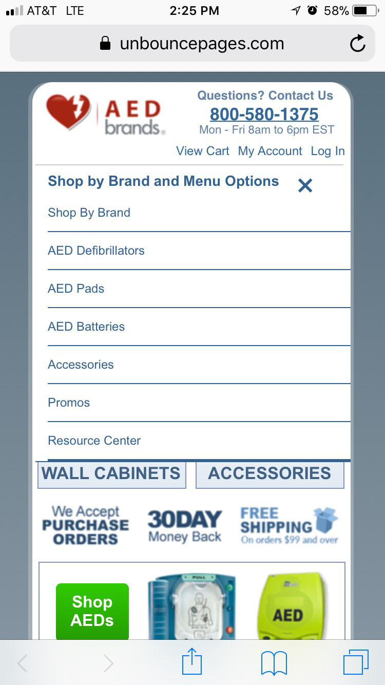
As mentioned in the title, this workaround is a desktop only feature. You will probably want to go to your mobile view and either compact the menu to make it fit on mobile, or hide its visibility completely. To see how our visibility tool works, you can check out our documentation here.
Testing
Like anything else you implement on your page, you’re going to want to test this out thoroughly to see what effect (if any) it has on your conversion rates. We recommend running an A/B test and segmenting a small portion of traffic towards the page - just to be safe.
Conclusion
This is a really slick way to have your customers navigate the different aspects of your landing page while still keeping your CTA on screen and ready to be clicked. 🙂
Can’t see the instructions? Log in or Join the Community to get access immediately. 🚀
Want to take your Unbounce landing pages + Convertables to the next level?
 Check out the Ultimate List of Unbounce Tips, Scripts & Hacks


