Hi @Jenna_Bensoussan!
Here’s a script you can use to fire any code on mobile or desktop only:
<script>

  if ( lp.jQuery(window).width() <= 600 ) {


    // Your mobile code goes here


  }else{


    // Your desktop code goes here


  }

</script>
All you need to do is remove the opening <script> and closing </script> tags in the Flexible Form Fields script and add it to the ‘Your desktop code goes here’ area on the script above. That will prevent it from firing on the mobile version of the page.
Hope you find this workaround useful. Have a great day!
Hello Vic - I’m trying to accomplish the multi-column (from here: http://unbouncepages.com/split-form-fields/) and am running into a bit of trouble. I’m going to send you a note via support to try and figure it out. You said the width of the fields will adapt to the width of the boxes, but that doesn’t appear to be the case. Any troubleshooting would be incredibly helpful.
I tried this and it kinda worked. I have form validation going on to show State and Province fields only if the US or Canada are selected respectively. In order for those fields to show up in the right place I had to add CSS code to place them on the form in the right place in the desktop version. How can I compensate for these two fields on mobile? Can I do conditional CSS for mobile for these two fields?
I can’t seem to make it work. I have a demo at http://ar-vida.primerolafamilia.com.ar/service-callback/
I create the boxes, I added the script, I followed every step, and it’s not working. The fields are not there.
I just created the boxes. Do I have to create a form instead?.
Any help is appreciated. Thanks!.
Max
Hi Max,
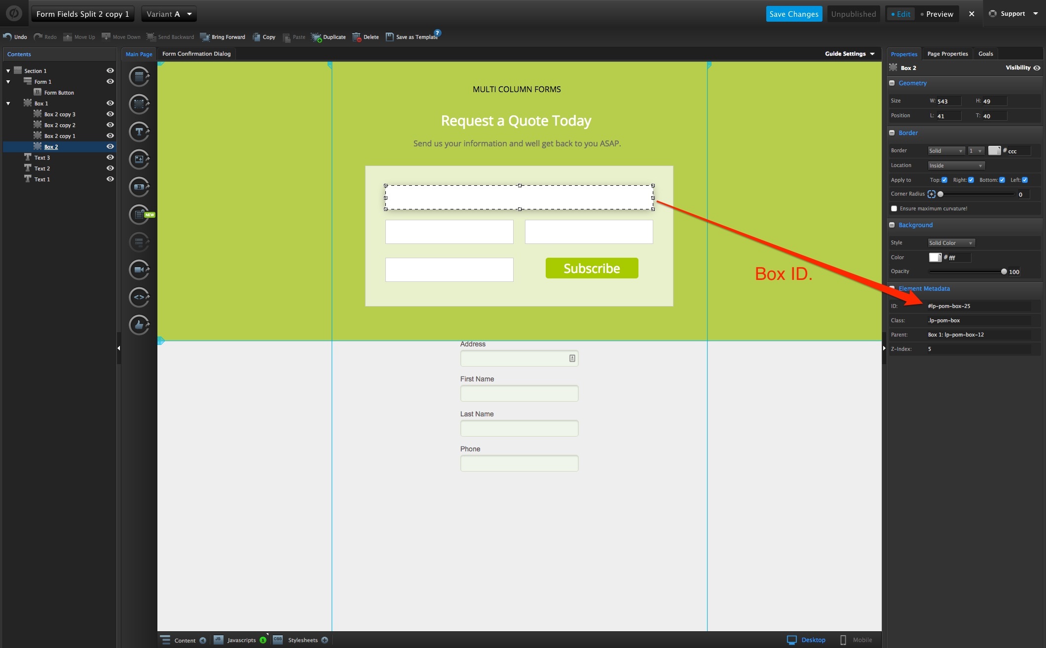
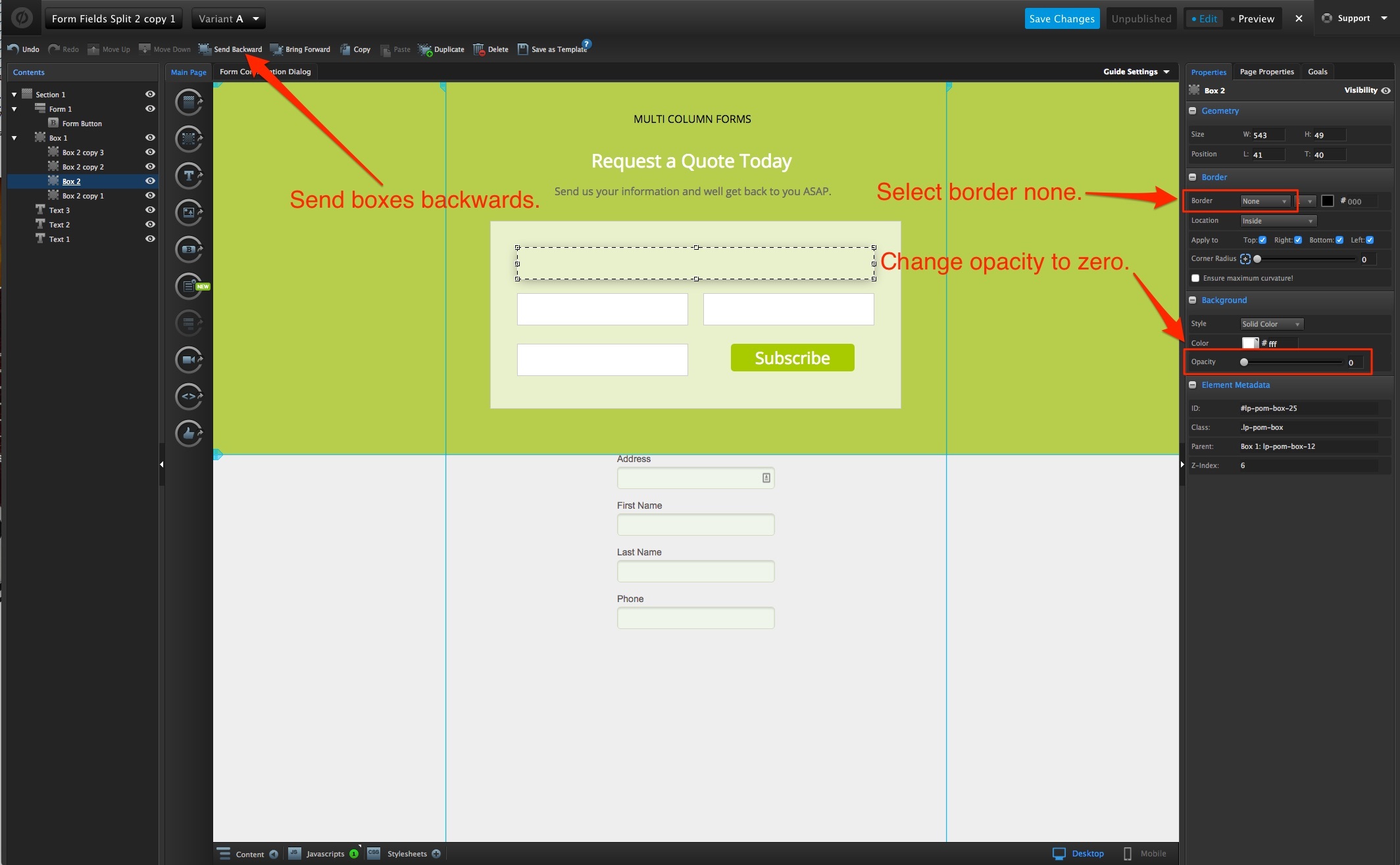
You have to do both. Your form has to contain the fields you are collecting data for. The boxes are for placement purposes only. Think of it as a front end and a back end. The form is the backend - it holds the data you want to collect. The boxes are the frontend - they are strategically placed where you want the form fields to appear. You will also need to make sure you send the form “to front” and the boxes “to back” otherwise visitors will not be able to enter data. Also - make sure you view how the form looks on your mobile version because you will need to move the boxes to fit a smaller screen if you have them positioned horizontally on the desktop version.
Thanks so much, Jenna!
Couldn’t have explained it better myself!
Jenna,
Thank you very much!. I could finally resolve it.
Cheers,
Max
Hi,
I have been trying this script on a new page I’m making. It works great (Thanks!) except for one thing.
One of the form fields can’t be selected.
So I made a page that has a monster form with 34 fields. When I tried it out in preview, and live, two of the fields would not work properly. All of the boxes are sent as far back as possible, and the form itself is sent as far forward as possible.
After deleting the two boxes, copying a box that worked, and pasting it two times, one of the fields in the newly pasted boxes started working. I naturally tried the same thing a few more times for the one that still wasn’t working. But after 5-6 times I gave up. I instead deleted the malfunctioning box and made a completely new one. I of course altered the script to reflect the new boxes names at all times. I sent the new box back as far as I can, but it still won’t work.
I even tried having the box display another form field, but that didn’t change anything. It was always the same box that didn’t work.
However, the field is properly displaying. And it is actually possible to select it by tabbing. And when selected, you can type in it. So it seems to work in every way, except that you can’t click the field to select it.
Any ideas?
Is there any thing else that could be blocking the form field? Is there anything else that I might have to do to make it accessible?
I have tried with both radio buttons (which is what I would prefer) and just a plain text field. Exact same result with both.
Very grateful for any help!
EDIT: I finally realized what the issue was! It was the positioning of the boxes. I had placed the two boxes too close together, although they didn’t overlap visually, the actual (but invisible) size of the form fields would cover each other. And even if one field was “in front” of the other, it made it impossible to select either one of them. Moving the fields further apart solved the problem for me.
Perhaps stupid of me to not realize it sooner, but using the visual editor sometimes makes you forget what is not seen 😉 Hope this might help anyone else out there with a similar issue!
Thanks again for the script, works really well!
Praying that this kind of flexibility becomes a built in feature soon
Vic,
I applied the code as you mentioned but for some reason Unbounce is showing me the script on Orange, meaning something is wrong. The form does works as intended, script to work on desktop but not on mobile. Here is the code. What could be wrong?. Could you let me know?. Thanks.
Hello,
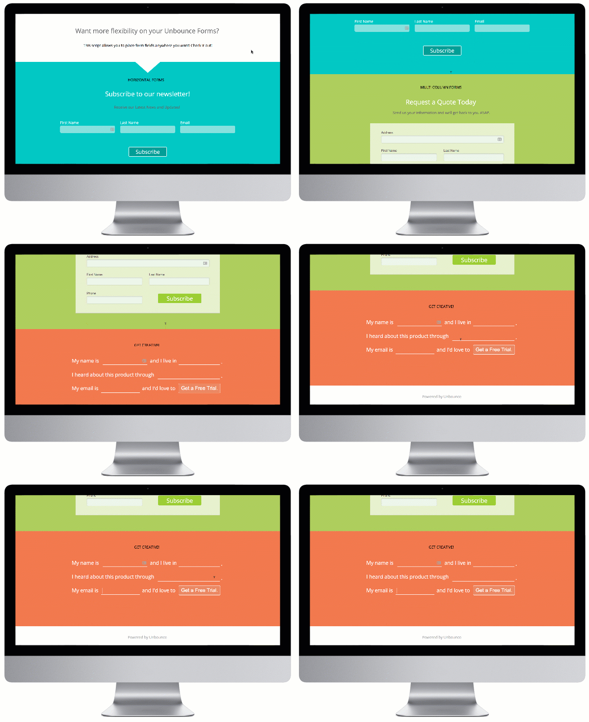
I was trying to create the flexible form fields using the steps, but I was not able to see the expected result.Can you add the images of each steps. It would be great If we have the images of how to create each step.
I implemented the flexible form fields. The error message div is overlapping with the form how can I change the position of the box.
Hi,
I’m trying to create a mobile view with a flexible form. If I preview the mobile view, the preview shows me the boxes of the desktop view. I have used the script, which “fires any code on mobile or desktop”, too. I even have created seperate boxes for mobile view and disabled the view of the boxes for the desktop view, but still only the desktop boxes are shown. I have change something on the mobile view and press save and refresh the preview, it takes the boxes of the mobile view and also shows them on the desktop view.
I have already spent some hours to figure out why this happens, would be great if someone could help me out here.
Best and also thanks for the great script.
Kurbm
OMG Vic!
I freaked out cause I thought the github link was created specially for me since it has my name on the url hahahahahaha
😂
Specially for you friend! 🤣
Hello!
Thank you for this script. I’m using it on several pages and it’s working great.
I generated a new page based on an old one, and can’t seem to get the form fields to display.
Could you please check it out?
http://unbouncepages.com/november-enewsletter-1/
The second set of three boxes should also have checkboxes at the top.
Wow @JasonRoach, love your page! How did you get those checkboxes with images done?
Does this add any extra space to the right side of the page for anyone else?
When I remove the script the space is no longer there. Can anyone assist… @Vic ?
In addition to this I have found a work around for the desktop/mobile issue. (Mine was only working properly on load and if i resized the window, it would not work - which I realize that a user will usually just see one version, but a client will most likely view mobile on a desktop)
It is a bit wonky… but it works.
Just copy the fields on the mobile editor, hide the old ones, and place the corresponding fields in the script.
<script>


  $(document).ready(function() {


    var windowType;

    var $wind = $(window);


    var mobileCheck = function() {

        var window_w = $wind.width();

        var currType = window_w < 940 ? 'mobile' :'desktop';


        if (windowType == currType) {


            return;

        } else {

            windowType = currType;

        }


        if (windowType == 'mobile') {

                          lp.jQuery(document).ready(function($) {


    //Change #lp-pom-box-01, etc. for the IDs of the boxes where you want the form fields to display.

    var boxes = s"#lp-pom-box-175",

                 "#lp-pom-box-176",

                 "#lp-pom-box-177",

                 "#lp-pom-box-178",

                 "#lp-pom-box-179",

                 "#lp-pom-box-180",

                 "#lp-pom-box-181"];


    $('.lp-pom-form .lp-pom-form-field')

      .each(function(i, field) {

        $(field)

          .offset($(boxesoi]).offset())

          $(this).children().width($(boxesoi]).width()-16)

      });

  });

        } else {

              lp.jQuery(document).ready(function($) {


    //Change #lp-pom-box-01, etc. for the IDs of the boxes where you want the form fields to display.

    var boxes = s"#lp-pom-box-151",

                 "#lp-pom-box-152",

                 "#lp-pom-box-146",

                 "#lp-pom-box-147",

                 "#lp-pom-box-148",

                 "#lp-pom-box-149",

                 "#lp-pom-box-150"];


    $('.lp-pom-form .lp-pom-form-field')

      .each(function(i, field) {

        $(field)

          .offset($(boxesoi]).offset())

          $(this).children().width($(boxesoi]).width()-16)

      });

  });

        }

    }


    mobileCheck();

    var resizeTimer;


    $wind.resize(function() {

        if (resizeTimer) {

            clearTimeout(resizeTimer);

        }


        resizeTimer = setTimeout(mobileCheck, 300)

    });


});


</script>
If anyone has an alternative to this, please share!!
Thanks!
I don’t remember what I did, but I’m having the same trouble again. I add form items, add the appropriate boxes, add the box #IDs to the script, but it won’t add the new ones.
http://unbouncepages.com/August-enewsletter-2
I’m inspecting the code of the page and it’s just not plugging the form information in.
Any ideas?
Thanks for the Great Script People… it definitely saved me solid time… One question however, can i make multiple submission buttons on the page ?
Hi @Vic,
I’m currently trying to make these flexible fields work but I have pain doing it Is it possible to make a video call so that you can help me make it work ?
Shouldn’t be long !
Thanks in advance for your help
Best,
Arnaud
Hi,
I´ve been reading the thread but apparently no one went into this issue before.
These forms (in the gif attached) seem to work nicely.
But the cursor only allows the user to type something in the lower part of the field.
From the middle part up, the cursor becomes an arrow and prevents the user from typing.
Any ideas why this might be happening?
Desktop version live at: https://test.baisargentina.com/2-fields-test/
Thanks!

This seems not to work anymore. At least to me. The code provided does absolutely nothing.
Is this somehow connected to jquery removal?
I can’t seem to get this to work on any of my forms. Is this script out of date? I’ve copied it word for word, step-by-step, and it doesn’t do anything.
Hi, I’m having the exact issue you described, it’s adding extra space to the right of the page. Were you able to find a solution to this?
Can anyone confirm that this still works?

 to the next level?
 Check out the Ultimate List of Unbounce Tips, Scripts & Hacks


