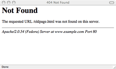
Ugh. We’ve all been here (and, it’s the worst):

A 404 error means “not found”. This usually happens for one of three reasons:
- The user mistypes or misspells the web address
- The web page is deleted
- The web address has changed (or the page content has moved)
The problem is that the standard 404 page is ugly and unhelpful:
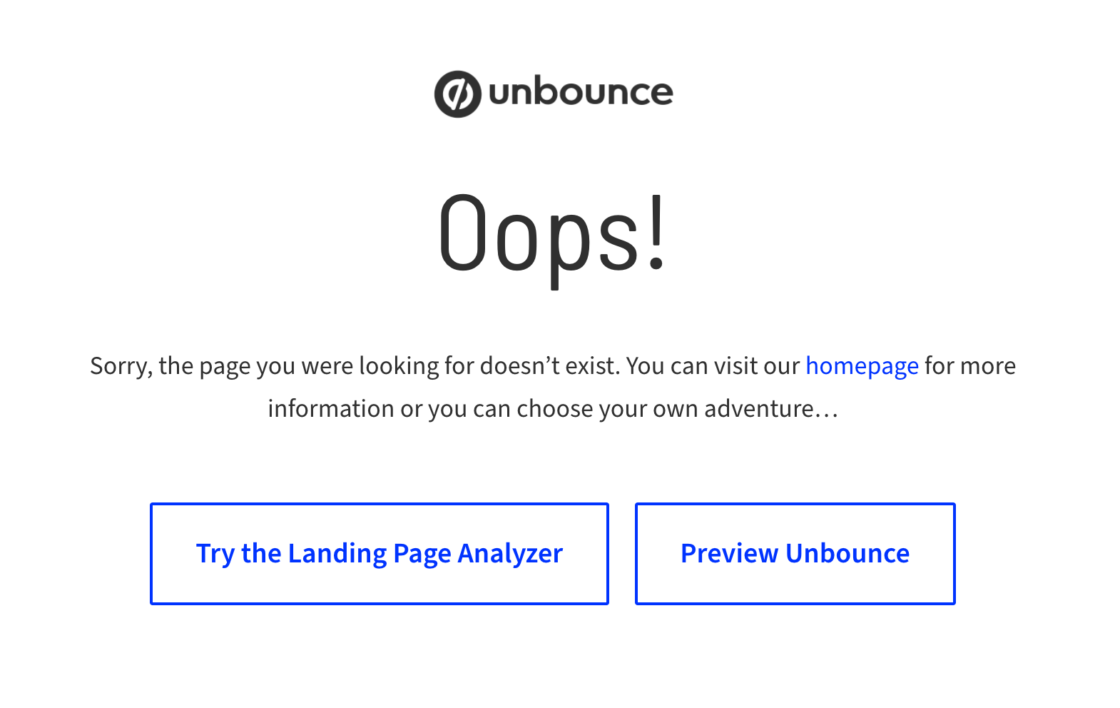
It’s really easy to create a custom 404 page using Unbounce - all you do is create the page in Unbounce (as usual) using the path /404/ of your website’s domain:
Step 1: Create a new page in Unbounce that you’ll use as your 404 page
Step 2: Save and publish your page
Step 3: Change the URL of the page to /404/
Should you customize your 404 error page?
If you’re in the business of delight, the answer is almost definitely. Moving away from the status quo (ie the typical page above), means it’s possible to create a more bearable user experience (and possibly even delightful visitors). At the very minimum, by customizing your 404 error you have the ability to be on-brand.
It’s even possible to turn a 404 error page into a mutually beneficial experience: consider adding a form to your 404 page and try collecting leads. (I’d love to see this tested!!)
If you decide to create your own 404 redirect page, think about how you turn this painful user experience into a delightful experience. Here are 4 ways make the most of your customer 404 page:
Explain the situation like a human being. Tell visitors why they ended up there (in layman’s terms), and treat the 404 page as a chance to be on-brand and delightful. Don’t hide behind the technical language we’ve always come to expect. Most
Be helpful. Take advantage of the fact that your user may not know where to go next. Link to some your best content (blog posts, homepage, etc.).
Give the option to report a dead link (or at least get in touch). Allow users to participate in making the site better can make them feel useful and help you fix the problem for future searchers. At the very least, give visitors a support email address so they feel their voice matters.
Bonus points for humor and delight. 404 error pages are annoying and sometimes inevitable, but these brands are making lemonade from lemons.
Have an example of a clever 404 page? I’d love to see it!


