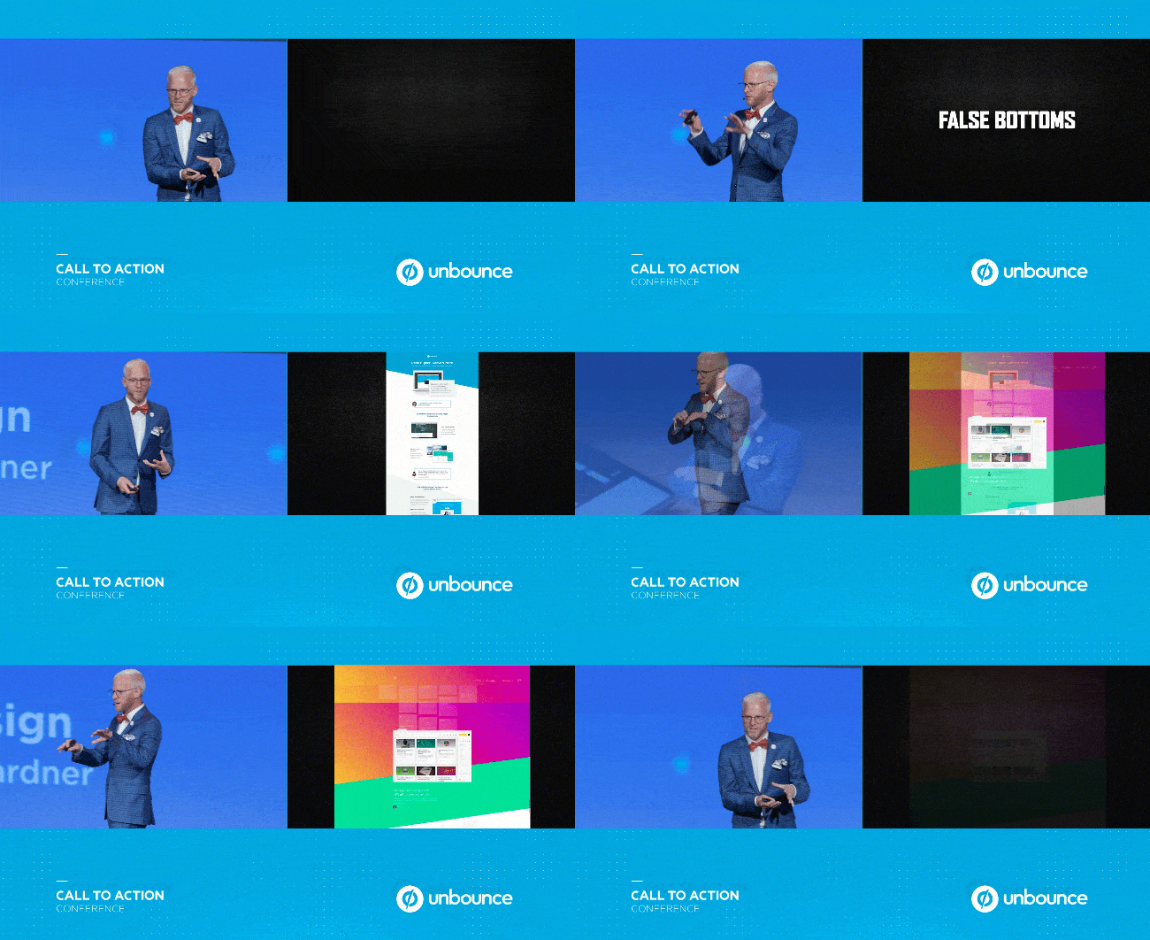
One of our favourite highlights from @Oli_Gardner’s talk at CTAConf 2017 was his tidbit on asymmetrical design - but more specifically, false bottoms.
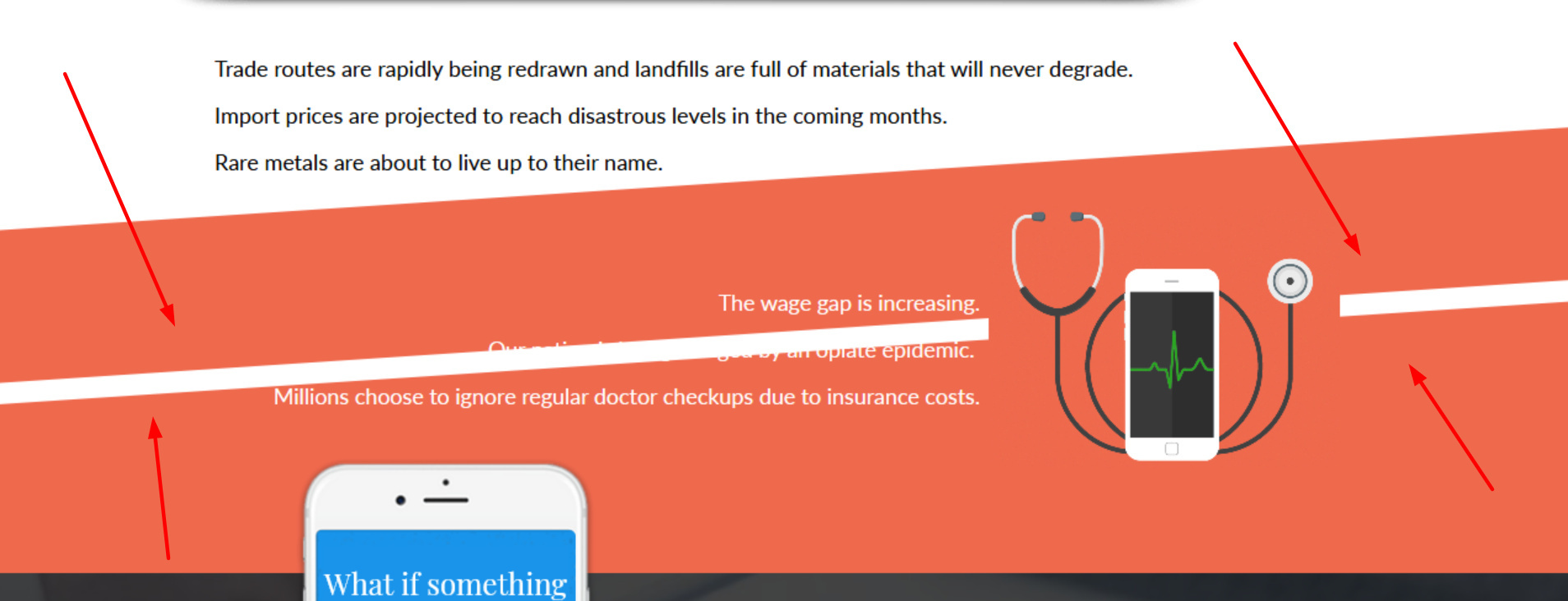
Implementing angled page sections is is a subtle way to indicate that more content exists below the fold, and subconsciously prompts visitors to scroll down to find it.

This isn’t a native Unbounce feature, but we’ve put together a quick CSS script that will allow you to achieve this effect in Unbounce quickly and easily.
You can see this in action (built in Unbounce) here:
http://landingpage.noahmatsell.ca/angled-page-section-demo/
How to Install in Unbounce
Click Here for Instructions
🚨
This is not an official Unbounce feature. This functionality is based entirely on third party code, and has only been tested in limited applications. Since this isn’t a supported Unbounce feature, our support team will be unable to assist if things go awry. So if you are not comfortable with HTML, Javascript and CSS, please consider consulting an experienced developer.
Step 1.
🔗 Get the latest script here: https://gist.github.com/noahub/783cf6bc402bf4cc99cb84aa8927c8f8
Step 2.
Copy the CSS and paste in your Stylesheets
Step 3.
Create a page section and replace the the ID in the script with the target page section ID.
Step 4.
Use the #lp-pom-block-34:after CSS rule-set to give a section an angled bottom and #lp-pom-block-34:before to give a section an angled top.
Step 5.
Optional: Change the value of skewY in the CSS to increase or decrease the angle or your top/bottom.
–
That’s it!
Did you find this tip useful? Show us how you implemented it with a screenshot of your landing page in the comments below! 🙂
Can’t see the instructions? Log in or Join the Community to get access immediately. 🚀
Want to take your Unbounce landing pages + Convertables to the next level?
 Check out the Ultimate List of Unbounce Tips, Scripts & Hacks


