Young Entrepreneur Seeking Feedback for First Landing Page


1: What challenge are you currently trying to solve? Give as much detail as possible

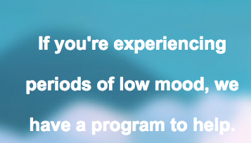
Trying to get people to sign up for a wellness program to help improve mood (decrease depressive symptoms). It is an 8-week program for $150.

I am trying to get people to sign up to learn more. We do not currently have a “buy now” feature.


2: How are you driving traffic to your page?

Facebook ads targeted to people interested in wellness and self-improvement. They see an ad offering a program to improve their mood. Just launched the ad yesterday and it has a CTR of slightly over 1%


3: What is your conversion goal?

7% of people that come to landing page provide email.


4: Provide a link to your published landing page / convertable:

www.sparkmyhealth.com


4 replies

Hi @jaybrown,

First thing I noticed was your CTA. I would make it a little bigger and since visitors have to scroll down on the page I would add another CTA in the bottom of the page. This will give the visitor another opportunity to convert.

Try testing where a person can add their email right on the landing page and submit their info. Here is an example of one I made and tested.
47%20AM

Also. I would test another color for your second heading is seems a bit hard to read, maybe test black.
35%20AM

Hope this helps!

Thank you so much for your feedback! Those are great ideas and I will incorporate those now.

Userlevel 5
Badge +2

Hi @jaybrown!

To add onto what great advice @Blandon gave…

  • 1st Section - place a box and set your logo of the plug as the background to make it less pixelated and make “Spark” centered with it - right now it looks a little higher. I would also make this a sticky header and add a “Join Now” CTA - A nice logo ensures trust.

  • 2nd Section - How do you access your program? Is this a website, an app, a phone coach? Elaborate more on this and make it your header.

  • 2nd Section - Do you have another background you could use that is more related to the product? I think it is a mountain - but it is too blurry. (If this is an app or website I would place a photo of the app/website on an actual phone)

  • 2nd Section - As @Blandon said, I would test this with form on page.

  • 2nd Section - Test the CTA - try to test “Join Group Now” or some other variations.

  • 2nd Section - Because the arrows are below the CTA and have an animation - it pushes the user’s eye past the CTA. I would place right above and maybe only use one. All three seems too pushy. They also look pixelated. Clean images create trust.

  • 3rd Section - I like the 3rd section, but again would try to use boxes and set those icon images as the background so they do not get pixelated on Macs. The title of this section is smaller than the text below the icons, maybe make the title smaller but in all caps, and use some letter spacing to differentiate the two. Add an additional CTA at the bottom of this that sends users to the form.

  • 4th Section - Could you make the image round? If you place it in another box you will be able to achieve this (with the photo set as the background). I would also center her name and title. Her quote also appears rather small on mobile. On mobile, I would place another CTA.

  • 5th Section (Footer) - Place the logo above “Wellness is Possible”. I feel as though this creates trust. I would also make both links the same color as the color of the background in the section above (rgba(39,153,136,1)). Add an additional CTA at the bottom of this that sends users to the form.

TEST, TEST, TEST!!!
Hope this helps! Feel free to message me if you need any help!

This is amazing feedback! Thanks Caroline. I’ve totally redesigned the page based on yours and Blandon’s feedback.

Reply