What do you think of my pages...Need Feedback!


1: What challenge are you currently trying to solve?
Improve conversion rate

2: How are you driving traffic to your page?
Google Ads

3: What is your conversion goal?
15-20%

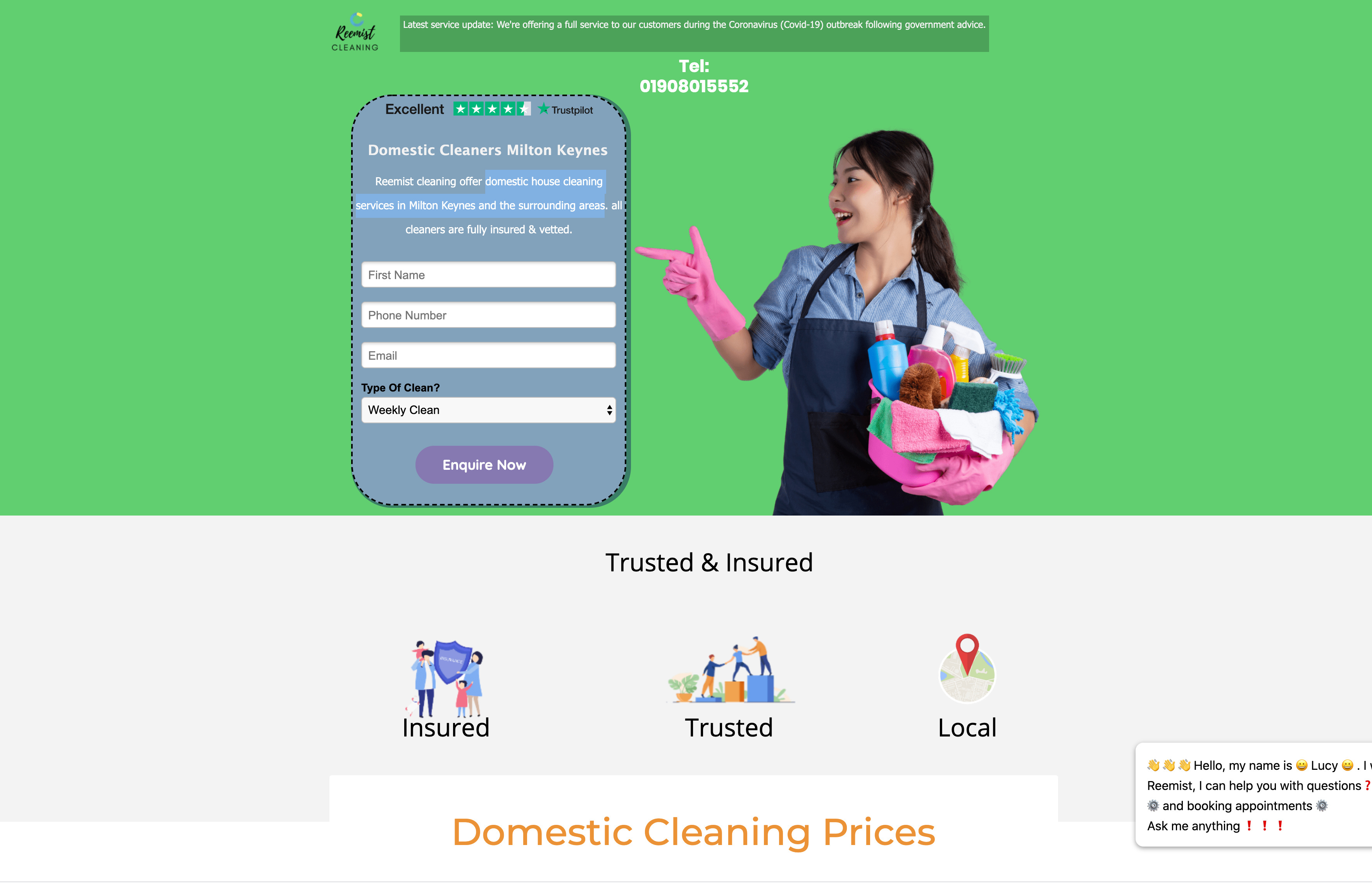
4: Paste a link to your published landing page/popup: 👇
Landing page with smart traffic and low conversion rate (is there a way to view both of the variants? when I get one I’m unable to view the other).
https://get.reemistcleaning.co.uk/domestic-cleaners/milton-keynes/

As well as the landing page has a low conversion rate the popups also have low conversion rate with variant A having 0% and variant B having 2.94%

All feedback and critisism welcome ! 🙂


3 replies

Userlevel 7
Badge +1

Hi Imran 👋

Here’s a screenshot of the page that I’ve reviewed here:

There’s a lot of good content in here, I’ll share my two cents.

What I love ❤️

  1. The Trustpilot iframe, that’s a brilliant way to display customer reviews. It’s clear and reliable, I’m going to recommend this to lots of other folks from now on 🙂
  2. The chatbot. I think it’s a great way to connect with your page visitors if they have questions.
  3. Smart Traffic! Love that you’re getting involved with machine learning 💪
  4. The regular clear vs. one-off clean price breakdown is great! It may however make it difficult to measure the performance of your landing pages since they’re two different CTAs, just something to think about.

What I’d test 👨‍🔬

  1. The form:
    I would try a different design here, it doesn’t really flow with the rest of the page contents. I’d consider removing the dotted border, and the background colour. You could have a transparent background so that all you see is the 4 form fields.
  2. There’s no headline. If I land on the page, I’m not 100% certain what the offer is here. I’d use something like “domestic house cleaning services in Milton Keynes and the surrounding areas”, as a headline at the top, that way you can take that line out of the form to clean it up a bit.
  3. The list of locations at the bottom. There are Google maps iframes that you could use to better illustrate the areas that are eligible for this service.
  4. I’d give this page a title, it cleans it up a little bit:
    Screen Shot 2020-06-22 at 9.56.01 AM
  5. The announcement at the top is a great way to make sure your visitors know that this page is taking measures to follow COVID guidelines - but it might look cleaner in a sticky bar format or a floating header.
  6. The logo in the top left corner of this page is quite small, and it’s the only instance that the brand appears on this page. I’d suggest making this a bit bigger, along with a headline.

Okay that’s a lot of information to go through so I’ll leave it at that for now.

In terms of viewing specific variants of your page, if you add a.html or b.html to the end of your URL you’ll be able to view your separate variants (without affecting your page stats). So it will look like:
https://get.reemistcleaning.co.uk/domestic-cleaners/milton-keynes/a.html

Another important question I’d like to ask is what are you testing with your Smart Traffic variants?

Hope this helps for now, looking forward to hearing updates on how this performs!

-Jess

Badge +3

A few thoughts – now with video!

Badge
  1. Problem: The Phone numbers mentioned more than once on a page occur often but considering that it has the same purpose of being a CTA can get annoying for the user.

Solution: Having a highlighted button at the top right can work really well.

  1. Problem: Title “Domestic Cleaners Milton Keynes” reveals more about the business and not about the aids or offers the landing page was formulated to convey.

Solution: Having a strong heading that conveys the offer would express the purpose in the very first look.

  1. Problem: At the end of the second section (Trusted & Insured), there is an overlapped rectangle of the “Domestic Cleaning Prices” section. Overlapping is right but not obvious and evident, and that’s because it doesn’t have any depth and contrast, which seems like an error.

Solution: Just pose a bit shadow on the overlapped rectangle.

  1. Problem: Finally yet most importantly, a lead generating landing page should consist of a source of action to get the required information. The primary goal of the landing page contact form is to solve the actual goal, which is securing interest and encouraging the visitors to find out more about a product or service they are offering at present.

Solution: Placing a contact form in the header or in the footer as the most highlighted section of the landing page will help to get a good addition to leads. It is an offbeat technique to multiply your lead generation results.

We hope it helps you to a great extent.
Thank you

Reply