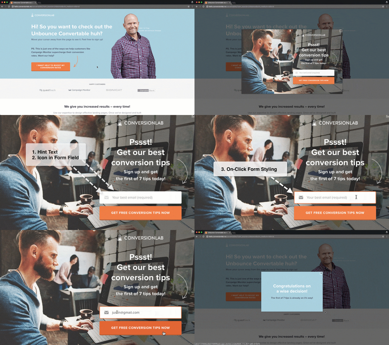
To celebrate the launch of Unbounce Convertables, we’re sharing 3 easy scripts to help you get the most out of your new overlays.
Our team at ConversionLab was one of the first to gain access to the Convertables beta. Over the last three months, we’ve launched numerous overlays across a number of different websites, and even deployed a high-converting overlay on our own site.
We’ve been seeing a ton of conversions so far, but in the spirit of pushing the envelope, we’ve discovered a few small tweaks that helped push our conversion rates even higher.
1. Add Hint Text to Your Form
2. Add a Custom Icon to Your Form
3. Add Unique On-Click Form Styling
You can see a demo of these scripts in action here: http://hello.conversionlab.no/convertables/
How to Install in Unbounce
Click Here for Instructions
🚨
This is not an official Unbounce feature. This functionality is based entirely on third party code, and has only been tested in limited applications. Since this isn’t a supported Unbounce feature, our support team will be unable to assist if things go awry. So if you are not comfortable with HTML, Javascript and CSS, please consider consulting an experienced developer.
Tip #1 - Add Hint Text to Your Form
Click the JavaScript tab at the bottom left of the page builder- Paste this Javascript
Customize the field names and placeholder values to match the fields in your form as show in the below screenshot
https://unbounce.zendesk.com/attachments/token/7iUns1hKtHdYHVmc1o6DfYHqu/?name=placeholders.png
Tip #2 - Add a Custom Icon to Your Form
Upload the icons you want to use to somewhere the icon image can be accessed using a URL. E.g. we have this on our website, located at: http://conversionlab.no/assets/email-light.png
Click the Stylesheet tab at the bottom left of the page builder- Paste this CSS script
Match the field name according to your form field name
(Optional) Specify a different icon for “focus” state, or keep the same icon
Tip #3 - Add Unique On-Click Form Styling
Add a border to your form field with your desired width. Use the same color as your form field if you want it to be “invisible”
Click the Stylesheet tab at the bottom left of the page builder- Paste this CSS script
Change the colour code to match your preferred highlight color
Can’t see the instructions? Log-in or Join the Community to get access immediately. 🚀
Voila! You now have a supercharged Unbounce Convertable that should drive even more conversions.
Did you find these scripts useful? Or do you have any tips of your own? Sound off in the comments below and show us what you’re working on! 😀
Want to take your Unbounce landing pages + Convertables to the next level?
 Check out the Ultimate List of Unbounce Tips, Scripts & Hacks


 !
!