Hi, I’m building a landing page with a form that sticks to the right side of the page. I’ve used the ID with position: fixed; to make this happen.
Is there a way to disable this for the mobile experience?
Thanks!

Hi, I’m building a landing page with a form that sticks to the right side of the page. I’ve used the ID with position: fixed; to make this happen.
Is there a way to disable this for the mobile experience?
Thanks!
Hey there,
I would suggest that you hide 👁️🚫 the form on mobile and use a new form in the mobile builder.
Likewise make sure you hide your new “mobile” form from the desktop view. You can select the 👁️ icon in the “Contents” tab in the builder to accomplish this.
Let me know if you need anymore help!
I tried what you said, but wasn’t able to drop another form on the page. Correct me if I’m wrong, but I think I can only have one form per page.
Ah that’s right, crucial error on my part. Sorry about that.
Hmmm I’m thinking of other options that don’t get too complicated 🤔
 +2
+2
Hi @BlaineBelo!
You could try using this bit of css:
<style>

  @media only screen and (max-width: 525px) {
  #lp-pom-form-181{
  width: 100% !important;
    }
}

</style>
Or maybe something some alternative styling to remove the float.
Just make sure to replace the form ID with yours.
Hope that helps!
Boom! @Caroline knows what to do 😃
Custom CSS would be my last resort. @BlaineBelo if you can implement an @media only css…for the float portion of the form, I bet that would be bulletproof.
Thanks @Caroline and @Kyle.C, but I still can’t get it to work.
I tried the media query you sent me, but it seems to have the opposite effect. Maybe sharing the actual page could help: http://www.beloandco.com/print-promo-credit-unions/
Thanks.
+2
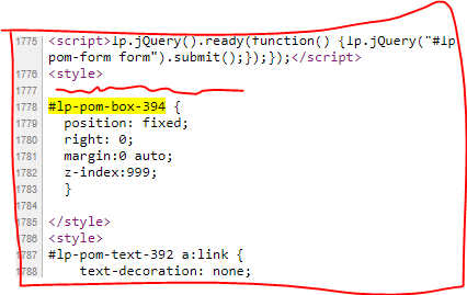
Looks like the box the form is in is set to fixed. Here is what I am seeing:
@media only screen and (max-width: 525px)
#lp-pom-box-394 {
    position: fixed;
    width: 100% !important;
    right: 0;
    margin: 0 auto;
    z-index: 999;
   }
Did I mention that I don’t know what I’m doing? I cobbled that code together from other forum posts. There isn’t any info I’ve found that can help me achieve my goal which seems like a CRO no-brainer.
Goal: a sticky form that slides on the right side of the screen on Desktop, but remains static on mobile so it doesn’t cover up all of the content.
If you could help provide code that does this then I would be massively grateful.
I added your code from the above post, but the form doesn’t slide on desktop.
Well what I see in your page doesn’t include @Caroline’s suggestion.
It will be crucial to have @media only screen and (max-width: 525px) in the box styling where my red squiggle is. Are you able to include that?
I updated it with the code, but it still isn’t working correctly:
https://www.beloandco.com/print-promo-credit-unions/
Got it, so if I understand your code correctly… we need to make two edits and we are done!
In the code you just edited, change “fixed” to “absolute”.
@media only screen and (max-width: 525px) {
#lp-pom-box-394 {
position: absolute;
right: 0;
margin:0 auto;
z-index:999;
}
}
Then we need to make opposite change for the desktop styling “absolute” to “fixed”. But I’m not sure if that is part of what you have added custom.
#lp-pom-box-394 {
display:block;
background:rgba(245,245,245,1);
-pie-background:rgba(245,245,245,1);
border-style:none;
behavior:url(//d9hhrg4mnvzow.cloudfront.net/PIE.htc);
border-radius:0px;
left:8px;
top:240px;
z-index:13;
width:303px;
height:651px;
position:fixed;
}
+2
Sorry @BlaineBelo - I was at work!
Here is the code you will need. Just update your IDs.
<style>

#lp-pom-box-185 {
  position: fixed !important;
  right: 0 !important;
  margin: 0 auto;
  z-index: 999;
  }


  @media only screen and (max-width: 525px){
	#lp-pom-box-185 {
    	position: relative !important;
  }
  }

</style>
Here is an example of it working: https://unbouncepages.com/test-page-fixed-form/
Hope that helps!
I’m glad you got it working @BlaineBelo 🙂
Thanks @Caroline
I need to ask both you and @Caroline since you guys worked on this.
Is there a tested way to stop this sticky form at footer? Since what is currently happening on my page, on some devices, is that the form goes through the footer due to display having a smaller height. You can check that out here http://unbouncepages.com/shiftsuite-landing-page/
Any feedback would be appreciated. Thanks.
Hi @Caroline, I am using the same code that you provided for my sticky form.
The form is an embedded hubspot form and I would only like it to show sticky/ fixed in desktop. Currently it’s still sticky for mobile for me. Can you please take a look?
https://lp.storehub.com/sticky-test/ >> here is my test LP
Im facing the same issue than BlaineBelo, I’d like my form to be sticky in the desktop version but not in the mobile version, where it should be at the bottom of the page. I’ve read your conversation but I dont get where I should verify and change my code (Im not good in coding).
Could you check my page and tell me where I should change it ?
https://pro.opera-energie.com/test-fin-trv-1/
Thanks for your help!
No account yet? Create an account
Enter your username or e-mail address. We'll send you an e-mail with instructions to reset your password.