Mobile Width 2019


Badge +1

Hi all,

Long-time Unbounce user here!

To jump straight to the point,
I’m looking for a solution to Unbounce’s 320px mobile width limit.

I understand you can remove the width boundary in the editor, which allows users to build outside of the 320 pixels. However, anybody viewing the published page with an iPhone 4 or smaller will have the edges cut off the screen.

I’m looking for solutions and workarounds that you guys have been using!

Maybe there’s some code that will help the page stretch edge-to-edge based on the device?

I’d really appreciate your input!


10 replies

I’m very interested in this too.

Hi Alan, did you hear from anyone on solutions for this?

Userlevel 7
Badge +4

Hi Kylee,

What are you trying to achieve? In some cases, there are workarounds depending on the required result.

Hi Stefano,

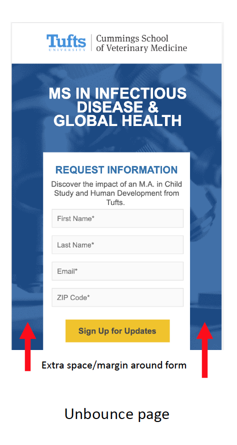
Can the form go further to the edge of the browser on mobile?

Is there a workaround to do this?

Userlevel 7
Badge +4

Hi Kylee, for clarification you’d like the background to be all white or would you also like the fields to be full width?

I want the fields to be wider. They should be flush against the sides but wider.

Userlevel 7
Badge +4

Hi Kylee! Let me see if my CSS skills could make something work here. It might be tricky due to the set width and absolute position.

Hi Stefano, were you able to come up with a solution?

Userlevel 7
Badge +4

Hi Andy! We requested to work on variant of that particular page for testing but I unfortunately did not hear back. Did you have a similar request?

Reply