
Hi, I’ve been working on flexible form fields using the script provided here, and there’s one problem which I noticed that I have not been able to solve yet.
The scripts when saved in desktop or mobile view the after laying out the same boxes will not be responsive in the counterpart view. If I saved it in mobile view, the desktop preview will not show the form. If I saved it in the desktop view, the boxes in mobile preview appear like how I laid it out in desktop’s.
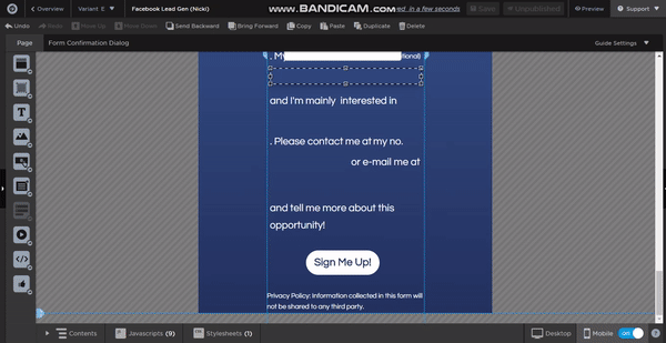
Any way to make the script mobile responsive? Thank you!
Best answer by nicki123tw
View original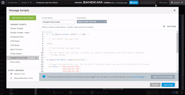