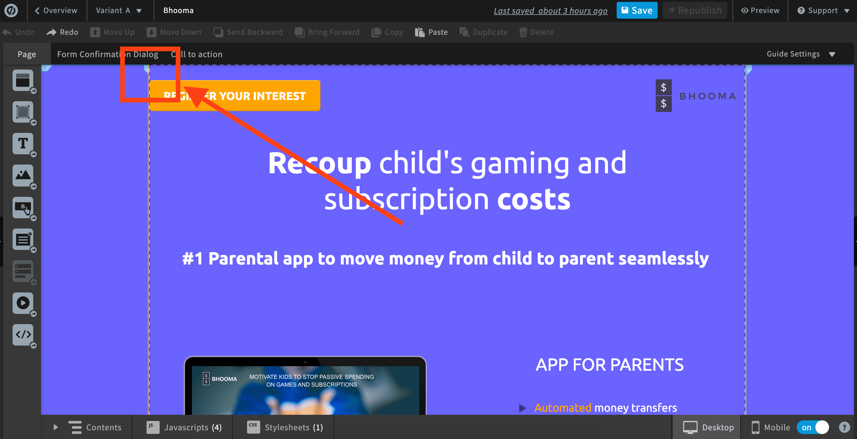
Hey @VivekAyer! I’m looking at your landing page and it doesn’t appear to me like there’s a lot of space on either side of your landing page. However, I’m looking at it on my laptop view (which is recommended for designing for desktop). Are you looking at it on a wider monitor perhaps?
If the content on the page is stretched further to either side, you run the risk of content being cut off in a smaller window.
It’s possible to drag the rulers on either side of your page while you’re editing, this will stretch the content out a bit.
Hope this helps!
-Jess
Dear Jess, thank you. I changed the width to 960 px today. It gave me some extra space 🙂
In google analytics, you can determine the screen size of the traffic you’re getting. I did that recently and changed my layouts to be optimized for 1920x1080.

