Landing Page Newbie! Please offer feedback

  • 26 September 2017
  • 20 replies
  • 8 views

1: What challenge are you currently trying to solve? Give as much detail as possible

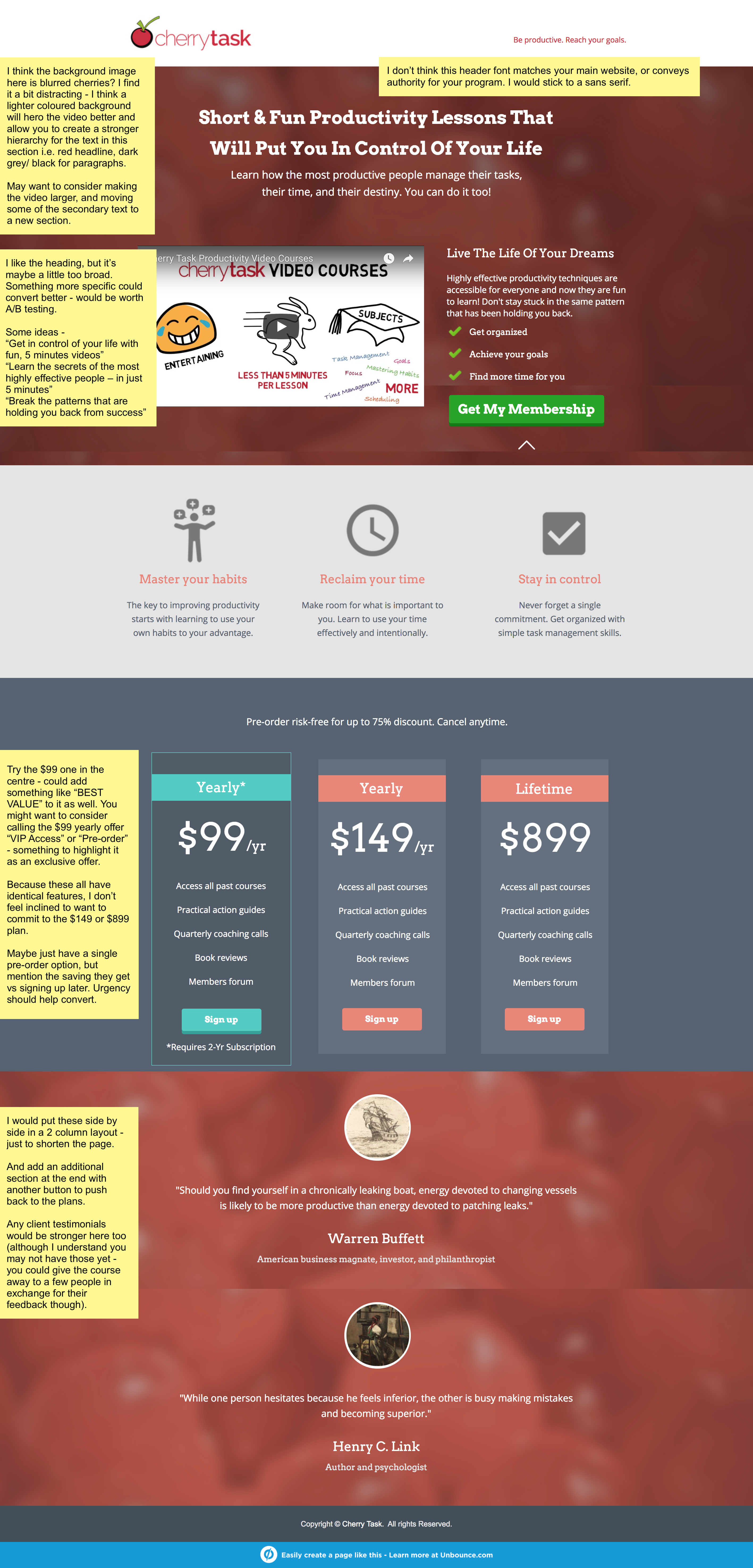
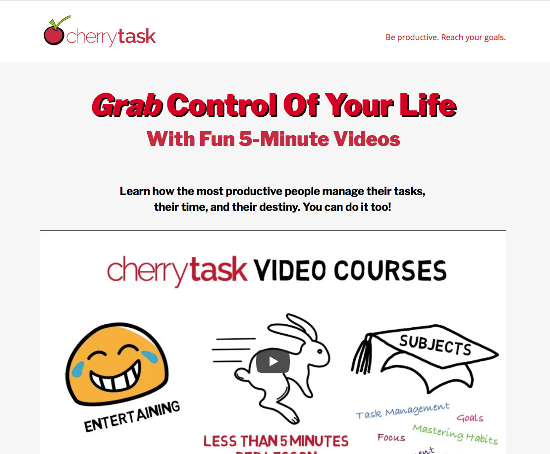
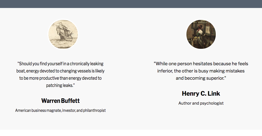
Hello! This is my first website/landing page attempt. I’ve tried to follow all the advice I can find on Unbounce and elsewhere, but I’m a newbie… 🙂 I’d love some feedback on how to improve it. This page has not been advertised yet, and is not yet linked to my membership site or any CRM. I should also add that I have not set up the mobile responsive view yet. I want to try and see if I’m on the right track first. I’m trying to nail my design before that stage.


2: How are you driving traffic to your page?

I will first take some targeted Facebook ads to drive a small amount of traffic to test conversion. Once I’m happy with that I will use Facebook and AdWords to drive traffic to a viral contest. At the end of the contest, participants will be directed to a version of this page that will announce the winner and make a special offer for entering the contest. They will have 72 hours to make the purchase (at half the price of what is listed on this page via a coupon code). So this page will continue after the contest to collect memberships from facebook and adword ads. For now, it’s goal is to test for conversions before the contest.


3: What is your conversion goal?

To get a click to subscribe to the membership site. This will be a pre-order. The product (video courses) is still under development.


4: Provide a link to your published landing page / convertable:

http://get.cherrytask.com/subscribe/

I did not set up a convertable yet. I still have to figure out that one!

The web site cherrytask.com will give you an idea of the rest of the branding.

Thank you in advance for any comments! I appreciate any help I can get. 🙂


20 replies

Userlevel 6
Badge +3

Hey, great first page! 🙂 I’ve left some feedback on the screenshot for you –

Excellent feedback! Thank you. I will work on it and post when I have some changes implemented. I wasn’t too sure about that background too! You convinced me. 🙂

Oh, and what did you think of the video? I tried to follow best practice for that too. Key message in first 8 seconds. Not longer than 2 minutes (okay, I’m a couple of seconds over). Tell a story. Did you find it convincing? Too long?

Thanks.

Userlevel 6
Badge +3

I think the video script is good – but I would cut it to 1 minute. So get rid of the package information, that’s all on the page anyway. I’m not personally a huge fan of the hand-sketching video, just because it takes so long! I reckon you could get the first minute of content down to 30-40 seconds without this style – you talking at the camera could also be great to build more rapport/trust. Or even a voiceover, with simple graphics and some previews of the video content, membership site etc e.g. exactly what they get.

Userlevel 7
Badge +4

Hey Ken,

Very nice page for your first attempt!

I fully agree with everything @Zoe_Tattersall shared. The background could be better/lighter. And the pricing section could be better arranged.

A few more points:

First of all, I could totally see myself signing up for something like this. I’m a huge productivity geek and I haven’t seen anything like this before with super short lessons. Totally awesome product.

The pricing section was what confused me though. In the video, you explain it so clearly, and show how the discount works. But if I didn’t see the video, I wouldn’t understand what discount I’m getting if I just looked at the pricing section. So I’d make that section better represent the discount. Maybe strike through the old prices and highlight the new prices in a different color. And the two “yearly” headings was confusing. Ideally, you want each pricing box to be unique.

Also, as @Zoe_Tattersall said, the Warren Buffett and Henry Link quotes are nice, but ideally I think you’re much better off with client testimonials. It would really add some social proof, which the page doesn’t currently have. Even if you start with friends and family, I think testimonials would be way better than quotes.

Lastly, if you have any trust logos you can add, throw them in. Maybe affiliations, or certifications from whoever will be teaching the course. Some of the questions floating around in my head as I viewed the page were “who is teaching this?” and “what makes them qualified?” So anything you can add to show those qualifications would be helpful.

Overall though, great page! Please keep us posted on how this goes.

Regards,

Thanks for all the great comments! I won’t have a chance to work on this again until Friday. I’ll be taking all of your suggestions one by one. Thanks again.

I’m nearly ready to post my updated landing page. I do have one question first though. My youtube video has small black lines at the top and bottom that I can’t seem to get rid of. If I make the dimensions slightly less tall, they go away, but then I have black lines on the sides when it plays. I’m not sure how to resolve this (and I want to because it’s ugly and distracting). Here are the various parameters:

The youtube embed code from my account:
<iframe width="560" height="315" src="https://www.youtube.com/embed/dI9GD3KRZQY?rel=0&amp;showinfo=0" frameborder="0" allowfullscreen></iframe>

The size of my video player box in Unbounce:
940 wide X 529 high

The embed code in Unbounce:
<iframe width="100%" height="100%" src="https://www.youtube.com/embed/dI9GD3KRZQY?rel=0&amp;showinfo=0" frameborder="0" allowfullscreen=></iframe>

Any ideas on how to size this properly?

Thank you!

Ken

I have completed my changes and re-published. Thank you in advance for all of the great suggestions. I feel very good about the new version. That said, I can’t wait to hear your comments!

http://get.cherrytask.com/subscribe/

  1. Social Proof/Testimonials — This is a hard one. I don’t have any. I read a tip that you can use quotes in place of social proof if you don’t have any which is why I included those. I did do some coaching and I am pursuing some testimonials there, but I can’t count on any.

  2. Trust Logo — Again, I have none. This is not my profession. I am a perpetual productivity geek and I know my material well, but I have no affiliations or official training.

  3. Who is teaching it and what makes them qualified? — I will be teaching the courses, and again, I have nothing official that makes me qualified that I could use. I just know my material, I’ve assembled what I believe is a collection of the best techniques that work well together, and it works for me and those I’ve coached.

  4. One comment about the video courses. I didn’t make them yet. Therefore, I cannot show them to anyone to get a testimonial. I also cannot show “simple graphics and some previews of the video content, membership site etc e.g. exactly what they get” because I don’t have it yet. Naturally, I can add these things once I have some content, but until then it’s not possible.

  5. I know the landing page should have only one CTA. My question is whether it’s okay to make my logo in the header link to my home page? Otherwise, there is no connection at all. What do you think? It won’t be an obvious button, just the logo that’s already there.

  6. Last is a question about the video. I cut it by 30 seconds by removing the redundant info that is already on the landing page. I will cut it at least 30 seconds more when I add voice overs (I just purchased a good microphone and will hopefully do this next week). My question is about the CTA at the end. I have “Click Now”, but should I make it “Join Now”, or “Get Your Membership Now”, or something like that?

One more comment. Once I get a page up and I begin optimizing, I see two opportunities for dynamic text. First is the black sub-head. I can replace “manage their tasks, their time, and their destiny” with whichever productivity term they found me through (task management, time management, focus, habits, scheduling, etc.). I can do the same swaps with the whole section with “Master Your Habits”, etc.

This comes later though!

Also, I’ll still set up the mobile version and convertibles after more feedback on the basic design. Thanks again!

Thank you all so much for your input. I look forward to the next round. 🙂

Ken

Userlevel 6
Badge +3

Hey @PTKen

  1. Understand that – if you can get testimonials, great, but if not, the quotes can substitute in the meantime.

2/3. Even if you’re not qualified, some credibility and trust can still be built if you put something more about YOU on the page – a bio, your experience, a nice headshot etc… people will generally want to know who is providing the service to them. e.g. I have a two min video that I used on our healthy eating program: http://www.detoxcleansenourish.com/zoe/ AND a short note again towards the end of who created the program:

  1. I get this is a pre-launch now 🙂 Do you have any structure/detail around what the course outline is? Again, just a bit more detail on what it is I’m buying.

  2. I tend not to – anything that disrupts the attention ratio is generally not good. Again, try to build in a section about your company to build more trust. It could be a section on you and the company, who you are, why you created it company, what your mission is, how your life changed by implementing these practices etc…

  3. I find “Click Now” rude like it implies I don’t know what a button is! 😉 I would definitely go with something more user-friendly and benefit based e.g. GET CONTROL NOW, MASTER MY HABITS TODAY, JOIN NOW TO SAVE etc…

Sidenotes:

  • I’m not sure of the background header image – why is it bringing to the page? It distracted me for like 30 seconds trying to figure out the relevance!
  • Same for the background image behind the quotes – I find it distracting from the quotes and not a fan of photos over a photo background.

Both look fresher/cleaner without (I used #f2f2f2 background) –


  • Does your video course have a product name? I think that would be worthwhile creating it.
  • I would stick to one heading/subheading font – the page feels inconsistent as you scroll down it.
  • Why “Grab Control Of Your Life” and not “Get Control Of Your Life”? Get makes more sense here.

There are a few other design/branding things I would change, but hard to articulate in comments.

It’s a good improvement from where you started, I think a few more tweaks and it’s going to convert much better! 🙂

p.s. for the video black lines, not sure here, they go away once you play it though. You could drop a 940x529px sized box with a 1-2px border over the top of it to cover that up though. Make it the same as the background colour.

Thank you so much for these suggestions! I have worked through them and re-published my page. It’s still not mobile friendly, but I think after this one it will be ready for that. I fixed the black lines on the video (it was the proportion of the thumbnail image that I uploaded which was slightly different from the proportions of the embedded video box). I did not shorten the video yet, but I’ll do that next and add voice over (I bought a nice microphone for that).

I’m looking forward to your opinions of the new landing page!

Thanks again.

Ken

Userlevel 6
Badge +3

Looking much clearer now! 🙂

Cool! Thanks. I’ll redo the video tomorrow and make it mobile friendly and add a convertible. I’ll post again when I get all that done.

Thanks again!

Hi again! I am working on a new one-minute video with voiceover (wow, that’s hard! I might have to hire someone to make is sound really good), adding a convertible, and making the landing page mobile friendly.

In the meantime, I have two questions:

  1. I know my page needs to have only one CTA and that should be clear. I did not add a link to my home page as suggested, but is it recommended to add an email address in case someone has questions before purchasing? Right now there is no way to contact me with questions. something like sales@cherrytask.com ?

  2. This page is pretty clear for direct links from a Facebook add. As I explained in the beginning, I am planning to run a viral contest to build an email list. At the end of the contest, I will send everyone a link to watch a video to find out if they were the winner. That video is where I will give my pitch, so that everyone gets something just for participating, they can purchase a subscription at basically 50% off of the regular pre-order. I can give them a coupon code for that, and it will only be valid for 72 hours.

The question is whether I should send them to a separate page for that video, and have another link directed to this landing page, or if I should combine that video directly into the video I already have, and simply have a different version of this page for contest etrants vs. Facebook direct ads? I think the former, where I will simply append my pitch to the beginning of the video I already have.

What are your thoughts about that?

Thanks!

Userlevel 6
Badge +3
  1. I would try something like a Convertable pop-up when the user goes to exit the page - with a prompt to get in touch e.g. “Got questions? Email us and we can help you out!”

  2. I would combine the video into the page. The less clicks and action the user has to take the better generally!

Hello. I’m working on the mobile version. It was a real pain, but I think I got there! The problem I see now is that when I view it on my iPhone 7+ in portrait mode, it looks fine, but if I view it in landscape mode it switches to the desktop site. Is this expected? It might get confusing when the content changes after flipping the orientation (I hid a couple of things on the mobile version).

Thoughts?

Thanks.

Userlevel 6
Badge +3

That’s standard for mobile. I don’t believe many users actually flip their phone around when viewing a site though, so I wouldn’t worry about it 🙂

Incredible feedback here, @Zoe_Tattersall!! Our team is pretty blown away. You’re a pro. 🙌

Userlevel 6
Badge +3

Aww shucks! 😍

I want to provide an update on my first landing page. My landing page is finally live! Thanks to this community, with a special thank you to @Zoe_Tattersall (couldn’t have done this without you!), it looks nothing like my first attempt. When I look back at what I first tried and what it ended up as it is hard to believe that I ever thought I was getting close before. 🙂

You can see the results here: http://get.cherrytask.com

So, on to optimizing conversions…

Thank you,
Ken

Userlevel 6
Badge +3

Excited to see you launch it all Ken! 🙂

Reply