

Hi everyone 👋
We’ve put together a tutorial that demonstrates how you can style your radio buttons in your Unbounce landing pages and replace them with clickable images using only CSS properties. Additionally, we’re going to add a hover feature to indicate when an option has been selected by the user. This feature can be done by adding the stylesheet into your Unbounce page.
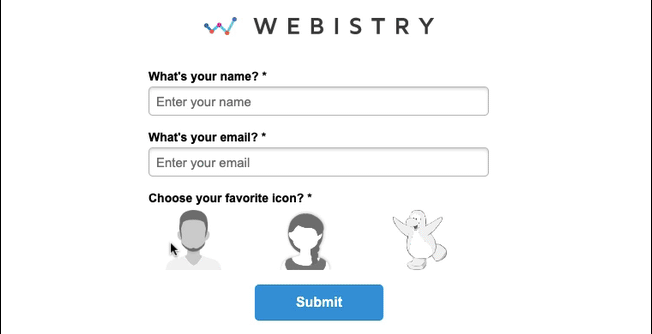
See it in action! 💥 Here’s a landing page (built in Unbounce) using icon radio buttons.
👈
🚨
This is not an official Unbounce feature. This functionality is based entirely on third party code, and has only been tested in limited applications. Since this isn’t a supported Unbounce feature, the Unbounce support team will be unable to assist if things go awry. So if you are not comfortable with HTML, Javascript and CSS, please consider consulting an experienced developer.
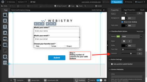
Step 1. (Optional)
Directly from the edit page, you can edit the radio button to have it shown in rows or columns inside the properties options.
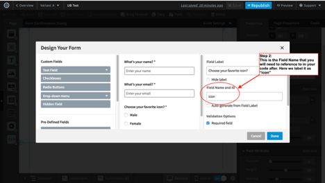
Step 2.
After creating your form, your radio buttons will have a field name that needs to be referenced to. You can find this in the box under “Field Name and ID”. You can use an auto-generated form field label or choose one yourself by typing it inside the box. In this project, it’s labeled as “icon”.
Step 3.
Host the images/icons you want to use on an image hosting website (ex: https://imgur.com/, AWS, your server, or Google Drive)
Each image will have its own url link that needs to be used.
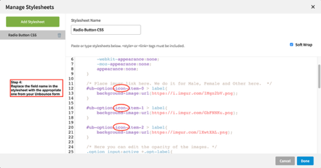
Step 4.
The CSS is commented below to help you understand what’s being done. Then you can copy it into your stylesheet. Wherever you see the word “icon”, you will need to replace it by the field name that you used in your form. Depending on how many options your form will have, each radio button will need to follow the same styling. Therefore, copy and paste the CSS properties that holds the word “icon” and edit it to make it work with your form field.
<style>


    .option input{

        margin:0;

        padding:0;

        -webkit-appearance:none;

        -moz-appearance:none;

        appearance:none;

    }


    /* Place imugr link here. We do it for Male, Female and Other here.  */

    #ub-option-icon-item-0 > label{

        background-image:url(https://i.imgur.com/1Mgn2bV.png);

    }


    #ub-option-icon-item-1 > label{

        background-image:url(https://i.imgur.com/GbFNNKu.png);

    }


    #ub-option-icon-item-2 > label{

        background-image:url(https://imgur.com/lXwtXAL.png);

    }


    /* Here you can edit the opacity of the images. */

    .option input:active +.opt-label{

        opacity: .9;

    }


    /* Here you want to make sure that there's no filter your images */

    .option input:checked +.opt-label{

        -webkit-filter: none;

        filter: none;

    }


    /* This is where you can style the image that you desire to use with any CSS properties.

    The width and height of your image can be adjusted here. Depending on the images you use, it

    will need adjusting. */

    .opt-label{

        cursor: default;

        background-size: contain;

        background-repeat: no-repeat;

        display: inline-block;

        width: 70px;

        height: 70px;

        -webkit-transition: all 100ms ease-in;

        transition: all 100ms ease-in;

        -webkit-filter: brightness(1.8) grayscale(1) opacity(.7);

        filter: brightness(1.8) grayscale(1) opacity(.7);

    }


    /* Here is where the hover feature is implemented */

    .opt-label:hover{

        -webkit-filter: brightness(1.2) grayscale(.5) opacity(.9);

        filter: brightness(1.2) grayscale(.5) opacity(.9);

    }


    /* Here we make the label names hidden (Male, Female, Penguin)  */

    #ub-option-icon-item-0 > label> span{

        visibility: hidden;

    }


    #ub-option-icon-item-1 > label> span{

        visibility: hidden;

    }


    #ub-option-icon-item-2 > label> span{

        visibility: hidden;

    }


</style>
In the stylesheet, it happens on two occasions.
- When the image is placed as the background-image
 #ub-option-icon-item-0 > label{

        			background-image:url(https://i.imgur.com/1Mgn2bV.png);

    		}
- When we hide the label names.
 #ub-option-icon-item-0 > label> span{

        			visibility: hidden;

    		}
Therefore, if you have more than 3 options, you will follow the same convention and put in:
 #ub-option-icon-item-4 > label{

        			background-image:url(https://i.imgur.com/image#4here.png);

    		}
That’s it! You’re done!
Let us know if you have any questions about these instructions in the comments section below. 👇
Want to take your Unbounce landing pages to the next level?
 Check out the Ultimate List of Unbounce Tips, Scripts & Hacks