CSS Help for TypeForm!

  • 21 March 2018
  • 2 replies
  • 22 views

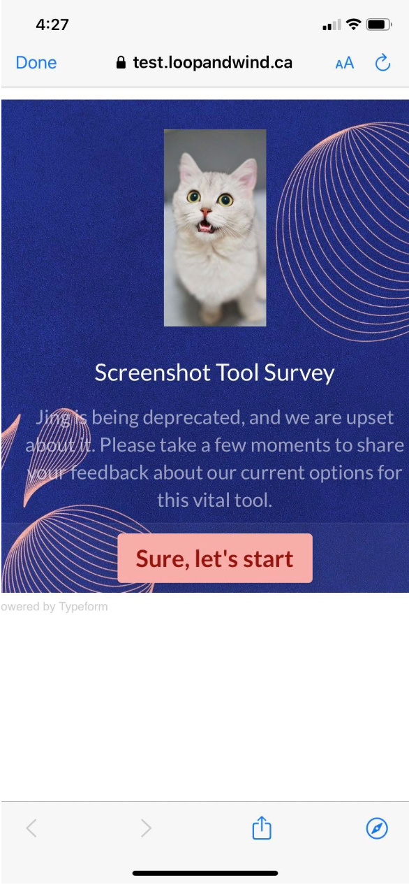
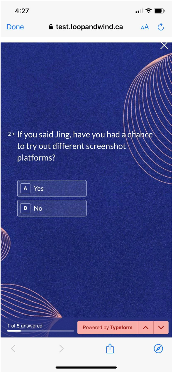
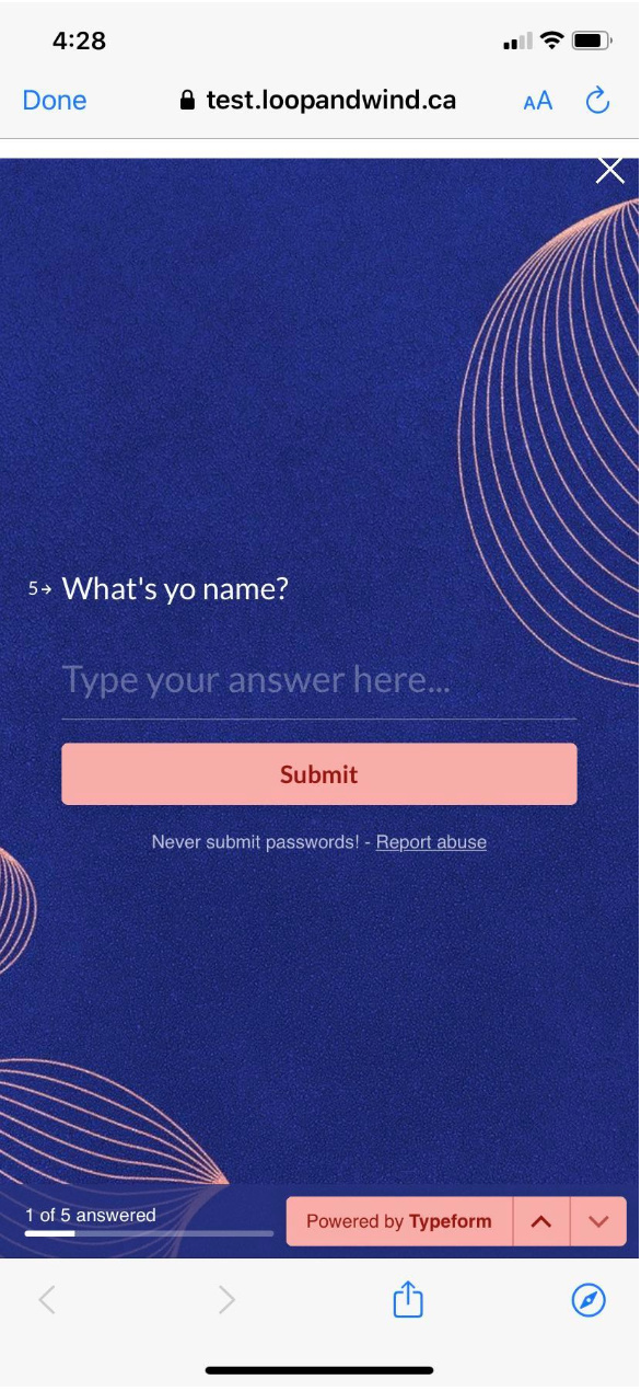
I’ve embedded a TypeForm into my landing page. It looks and works great when on a desktop, but when on a mobile device the TypeFrom formatting isn’t correct and makes it difficult to navigate and fill out the questionnaire. I’ve been told by the TypeFrom tech that “it looks like your banner has a higher z-index than your typeform so that, while it is not part of the typeform, it is laid on top of the typeform and obstructs the view.” I’ve also been told that I need to add css code, which I have no idea how to do.

Can anyone help me out? Thanks!

Neil


2 replies

typeform does not work well on unbounce on mobile.
after badgering their support, the answer is “we know it doesnt work and its not a priority”. their priority is to make their editor look better. i’m going to be looking for an alternative soon after I knock down a few other to-dos. their editor is awesome enough, you’d think that they’d fix other things that are clearly broken.

better integration into unbounce and mobile could remove two clicks for me in my conversion funnel.

Userlevel 7
Badge +1

Hey folks!

Just wanting to close the loop here as @Alyssa dug into this and wanted to provide some updated information. Here’s what she found:

@Alyssa: I took a look into a Typeform and it’s appearance on mobile devices for you, and it looks like everything is operating as I would expect with the current functionality of the HTML widget.

In this particular instance (the above thread), it’s a bit tough to tell what @nph5287 and @hans were experiencing, but in regards to functionality and navigating the form on a mobile device in my test page it seems to be all working well! You can try it out here: https://test.loopandwind.ca/typeform/ - I specifically sized this for my own device - iPhone XR, so it might appear a bit different for you than for me, but here’s some screenshots from my phone:


Typeform doesn’t have an option to make something mobile specific, they instead automatically detect screensize and adjust accordingly:

When you embed a typeform, our robots automatically resize the text to adapt to smaller spaces.

Depending on the space available, the text of a typeform will be shown in the following sizes: Large (default), Medium or Small.

The rules for determining different sizes are based on the following conditions:

  • if width of typeform > 800px = Large
  • if width of typeform < 800px = Medium
  • if width of typeform < 550px = Small
  • if height of typeform < 450px = Small

See full Typeform article here

If you view your typeform on a mobile device, and you’re seeing a symbol prompting you to turn your screen, it is likely your typeform is embedded with too large a sizing to view on mobile. In this case, double check the width and height of the embed. To improve your experience on mobile, you may also want to check the content of the typeform and segment large amounts of text into smaller questions if possible.

As with all HTML embedded options on a mobile view in Unbounce, it will take a bit of trial and error to get the size right, as everyone has a different device size. So if you size it too big it can cut off the words outside the screen, and if you size it too small then it can also cut off some of the extra in the extreme lefts and rights in the bottom corners as the HTML widget is not responsive to screen size specifically.

So in conclusion, seems to be working as expected, however not perfect.

Hope this provides a bit more context! If you have any questions, fire away!

-Jess

Reply